

You’re bound to have heard the terms ‘visual identity’ and ‘design guidelines’.
Do you think they sound a bit corporate and maybe aren’t for you?
Yet they’re vital tools for freelancers and smaller brands – and they don’t need to be overly complicated or expensive.
You can’t build a brand with a logo alone. A clear visual identity is a powerful communication tool that can work wonders for your business, whatever its size.
First let’s think about what you can do with a logo on its own.
Look at your lovely shiny new logo on your computer screen.
Now what?
Without a visual identity you can’t do much with a logo
For a start, where and how can you use it?
Can you use your logo in the format it was sent to you?
Sitting in the middle of a blank page or in the top left-hand corner.
Should it have a white background? Or a different colour each time?
Maybe you think it’s ok to send your logo off to your suppliers – like your printer and web designer – and let each of them alter it as they see fit?
Maybe you’ll just see how things go and sort it out later.
Except while you delay, your competitors will be using the time to forge ahead and build their brand image. Grabbing people’s attention, attracting them to their brand and making them want to buy their products or services.
A clear visual identity alongside clear design guidelines will make you look like you know your stuff – both within your industry and as a brand
A truly professional image!
A visual identity operates alongside a set of design guidelines (i.e., its rules of use) to bring clarity, unity and balance to all your marketing materials.
Without these, things can look sloppy or unfinished.
If you don’t take care of your brand image, it can send out the signal that it’ll be the same for your business and customer relations. That you’re not the real deal.
A well-considered visual system means no more uncertainty or hesitation
When you and your suppliers can refer to a set of design guidelines, there won’t be any queries about the colours, fonts and motifs to use each time.
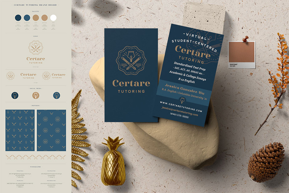
One of my customers was able to design and create their website using the brand board – a simple set of design guidelines – I created for them. It aligns perfectly with the look of their business cards and printed marketing materials.
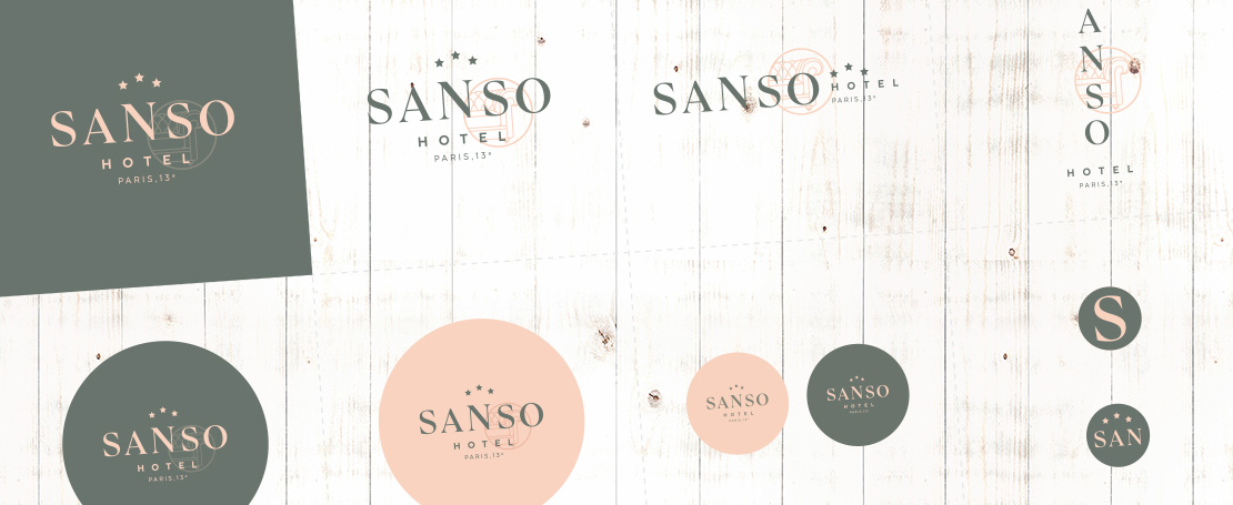
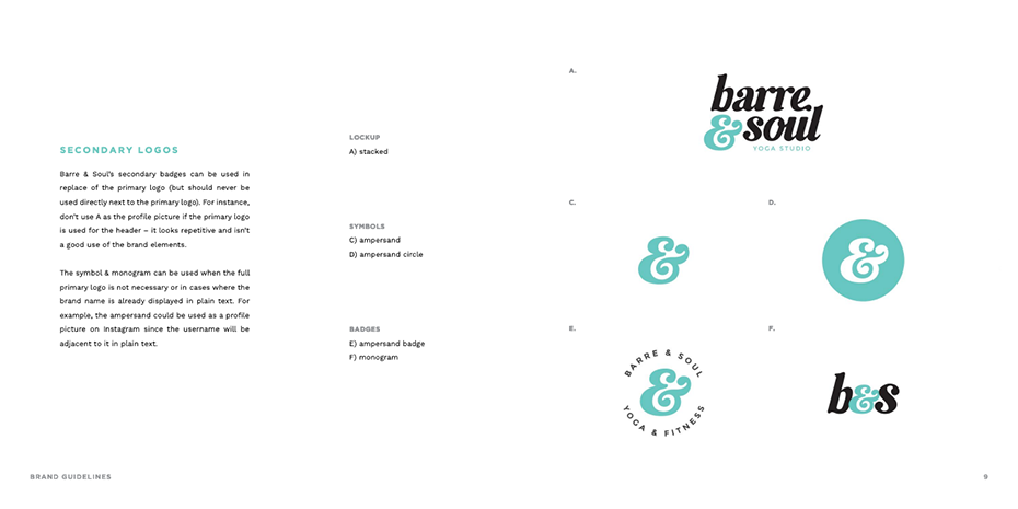
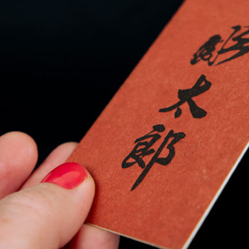
Logo (supplied in several different variations)
Having a few different versions of your logo brings more flexibility than having just one.
Your main logo is not always going to work – depending on the format, proportions or size of the materials you’re working on.
It’s a great idea to have a few secondary logos so you can tailor your look – for example vertical, online, stacked, monogrammed, as a badge or favicon
→ Complete visual identity on Issuu
“Yes!! Thanks for thinking of web designers who are pulling out their hair when there is only a single version of a logo (which can’t be used at a smaller size for the favicon, grrrr)”
Pauline Millot – sites web sur-mesure on Linkedin
Depending on the background (e.g., whether it’s dark, light or a photo) you might not be able to read or see your logo properly. So it’s best to test how it looks in a few different colours.
In any case, it is nice to switch things once in a while by alternating between your main logo and its variations – all the while remaining recognisable and identifiable.
Colours
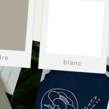
As an absolute minimum, you should define a colour palette for your brand.
You can go further and assign a proportional value for each colour.
Along with their function: primary colours, secondary colours, accent colours, for backgrounds, decorative elements and text.
Typography
The range of fonts you choose with your designer should work well with each other and with the character of your brand.
Some will be used for headings or subheadings and others for body text.
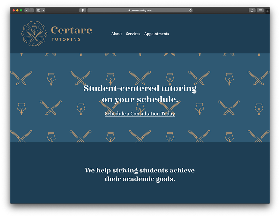
Layout
As a minimum, you need to specify the positioning of the logo and how it should be used with different media (on photos for example).
Depending on requirements, layouts and templates can also be developed.
Iconography
You can have motifs, illustrations and icons designed if you like.
You can also define a look for your photos (depending on the complexity of your guidelines) which might include elements like composition, content, colours and look and feel, effect, frame, depth of field, etc.
All these things make your brand and its world instantly recognisable without having to plaster your logo everywhere.
Maximum impact!
If your printed or online marketing materials aren’t visually coherent or don’t work together as a whole, you won’t just have a sloppy image.
You’ll miss out on making an impact!
If you’re relying only on a logo to get your target audience to make the link between your different communication tools and your brand, you’re risking going unnoticed.
A logo won’t suffice to make your brand instantly recognisable.
Think about when you’re looking for a product you like on the shelves – you don’t usually use the logo to find it.
For example, I can never remember the name or the logo of my shampoo. But I always find it thanks to a few distinctive characteristics – its colours and the general look of its packaging.
Take Nivea for example – it has a very simple logo. It is similar to lots of other logos. But because of the white letters against a blue background, and not just any blue, you immediately recognise their products.
And if I say Häagen Dazs to you. Can you see their logo in your mind’s eye?
Probably not, but I bet you would know their ice cream tubs in the freezers at the supermarket!
A visual identity says more about you, your business and your customers than a single logo
With a defined colour palette, typography and graphic elements, you can take people straight into a new atmosphere and world.
Here are four visual identities (for hotels, bars and restaurants) that all do that.
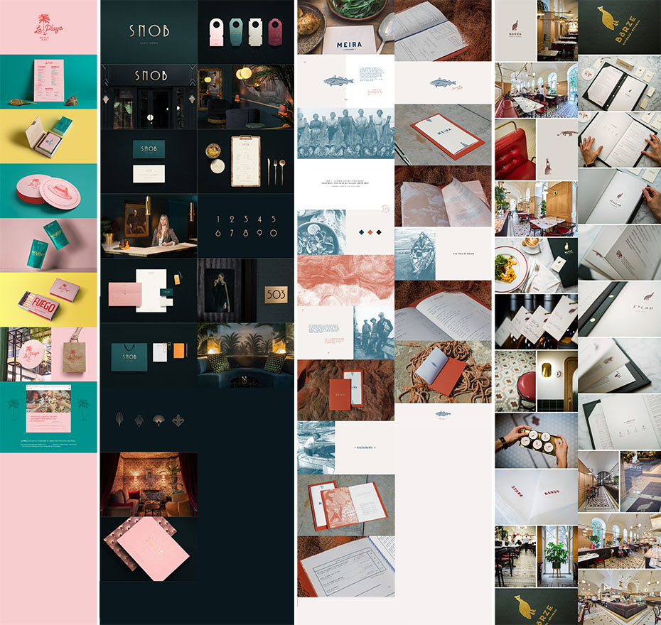
La Playa Beach Bar / Snob Hôtel / Meira Restaurante / Börze Restaurant
It makes it easy for your customers to understand where you sit within the range of products or services on offer.
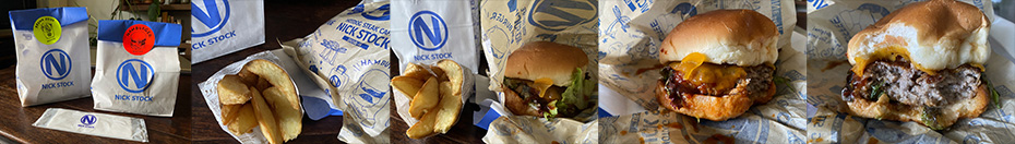
A burger lover will know these are premium burgers from their branding.
They’re prepared using dry-aged beef that is cooked on a grill.
If you have a great product it is a shame to miss out with marketing materials that aren’t of the same quality and that don’t make the most of it.
Your potential customers need to feel valued. They need to know that you’re talking to them. And it’s easier to send that message through a coherent visual identity rather than a simple logo.
You can use a straightforward logo (wordmark) and develop a sophisticated image.
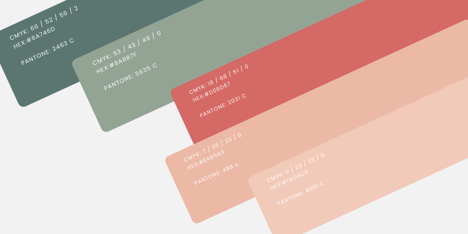
A well-chosen, considered choice of colours enhances your message
There’s more than just blue, green and pink!
Your palette is an important part of your brand identity.
It follows that choosing it shouldn’t be done lightly or hastily. And don’t base it on what’s trending right now.
The colours you love when you’re decorating your home or picking out an outfit won’t necessarily work for your brand or your business.
It’s best to choose your colours with your designer. They will take your personal taste into account along with the spirit of your brand and its message.
And they’ll consider how the colours work with one another, as well as the contrast for legibility.
Through colour associations and the use of less common shades, you can really stand out. And you will build the identity you need that aligns with what you offer and the customers you want to reach.
Solutions for every budget
Not everyone has the means to pay for a 50-page set of design guidelines like the major brands. And you probably don’t need one anyway.
Brand board
This is a simple summary of the various elements that make up your visual identity.
Ideal if you do a lot of promotion on social media and you use Canva.
Order your printed materials from a single designer
Your designer can create a range of materials. Those you need immediately and others that can be completed at a later date, when your business or your brand has grown. They will design the new materials and a set of design guidelines.
If you don’t design documents yourself and work with a single designer this is a good option.
Design guidelines (as simple or as complex as you need)
If you use different suppliers to design your marketing and communication materials, it is best to have a set of design guidelines.
This goes for when your employees are creating documents too.
The price will depend on your requirements and how complex the guidelines need to be.
A mix
Do you need printed marketing materials but you use social media too?
Where this is the case, commissioning printed materials and a brand board will be ideal.
“The Artisanal Branding Atelier” offers this service.
—
Are things a little clearer now?
Would you like to discuss your visual identity with me?

1 Comment
Good read. It makes sense that a logo alone isn’t enough, consistency in colors, typography, and style is what actually builds recognition.