Your colour palette is a big part of your visual identity.
It’s one of the first things people notice about your marketing materials.
Like your logo, your colours help people recognise you instantly. And they make sure you stand out from the competition.
Your colour palette should suit your products and services plus the image you want to project.
And above all, it should attract your target customer – customers will unconsciously form an opinion from your colours.
But be careful! For your colour palette to function properly, you mustn’t change it every three months!
Which means choosing it can’t be rushed.
To choose your colour palette you need to keep an open mind
Don’t randomly choose your colours or only base your choice on your personal taste.
It doesn’t follow that pink is the best colour for your brand just because it’s your favourite shade.
Although obviously, you have to like your colours!
Think of your palette as an outfit your brand is wearing.
You don’t wear uncomfortable clothes or clothes that don’t suit you.
The aim is to make you feel confident and attract customers!
But it’s best not to limit yourself to your favourite colours or the ones that first come to mind!
Make sure you can answer the following questions:
- What type of products and services do I offer?
- Who are my current customers? Who are my target customers? And what do they like?
- Who are my competitors? What colours do they use?
- What is my vision, my message and my mission? What are my values?
At this point, you might find one or two colours will emerge.
You can go on to refine these.
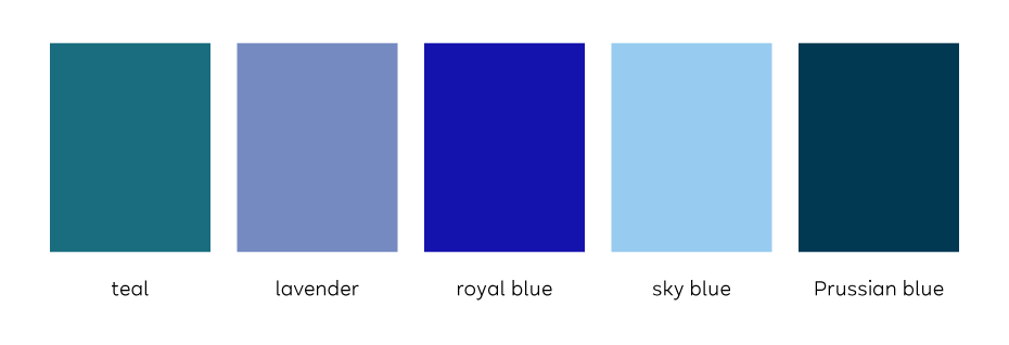
For example, ‘blue’ is not specific enough.
Are you thinking of teal? Lavender? Royal blue or sky blue?
Then complete your selection.
Two to five colours are perfect.
Use an inspiration board to help define your colour palette
You don’t need to cut up magazines and stick things in a scrapbook.
(But if you’d like to do it that way, go for it!)
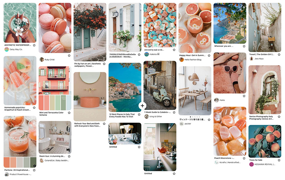
Otherwise, you can easily create a mood board using Pinterest.
Pinterest is an easy-to-use online platform where you’ll find everything you’re looking for!
Just pin things that inspire you and that speak to your brand, company and business.
Don’t exclude anything at this point – décor, objects, landscapes, interiors, places, fruits, flowers, etc.
During your research, you can use keywords that chime with your brand – seasons, ambiences, adjectives, times of day, etc.
You can delete anything that doesn’t fit at the very end.
Some colours will start to stand out.
Follow these basic rules
Limit your choice
- A minimum of two colours – one for the background and one for text or other graphic elements.
- No more than five or six – two to three dominant colours and accent colours.
You could choose three dominant colours and then the same three colours but with different degrees of saturation and brightness.
Contrast
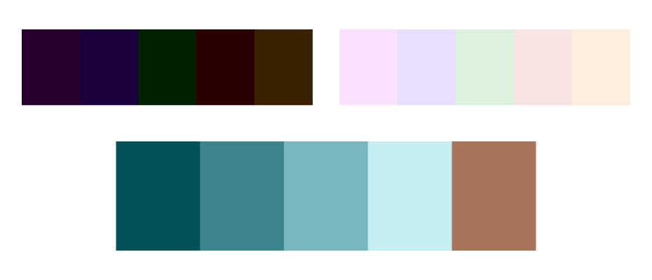
Don’t choose just dark or light colours as it will become illegible.
Harmony
Make sure your colours work well together. So they look balanced and are pleasing to the eye.
Colour palettes I’ve created for my customers
Kisuke Japanese restaurant
Customer brief:
“My restaurant serves high-quality traditional Japanese food but in a relaxed, modern atmosphere at an affordable price.
I don’t want customers to feel intimidated or hesitant about entering the restaurant.
I want a bold, pop look and I don’t want to use the drab colours that you often see being used by places that are very traditional or high-end.”
My proposal:
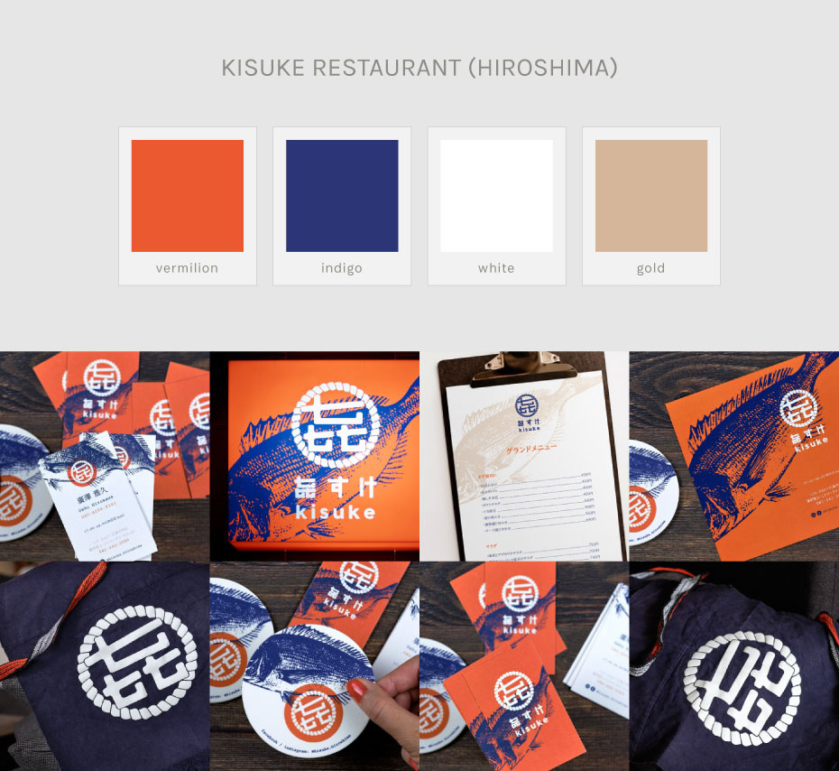
- For a modern, pop image: Two complementary colours – bright, saturated vermilion red and indigo blue work together to give a modern, electric intensity.
- For the traditional element: Vermilion and indigo are traditionally seen a lot in Japan.
Vermilion in Shinto shrines, lacquered tableware and the ink used on Hanko seals.
Indigo in Japanese traditional dye, pottery, Japanese maekake aprons (worn in the izakayas – Japanese saké breweries).
+ a natural, neutral colour reminiscent of sand, metal or wood as an accent colour.
A little something extra:
The luminous sign stands out from other restaurants (there are many in Japanese cities and the restaurant is located above ground level).
Autour du Japon Boutique
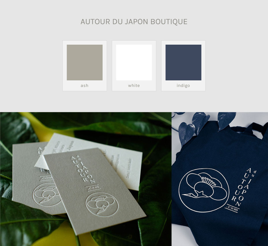
Client brief:
“My store brings together Japanese and French designers who offer high-quality designs in the Japanese spirit and style. Items are chosen with extreme care and often involve trips to Japan to meet the artisans.
I need
- a stripped-back visual identity that instantly creates a Japanese connection.
- to differentiate my business from dropship stores selling poor-quality items that are often produced in China.
- to reach out to a passionate, cultivated customer with excellent taste and who enjoys art. Someone with whom I can have a warm relationship. Goodwill is important to me.”
My proposal:
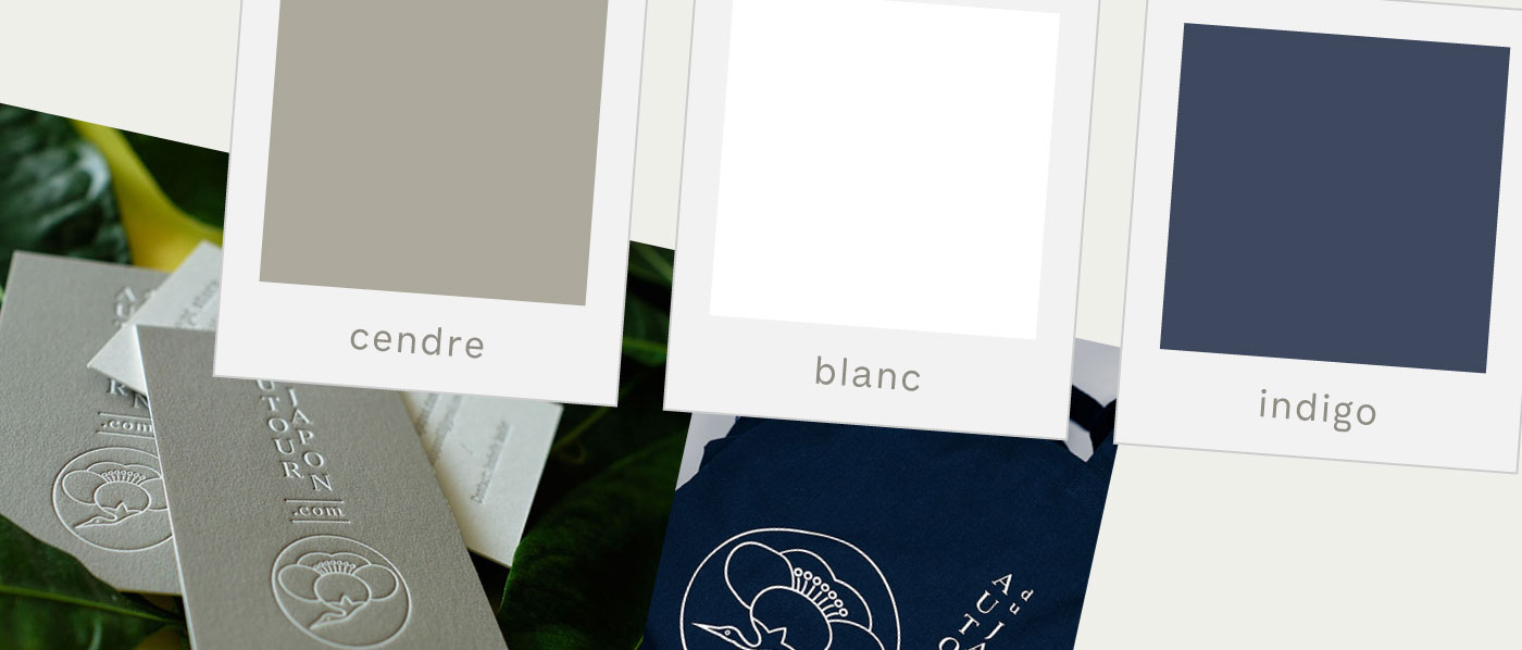
- Grey was one of the colours the client chose initially (red, black, white, grey and cream). I chose a warm grey from a colour chart of traditional Japanese shades. And reduced the number of colours to create a ‘pared-back’ feel.
- Indigo for their tote bags, a colour traditionally used in Japanese crafts.
The look and feel is soft to echo the client.
Sanso Hotel
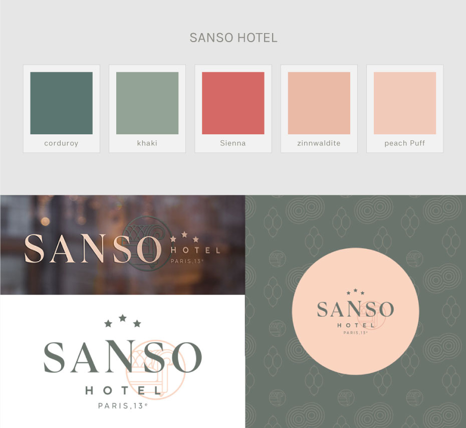
Client brief:
“Our hotel’s décor is contemporary with comfort of the highest standard.
We want our image to echo the atmosphere of our neighbourhood (Paris’s 13th arrondissement).
We want to create a cosy place with a leather sofa to lounge on, read, or enjoy a whisky. We have a selection of Japanese whiskies.
The hotel library has a Manga selection and books on Japan and Zen.”
My proposal:
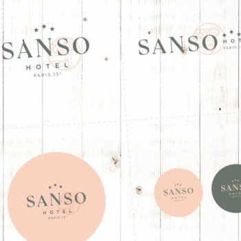
I chose soothing colours inspired by the library’s décor with its famous Chesterfield sofa (khaki) and by the flowers in the neighbourhood and a peach colour for freshness and contrast.
Horitaro, traditional Japanese tattoos
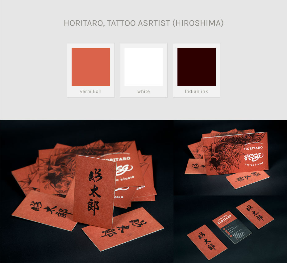
Customer brief:
“I want a classy, elegant look and I want to communicate the traditional nature of my art (i.e., traditional Japanese tattooing and the tebori technique – hand-completed tattoo artistry without machines).
I want to pull away from clichés and stand out from other tattoo artists who often use photo collages of tattoos on glossy printed flyers.”
My proposal:
- Only use three colours for marketing materials with a sophisticated look.
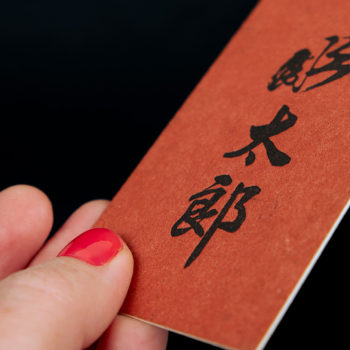
- Paper white.
- Black (reminiscent of Indian ink and tattooing).
- Vermilion red is used traditionally in the Shinto religion and for Japanese lacquer. Often considered a colour to ward off demons.
A little something extra:
As well as its symbolic meaning, this colour palette also keeps printing costs down.
Use online tools to create your colour palette
There are lots of online platforms to help you decide your palette.
- Canva (palette generator, inspiration, colour wheel, colour meanings and symbolism)
- ColorSpace (you can generate colour gradient)
- And my favourite one: Adobe Color (lots of tools like extracting colours from a photo or a web page, trends, contrast, etc.)
You’ll find even more once you start looking. Choose the ones you like best.
–
So? Have you created your brand’s colour palette yet?
If you’d like some help creating your colour palette, visual identity or your marketing materials, take a look at my portfolio and contact me!


