
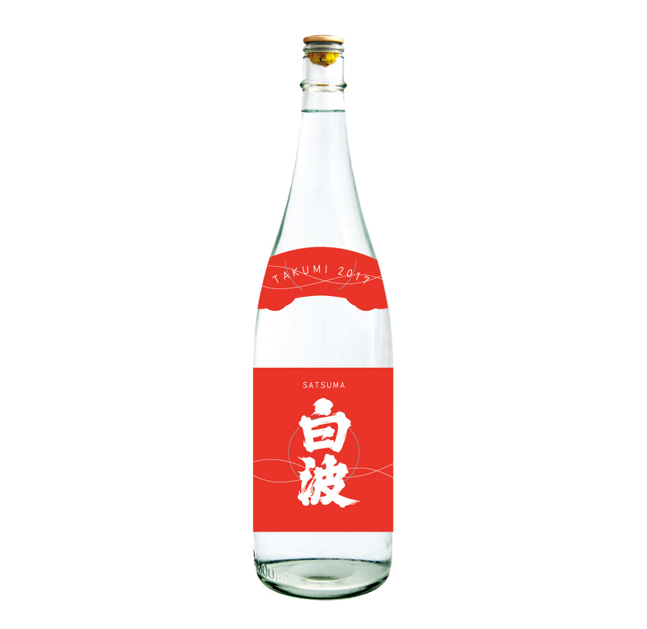
“Shiranami” shochu
Shiranami (白波) is a very famous Japanese brand of shochu. It is a sweet potato-based distilled spirit from Kagoshima, in Kyushu.
However, this alcohol has gradually lost its popularity among young people. This is why the brand thought of working on its image.
A new label design to modernise the product’s image
I was asked to come up with new collars and labels for the “Takumi” series bottles.
The aim was to modernise the image of the product in order to attract younger customers. The client was also open to proposals with or without their usual logo.
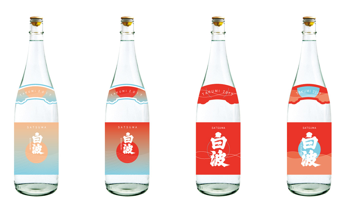
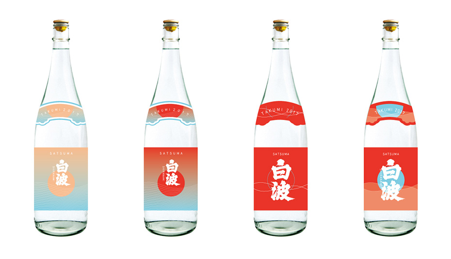
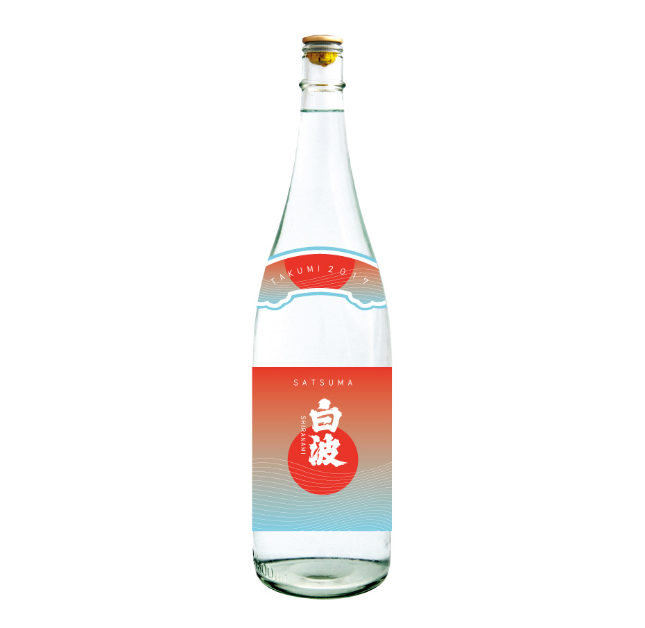
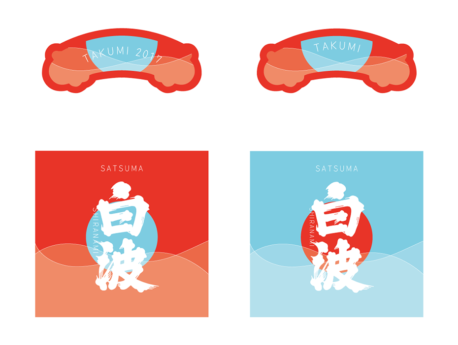
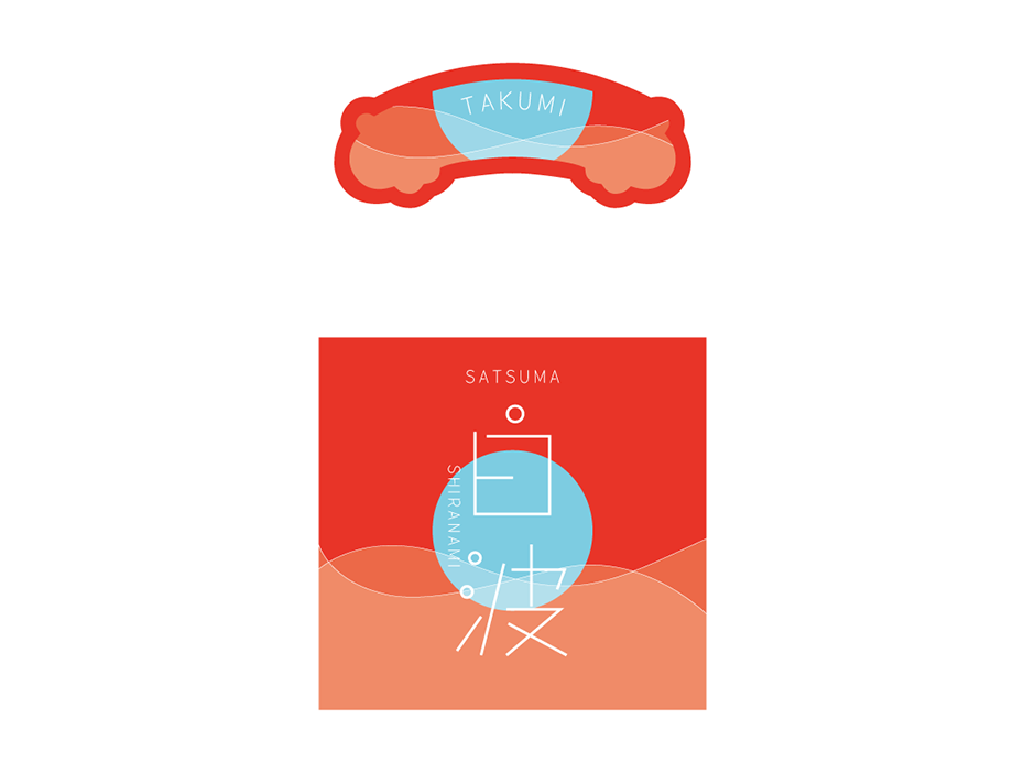
My label proposals
Lightness and minimalism
I presented several designs in which I tried to maintain the main elements (the wave, since “Shiranami” means “white wave” and the sun).
However, I represented them in a more graphic and abstract way to bring lightness.
I also chose brighter colours and more modern fonts.
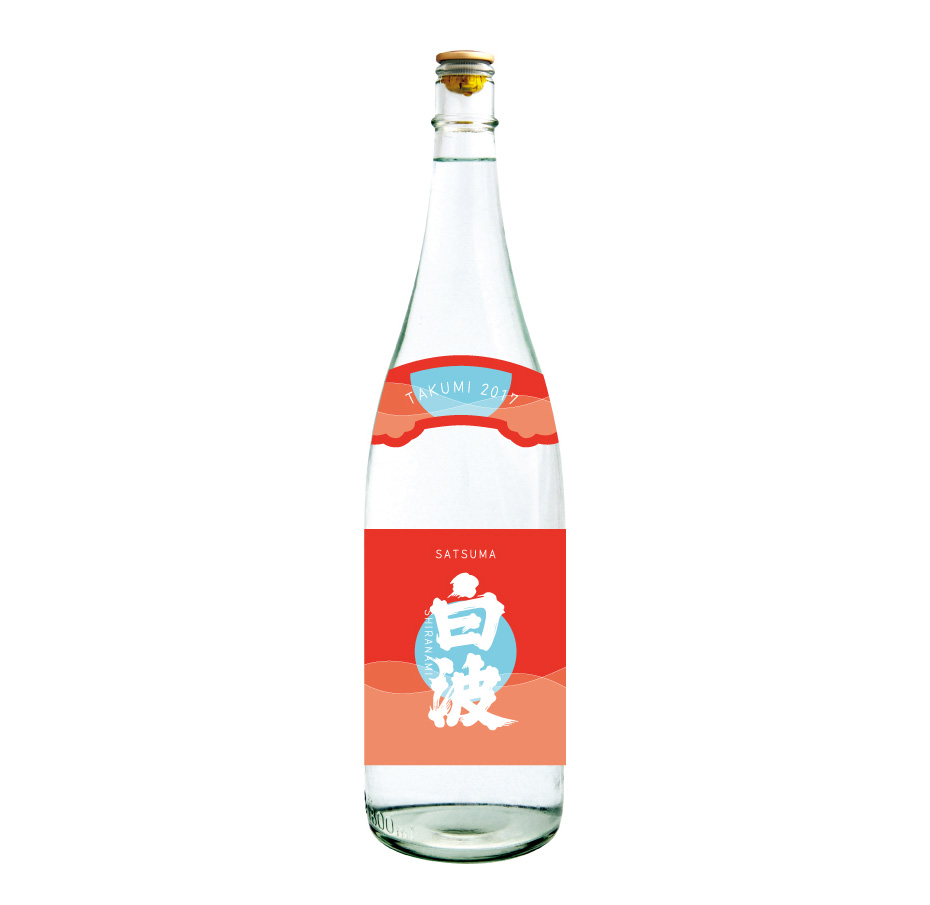
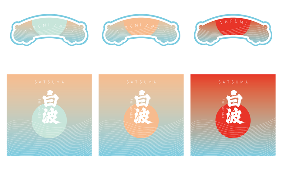
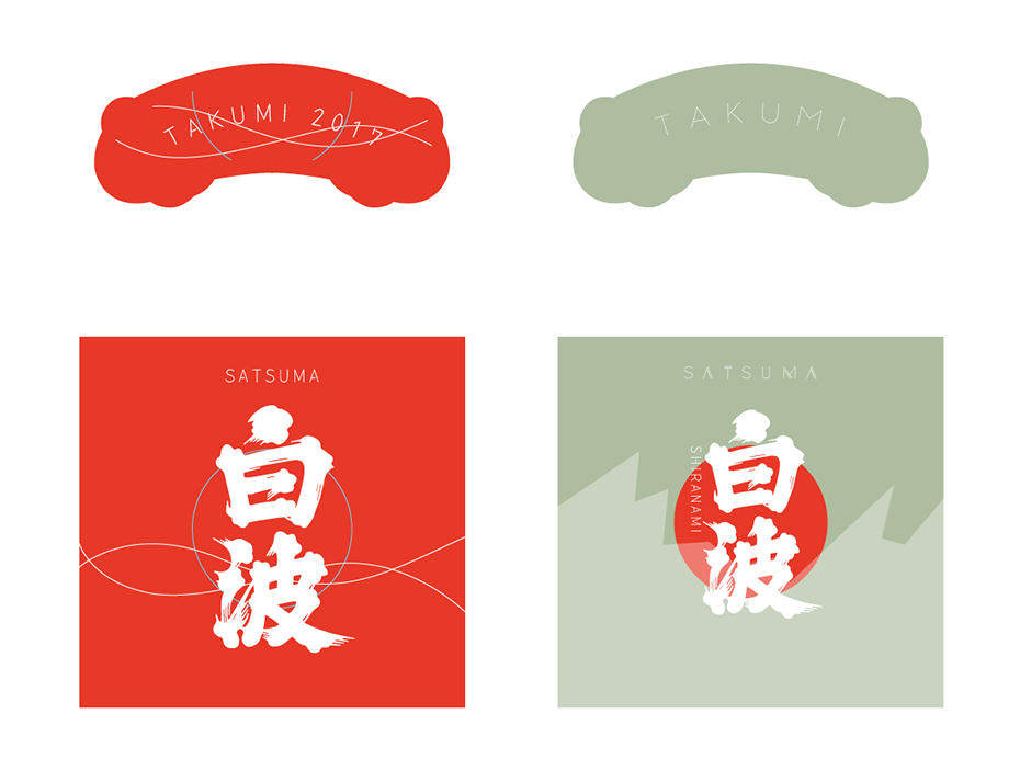
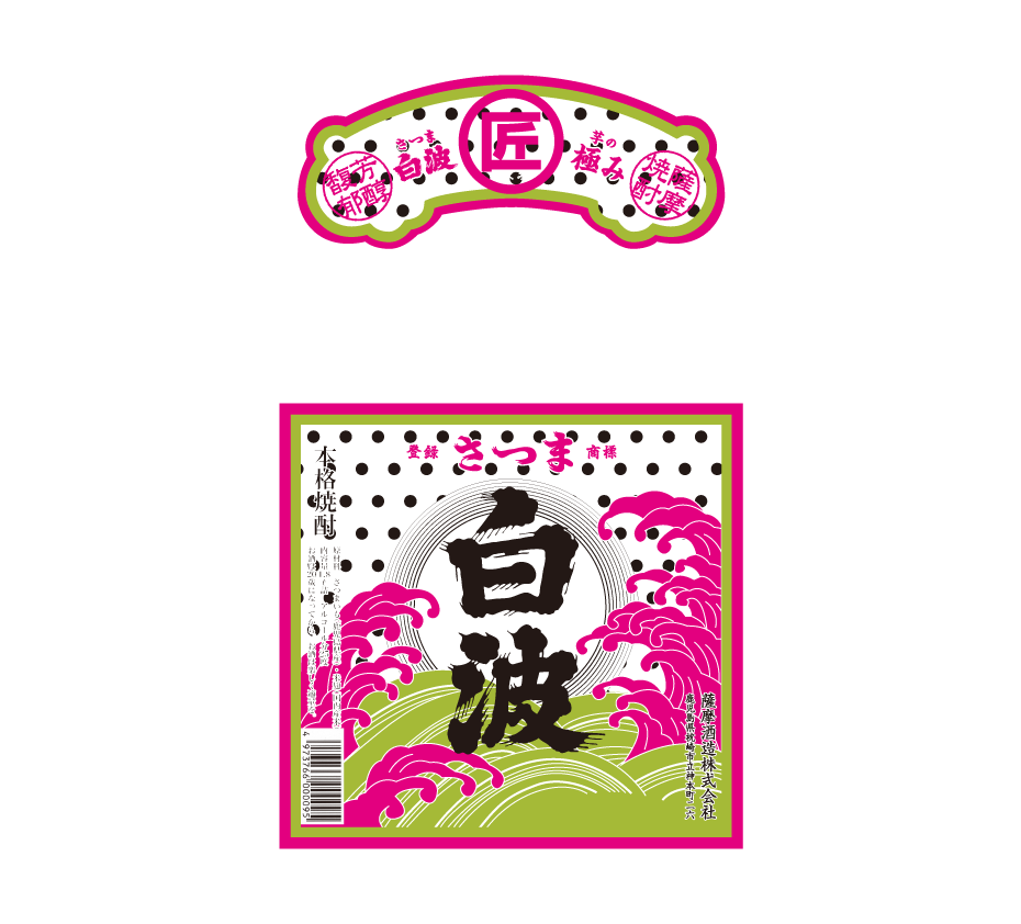
A proposal more faithful to the original
In this last proposal, I stayed as close as possible to the original design.
I modified the colours, added a polka dot pattern and represented the gradient of the sun outline with concentric circles.
This is the proposal that the client preferred.
→ more about label design
Project description
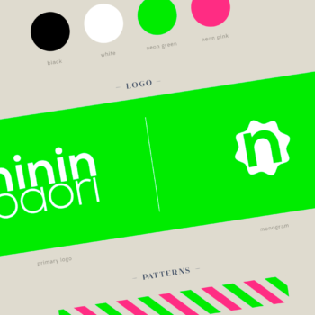
Job made while working at Nininbaori | Hiroshima.
Project details
- Client:
- Categories:
- Skills:
- Share Project :