
Naming and branding project for a hotel in Paris
For this hotel that was changing group, I was in charge of finding a new name and rethinking the visual branding, to match its new image.
![]()
Description of the hotel
Located in the 13th arrondissement, this hotel provides accommodations suitable for various situations. Whether you are traveling alone, with a partner, or in a group, for a short stay or an extended period, the hotel’s 70 rooms, studios, and suites are designed to cater to all needs.
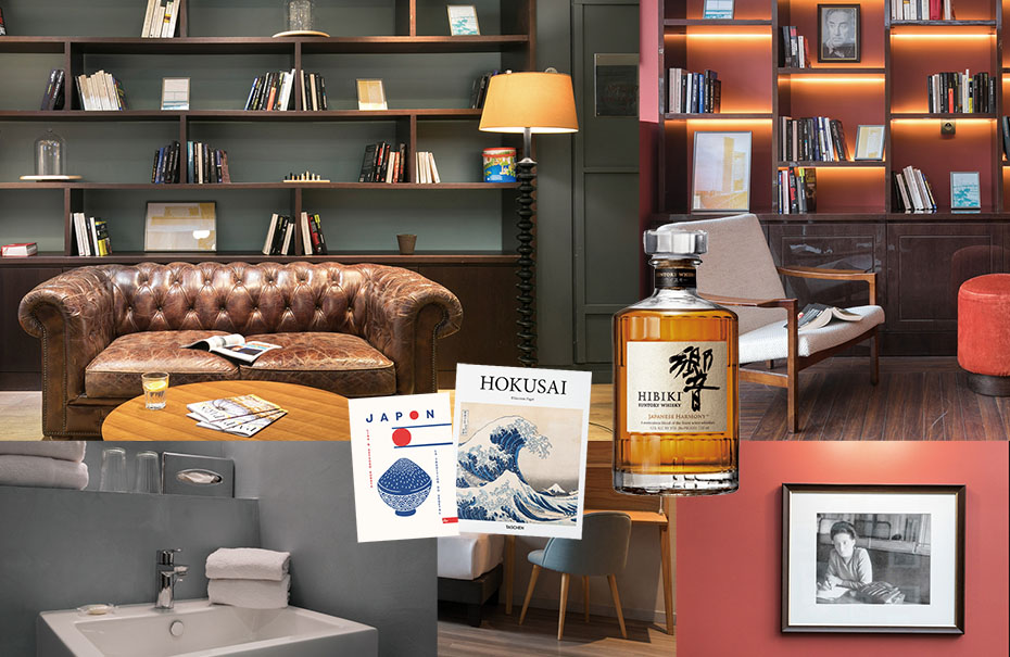
The hotel boasts contemporary decor and offers comfort that meets the highest standards.
It aims to create a warm and inviting atmosphere where guests can relax on a leather Chesterfield sofa, indulge in reading a book, or savor a Japanese whisky.
Additionally, there is a selection of manga and books focused on the themes of Japan and Zen.
Furthermore, the hotel invites you to explore the diverse district of Paris surrounding it. Just a couple of streets away, you can discover the charming Butte aux Cailles, Bercy Village, the National Library, and the bustling streets of Parisian Chinatown. This change of scenery awaits you, providing a unique and multifaceted experience.
Hotel naming
Naming brief
The goal is to create a new name for the hotel that meets the following criteria:
- Concise: The name should be short and to the point.
- Reflective of the Neighborhood: The name should capture the essence of the neighborhood and its iconic places, such as the BNF (National Library of France).
- Consistent with the Hotel’s Promise and Positioning: The name should align with the hotel’s offerings and positioning, which include the following:
- Rooms that function as studios.
- 3-star rating.
- Average price of €90.
- Multiple rooms available for 4 or 3 adults, equipped with additional kitchenettes.
- A seminar room with ample natural light that can accommodate 15 to 20 people.
- Strong corporate activity.
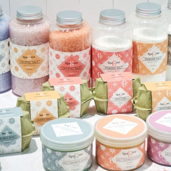
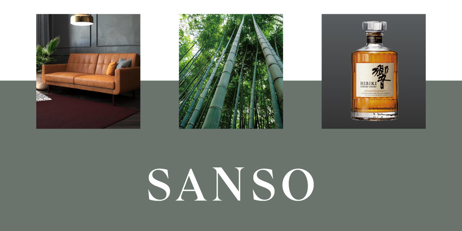
- Convey the Atmosphere of the Relaxation Area: The name should also evoke the ambiance of the hotel’s relaxation area, which features a comfortable sofa, a selection of whiskies, and a library with a Japanese theme.
Selected concept (among 3): Relaxation / Zen / Asia
NAME:
Sanso
ORIGIN:
Word meaning “oxygen” in Japanese (but does not sound excessively Japanese, e.g., banzai, Kawasaki, etc.)
SOUND:
Very short word, round sound, pleasant and visually appealing sequence of letters.
Easily pronounceable (in different languages).
TONALITY:
Pause, relaxation, calmness, serenity, breath, elegance, simplicity.
WHAT THE NAME EVOKES:
- Sensation, feeling
- Japanese whisky, Zen, manga
- Japan/Asia/Asian district
- Change of scenery
- A neighborhood full of greenery and tranquility in the heart of Paris
- A garden within the BNF (National Library of France)
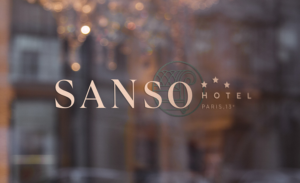
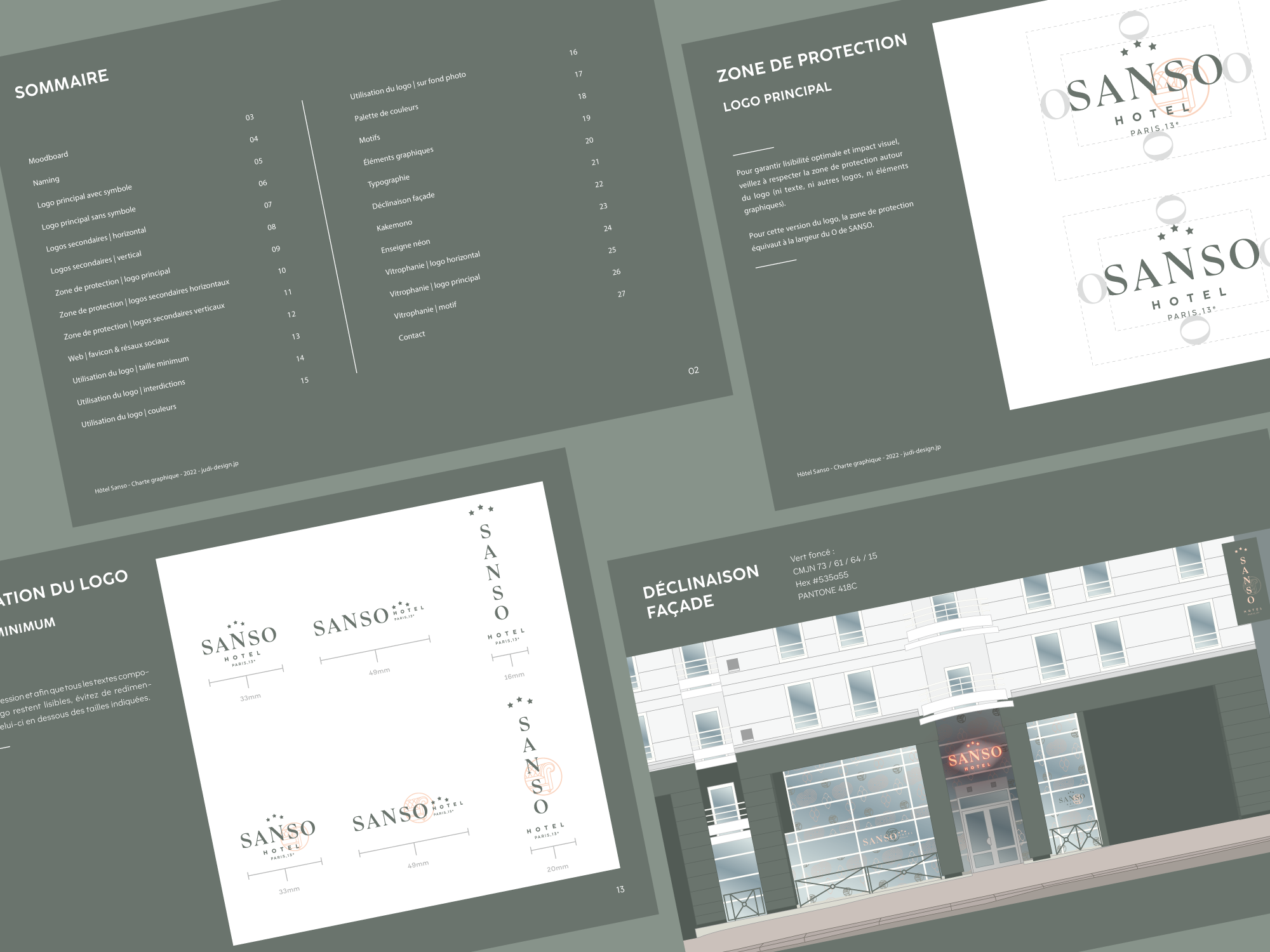
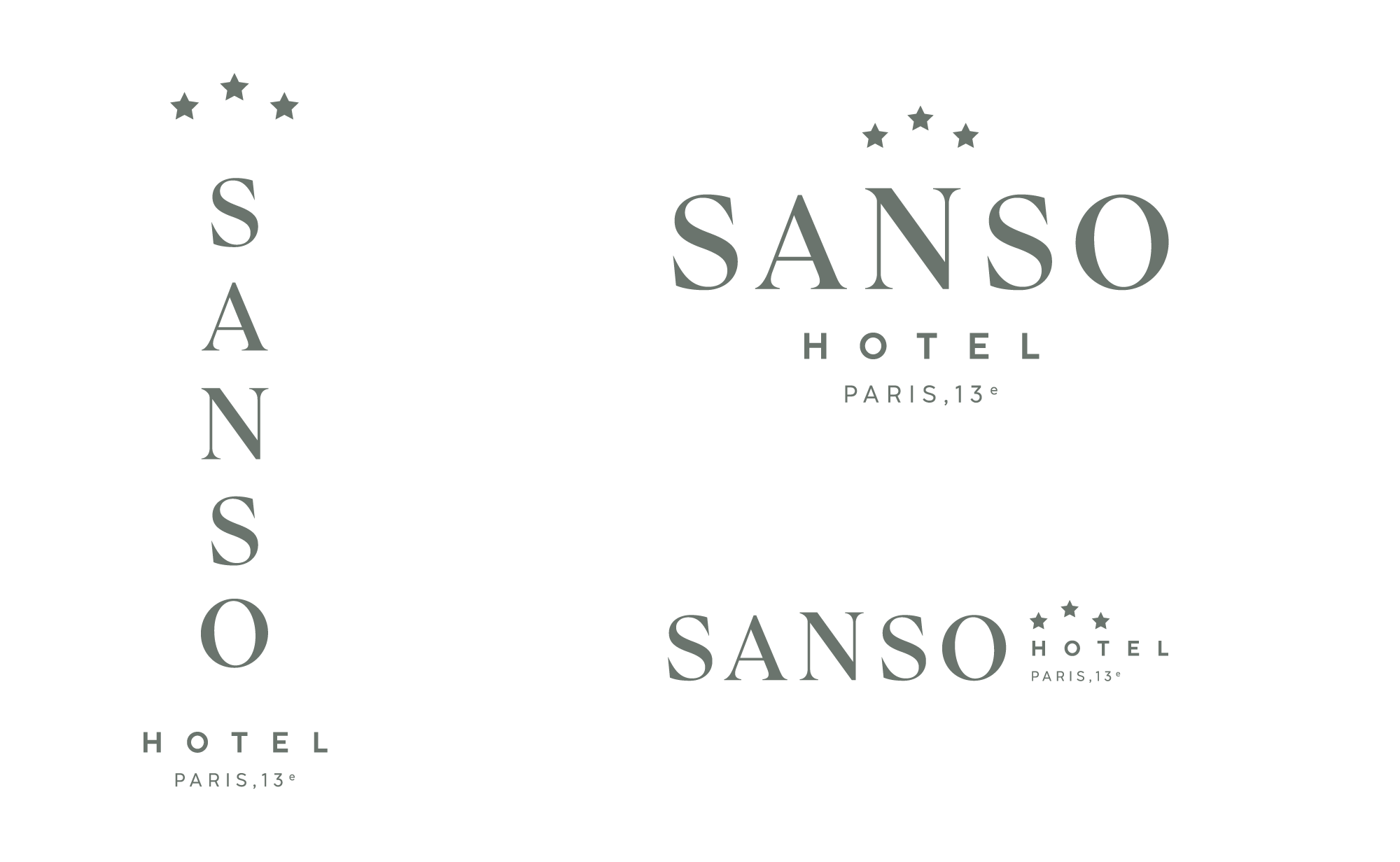
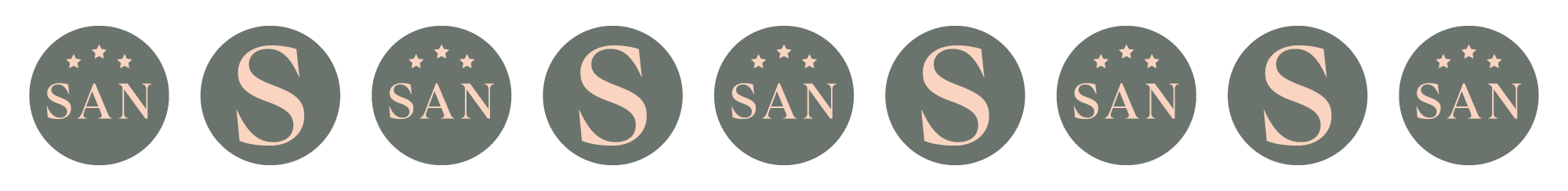
The primary logo and its variants
I chose an elegant serif font for “SANSO” that contrasts with a more modern and neutral sans-serif font for “hotel” and “Paris, 13e”.
A wide letter spacing and an “N” slightly taller than the other letters represent the idea of breath, pause, and comfort.
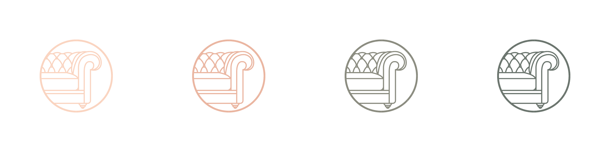
The iconic Chesterfield sofa symbol is reminiscent of a Japanese hanko seal.
Other elements of the visual identity of Sanso Hotel
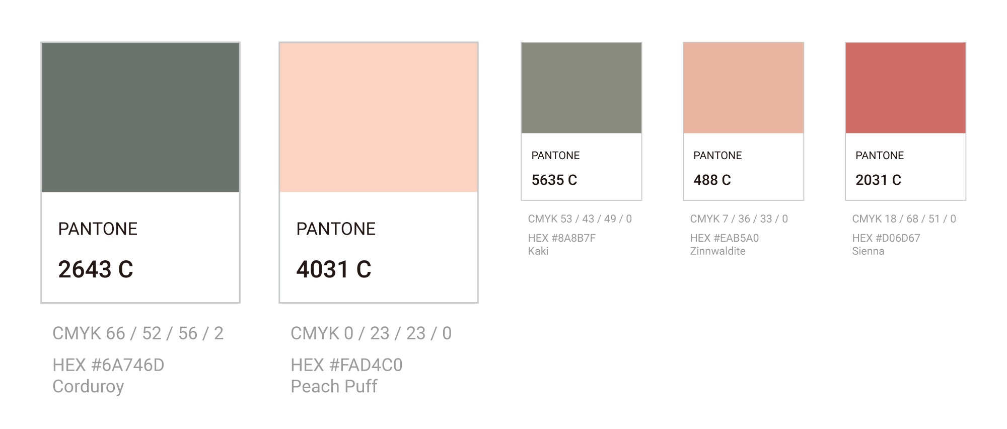
Colour Palette
For the colour palette, I have chosen subdued, natural, and timeless shades that reflect the interior of the hotel and evoke a sense of relaxation and the floral ambiance of the neighborhood.
DOMINANT COLOUR:
Corduroy (reminiscent of the walls of the room with the leather sofa).
SECONDARY COLOUR:
Peach Puff (to create contrast and add a touch of freshness).
ACCENT COLOURS:
Kaki, Zinnwaldite and Sienna.
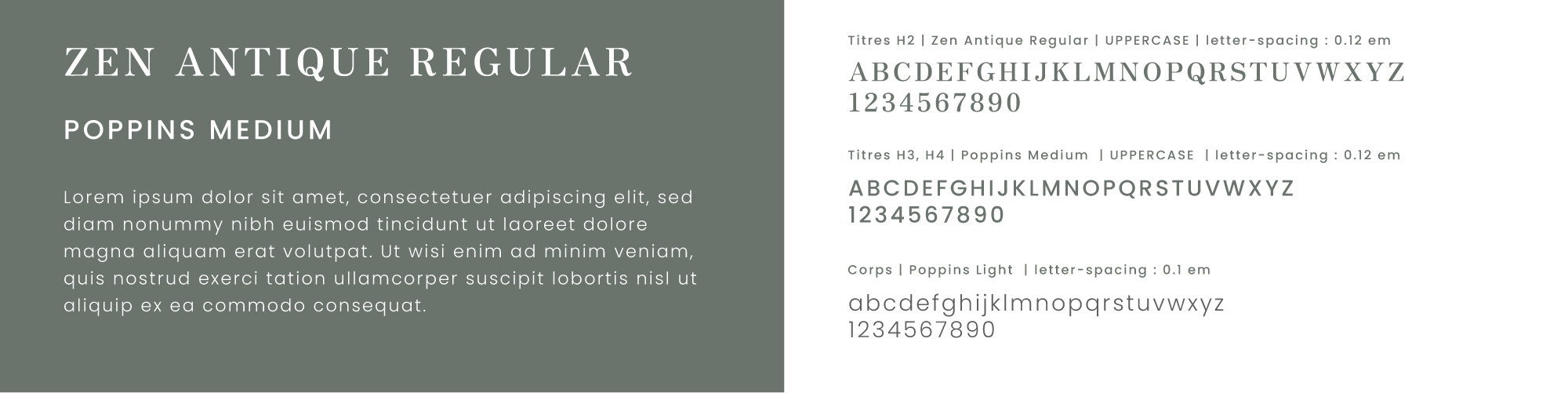
Typography
Graphic elements
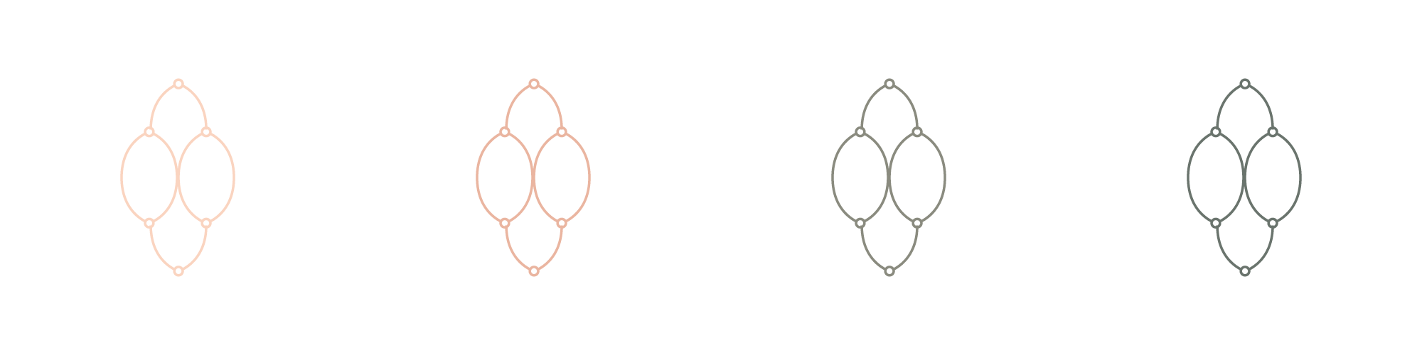
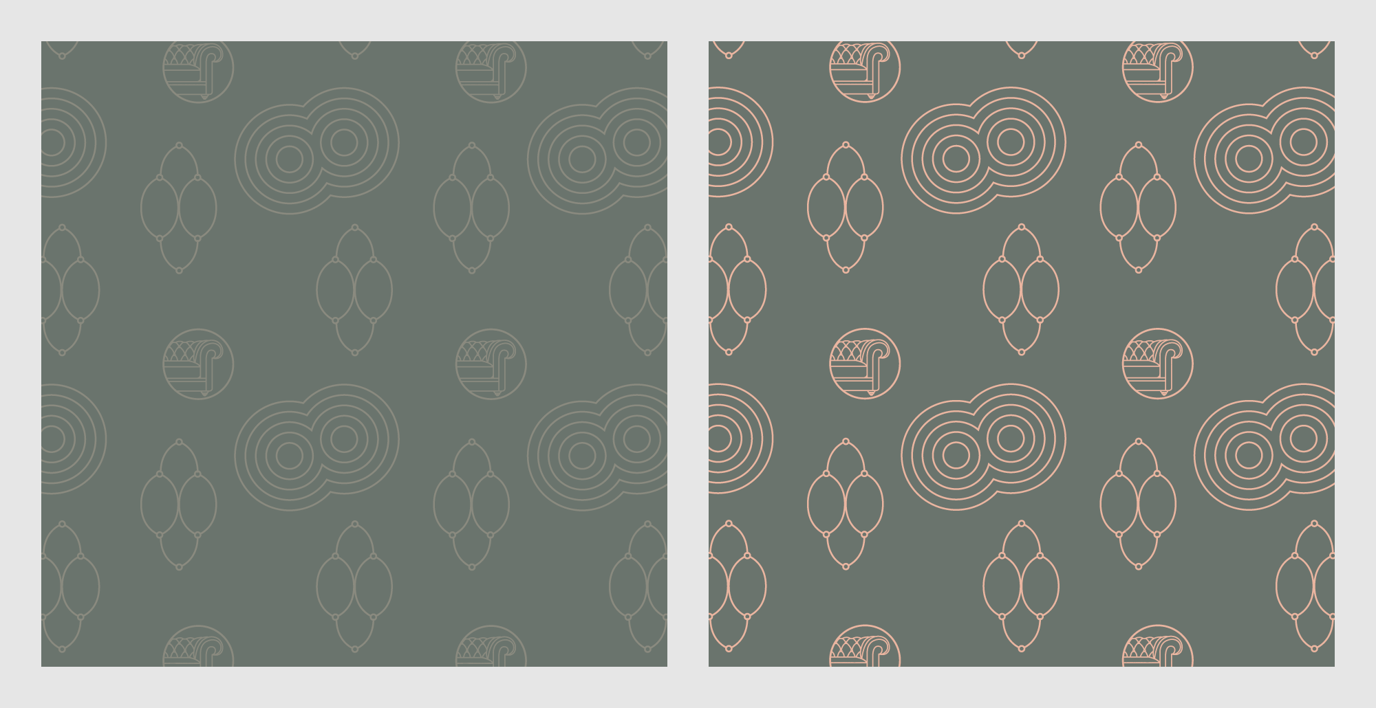
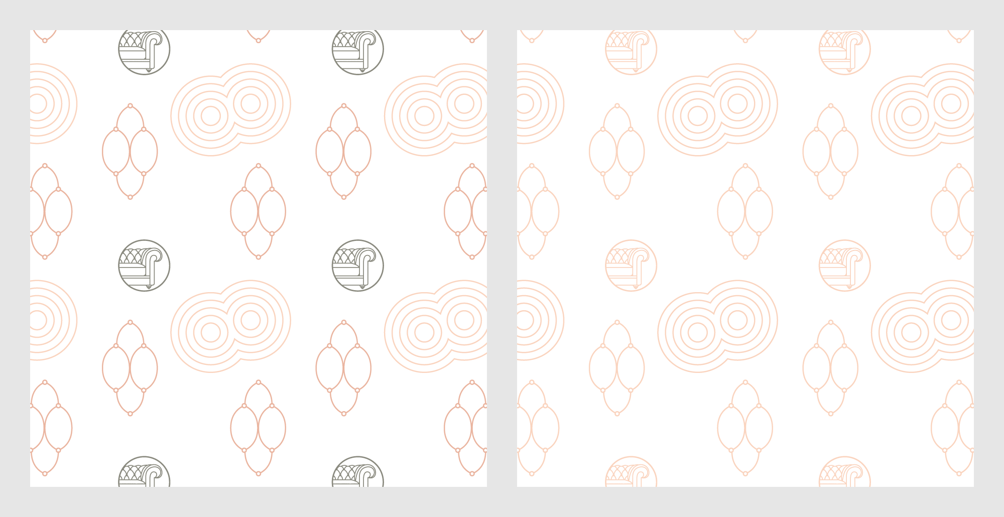
3 elements that are also used in the patterns:
- The Chesterfield sofa designed in the style of a Japanese hanko seal, which is also featured in the logo.
- A geometric pattern reminiscent of the lines found in Japanese Zen gardens.
- The shape inspired by the backrest of the sofa.

Patterns
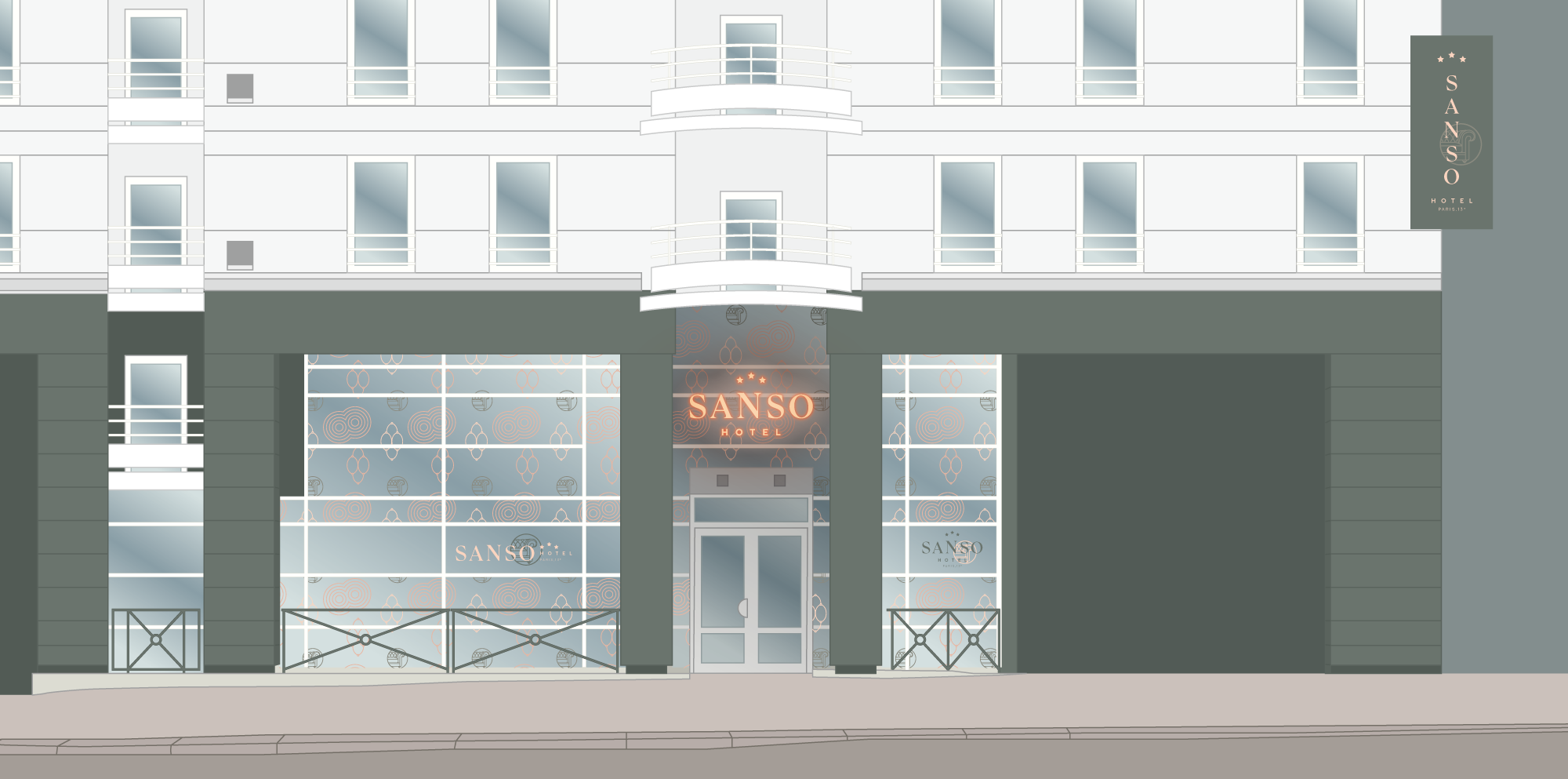
Hotel visual branding applied to its front
Selection of paint colours for walls and fences
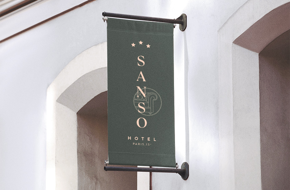
Rollup banner with the vertical logo
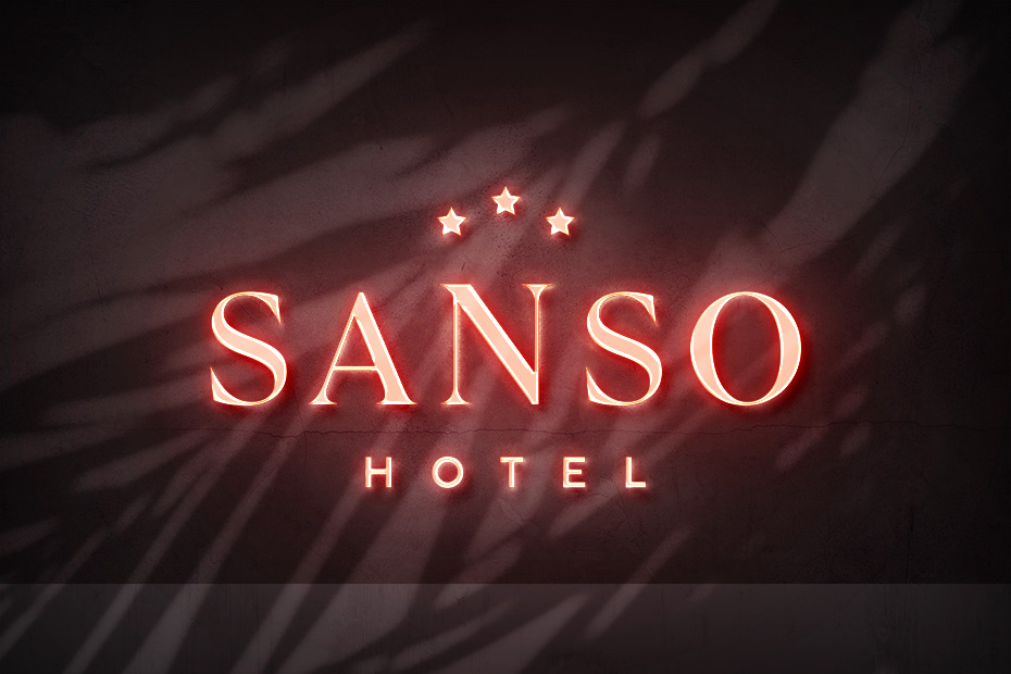
Neon sign above the front entrance
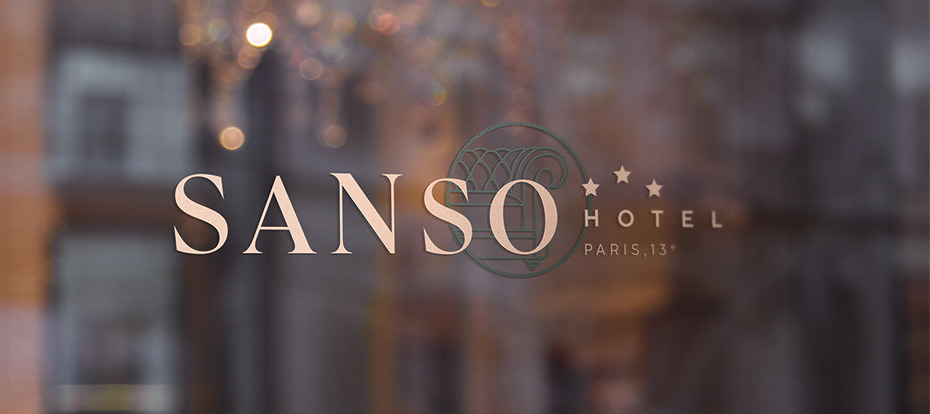
Window decals
![]()
___
Contact me here if you want to talk about your visual identity and branding!