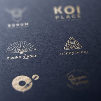
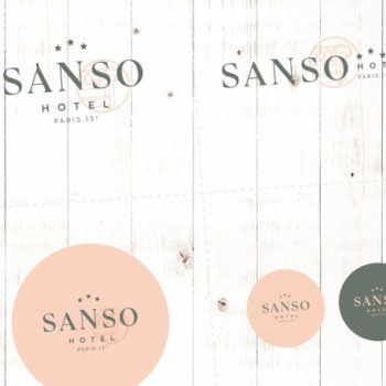
Perhaps you are thinking of creating a Japan-inspired logo or visual identity.
Or developing a brand or company that has a link to the country.
But where to start? How will you find inspiration and make your company stand out? How will you explain what you want to an agency or a graphic designer?
And, most of all, how will the designer know how to meet your expectations?
How to create a visual identity inspired by Japan
How to avoid the clichés
You’ve probably already done it but, if not, type ‘Japan logo’ or ‘Japanese-inspired logo’ into the Google search bar and click on images.
What do you see?
A palette dominated by red, black and white, colours which are far from being the only ones used in Japan.
Overused, overdone symbols, or ones that have particular connotations: the eternal red circle symbolising the sunrise, sometimes accompanied by rays (the Japanese navy’s flag); Torii; waves; Mount Fuji’s silhouette; chopsticks and bowls of rice or even cherry blossom.
However, your clients, who are perhaps already familiar with Japan or maybe want to work with you for other reasons, might not be so enamoured of these images. Even worse, they might get the impression that your business is low-quality or amateur and be put off.
You not only want to differentiate your company from your competitors; you also want to demonstrate that it is more subtle and refined.
Logos and visual identities inspired by Japan
A visual identity with you as the starting point and which makes sense
If your logo must be inspired by Japan, it must also reflect your brand values and positioning. It has to provoke the emotional response that you desire in the clients you seek to attract.
So the colours, symbols and motifs and general aesthetic can’t be chosen in a knee-jerk way, just because ‘this says Japan’. They must make sense and derive from a considered thought process*.
(*Don’t worry, branding studies confirm that not everything needs a meaning or a logical explanation.)
How can I help you create a Japanese-themed visual identity?
By finding the link between your company and Japan.
As with all projects, the first thing I want to know is everything about your business. I want to immerse myself in its values, its story, how it started, what sort of clients you are targeting and all of the small details and anecdotes that make it unique.
And, since it’s your business, I also want to learn everything about your world: your tastes, influences and references.
This is how I find the perfect axis between your company and Japan.
By exploring and drilling down to create an authentic and original visual identity
Once the analysis is finished, the basic principles and direction agreed, we drill down into the details.
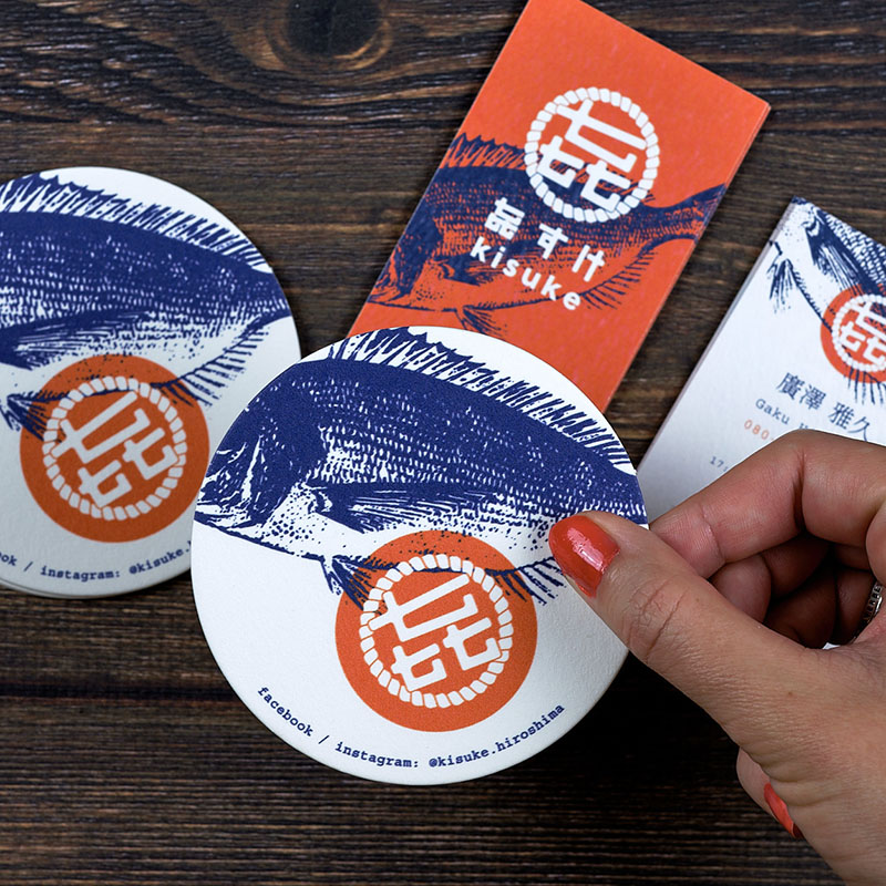
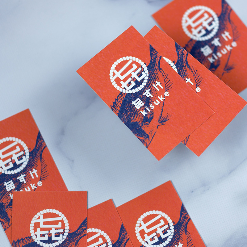
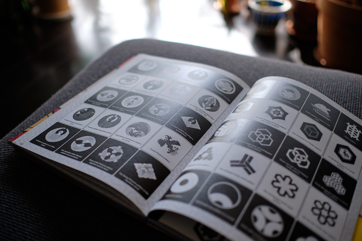
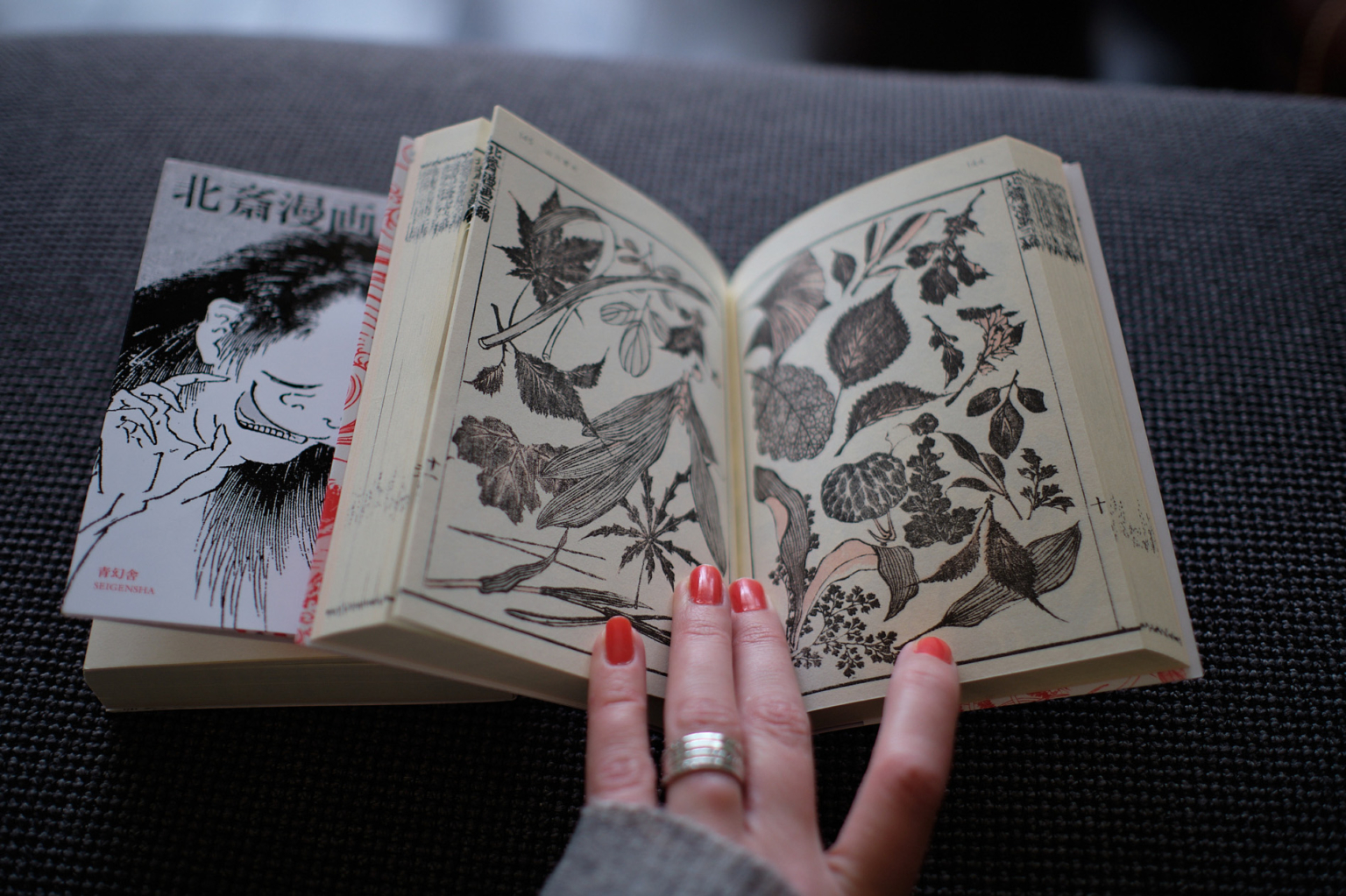
I will dip into Japanese culture and aesthetics. And, by exploring different historical periods, traditional craft techniques, traditional patterns and typical colour palettes*, I will unearth the essential components of your visual identity. Like I did for this Japanese restaurant.
I will also start to build a selection of fonts (either Latin or Japanese alphabet, as required) that are consistent and in tune with the graphics chosen.
(*although printers use Pantone colours in Japan, the DIC colour guide is more prevalent. There is also a ‘traditional Japanese colours’ chart, which I can guide you through, if you are using spot colours and printing in Japan.)
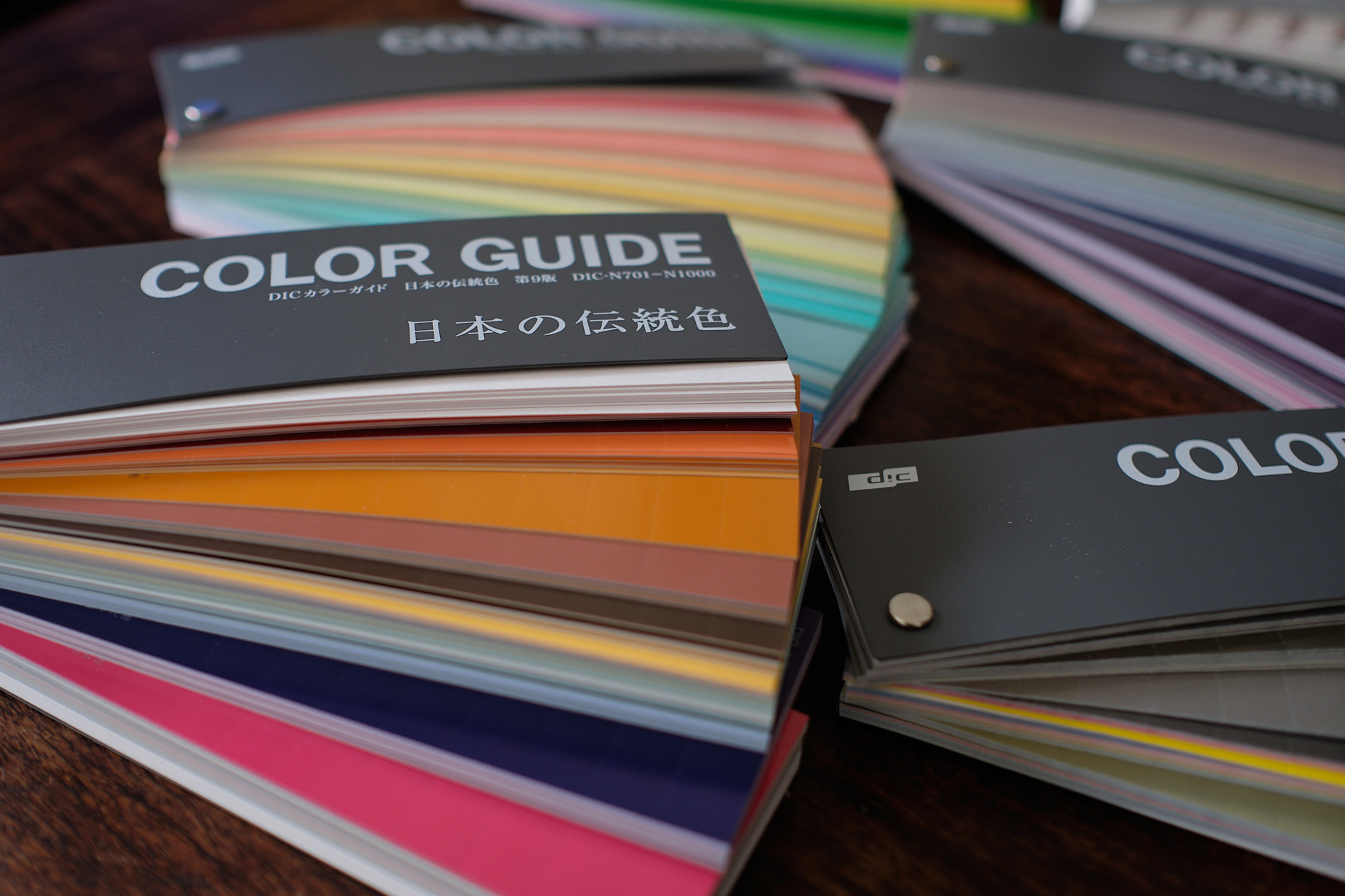
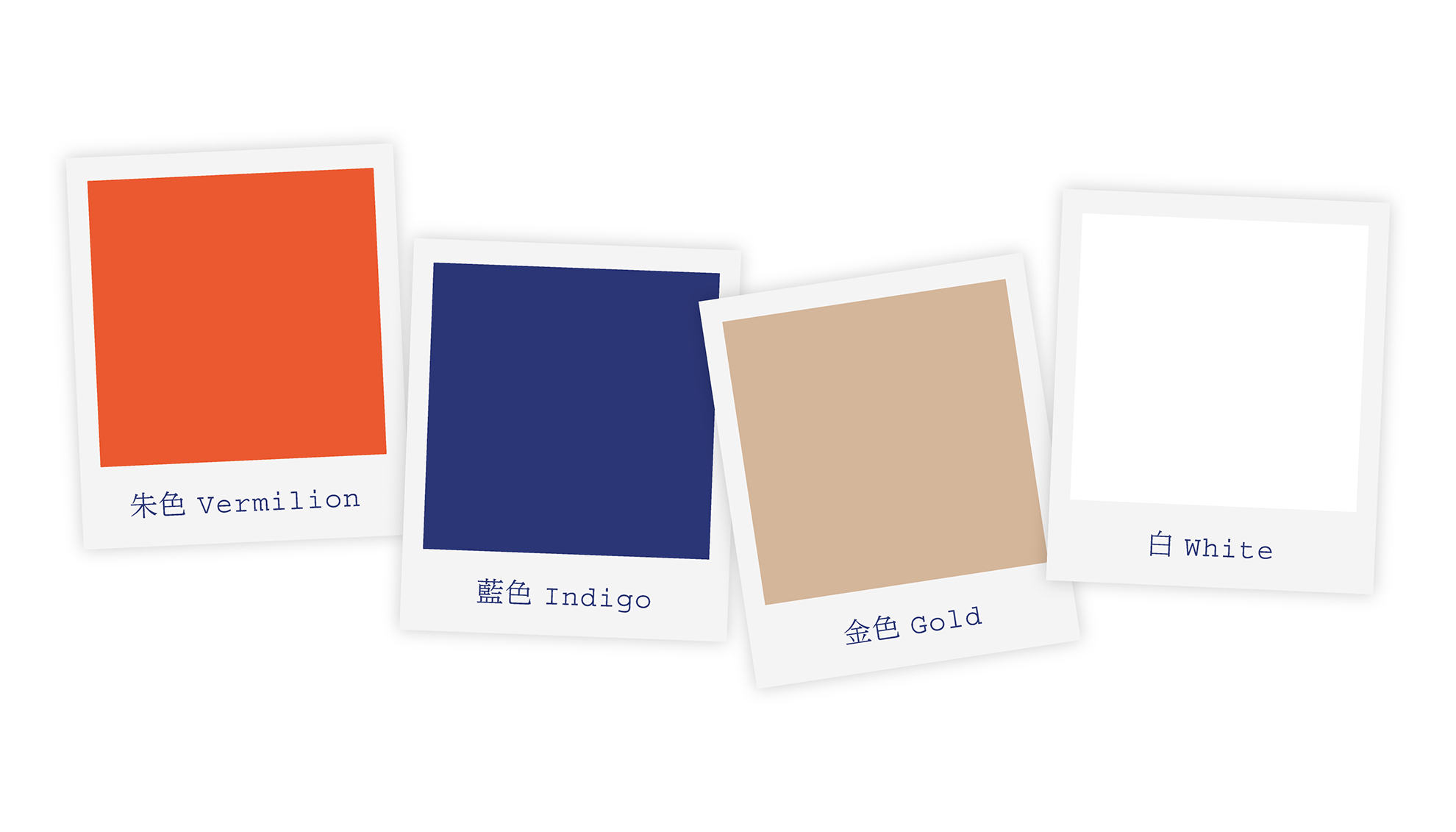
These colours, patterns, graphics and fonts will form your visual identity.
We will be able to use it on different print media, as required.
But perhaps you want to promote premium products and services?
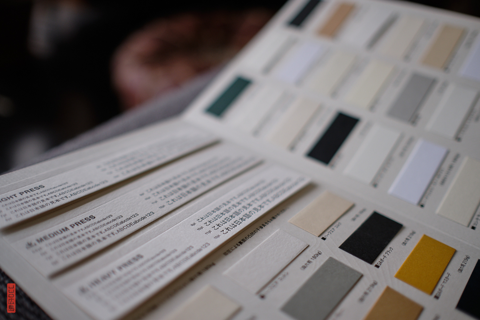
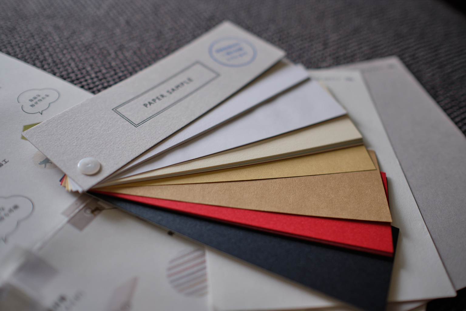
If so, we can use a thicker, textured paper, different printing processes or packaging ideas that are more original and reflect a higher quality.
I will help you choose suppliers and I will look after the printing.
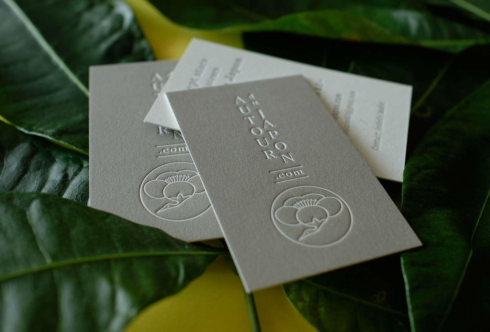
Paper and printing samples
By drawing on many influences
Your objective is not, I imagine, to pass yourself off as a 100% Japanese business.
Denying or hiding your background, culture or geography may actually produce the opposite effect to the one desired. In fact, retaining your origins, even in a subtle way, can have a positive impact. And a timeless and cosmopolitan visual identity will last much longer.
So you’re in luck! Because, although I live in Japan I am still very much attached to Europe and I love travel and different historical aesthetics. I like to play with influences and cultural codes, as well as with allusions.
This is how we will create something original, unique and unexpected.
Why trust me?
I live and work in Japan, and work for a lot of Japanese clients.
- I have been a graphic designer since 2002 and I have lived in Japan for around 15 years. I worked in a Japanese design studio (Nininbaori/Hiroshima) for six years. Since I went freelance, I work with a Japanese communication agency.
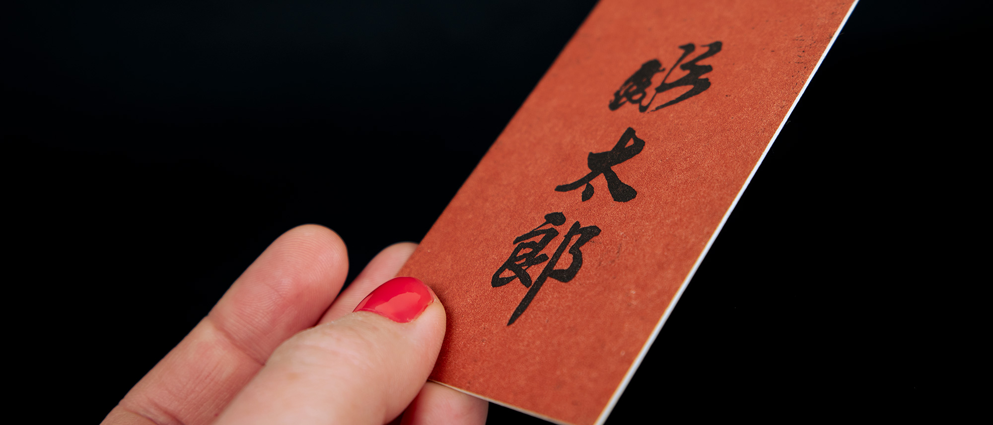
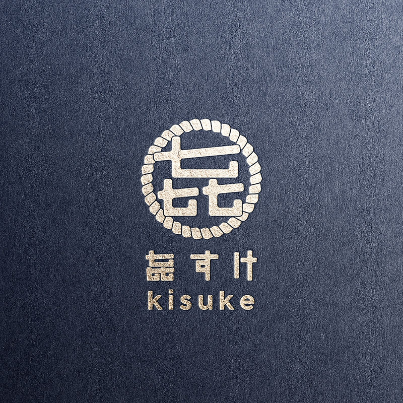
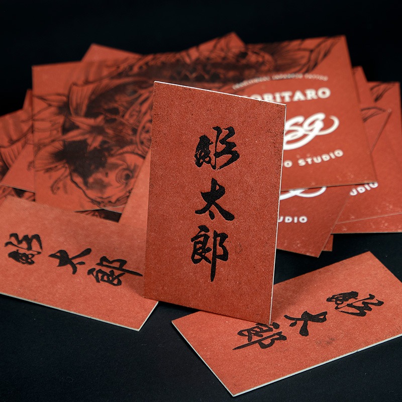
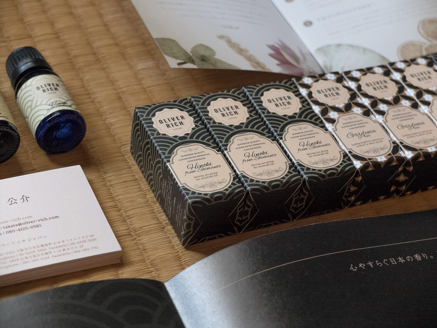
- Many Japanese clients have trusted me to create corporate identities for them; some are typically Japanese, some are more of a combination (e.g. a restaurant: Kisuke, a tattoo artist: Horitaro, a cosmetics brand: Oliver Rich)
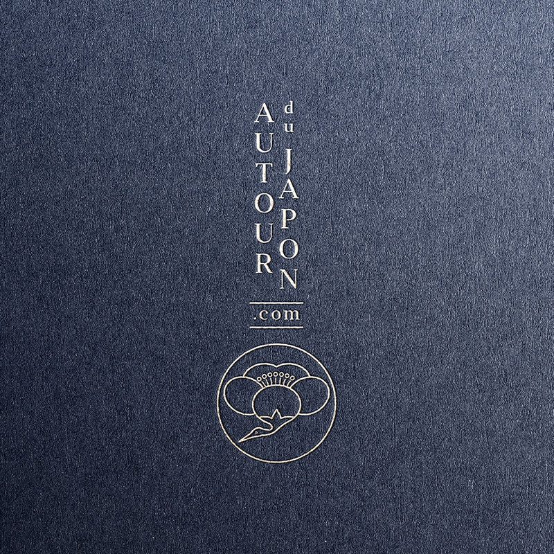
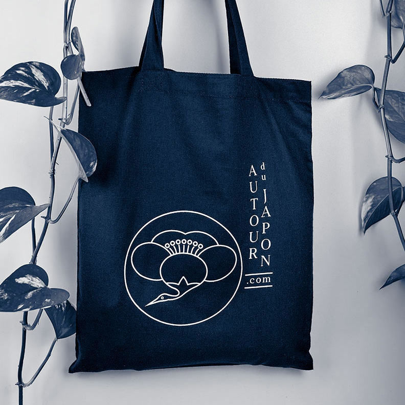
- I also work for French (Autour du Japon, Ikigai Ramen) and American clients, both based in Japan and abroad.
- My work is regularly published in international graphic design publications about Japan.
Brand identities and logos for international and Japanese clients
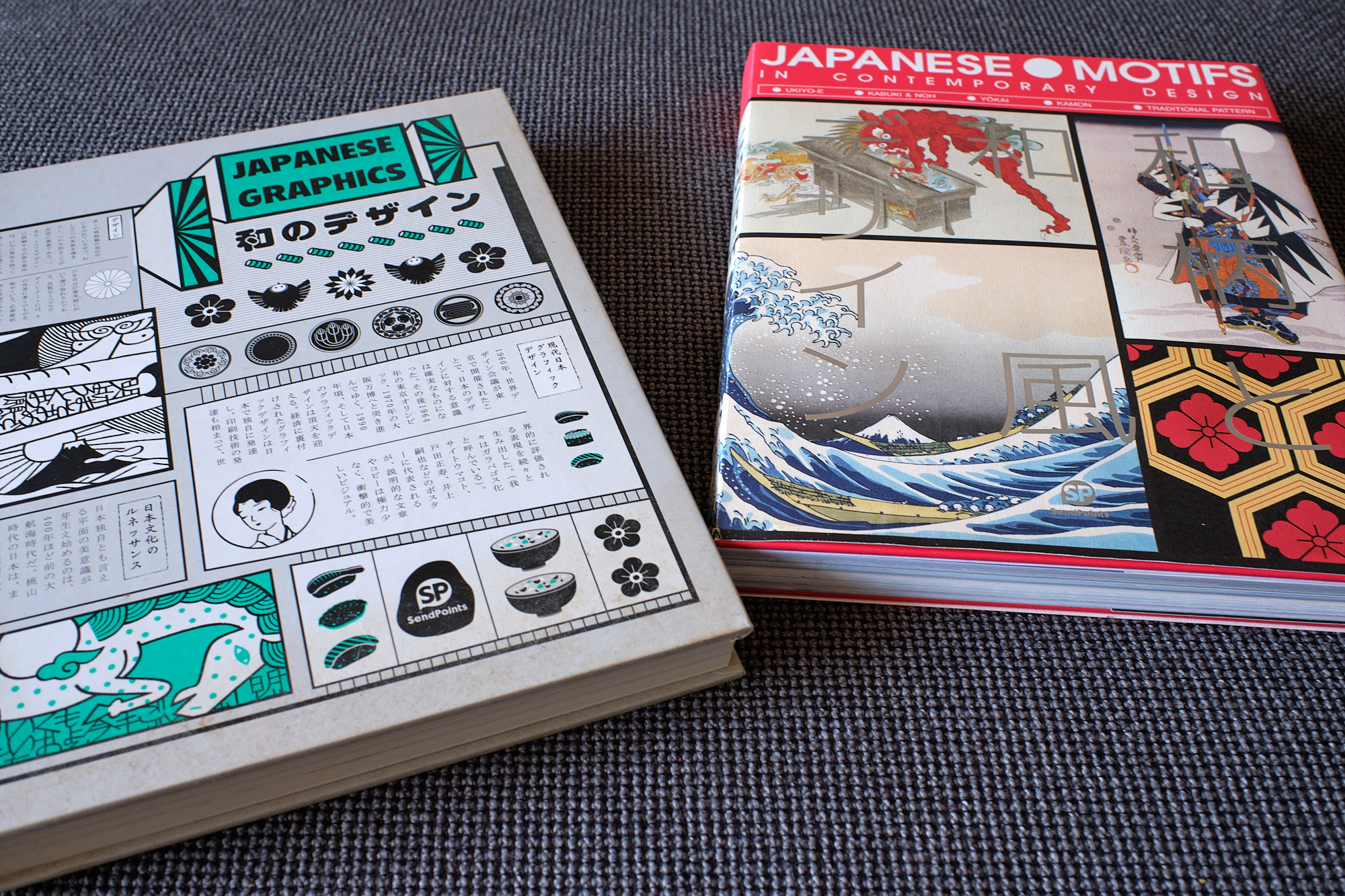
I have wide-ranging artistic and cultural influences
They are not just Japanese. I’m interested in everything from old French cinema (Chabrol, Verneuil, Corneau, Sautet etc), Ethiopian jazz and 70s Jamaican reggae to traditional American tattoos and Arab calligraphy. (And, obviously, lots of other things!)
With respect to Japan, my inspirations are equally eclectic. I like exhibitions on traditional as much as contemporary art; I’m interested in photography, architecture, fashion and street art.
Influences: different eras and artistic fields
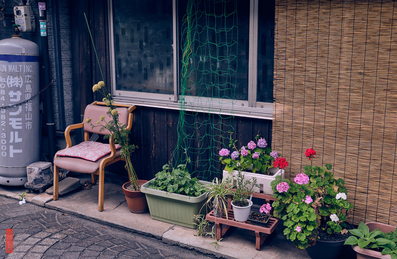
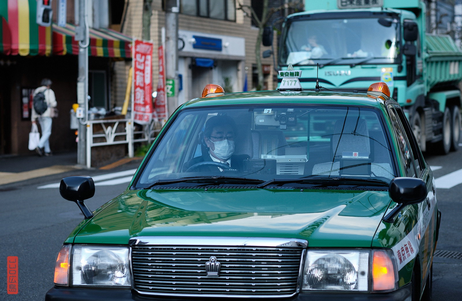
I love retro Japan/Showa era and I love big cities as much as the most rural countryside.
Different aspects of Japan
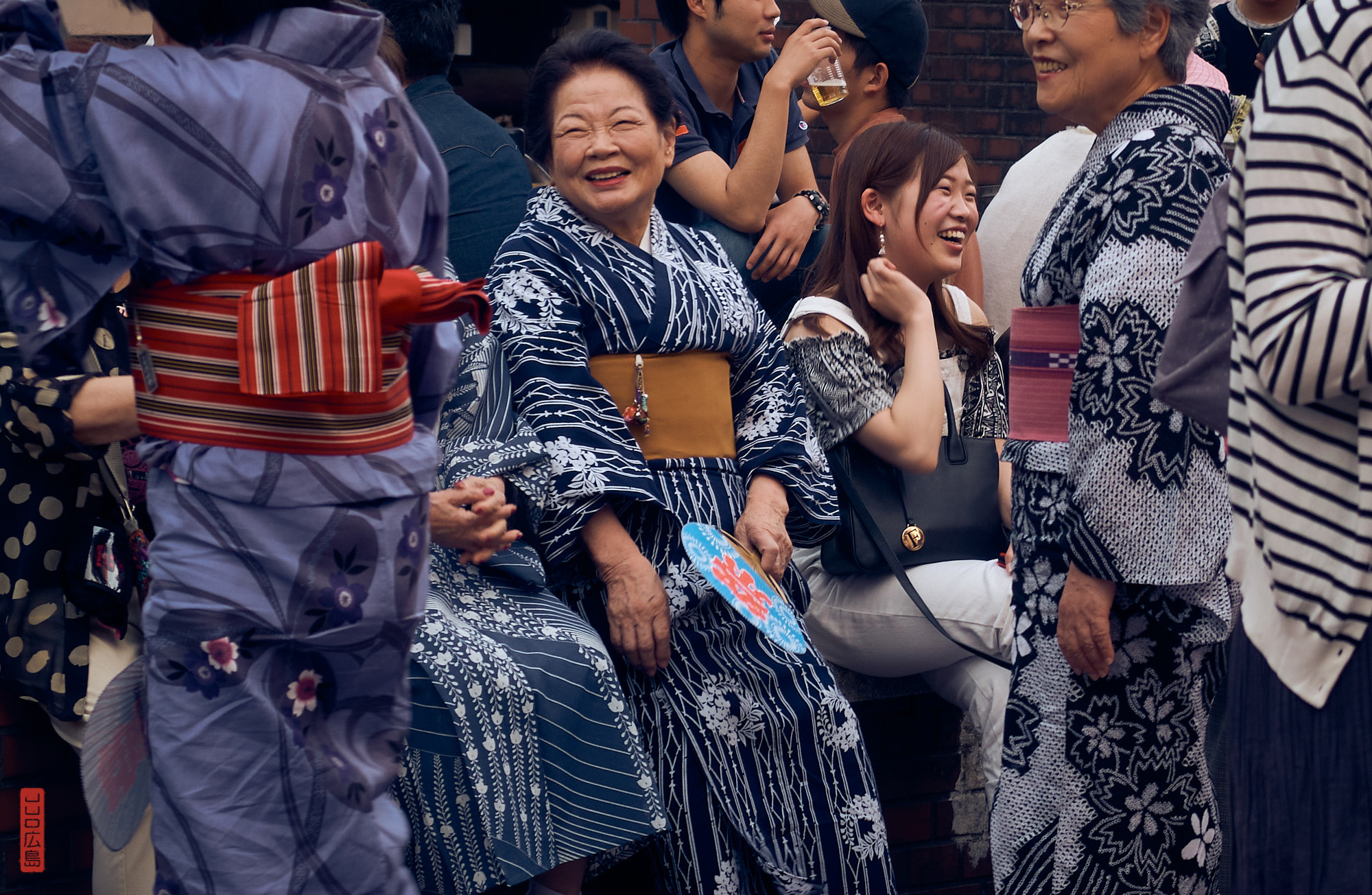
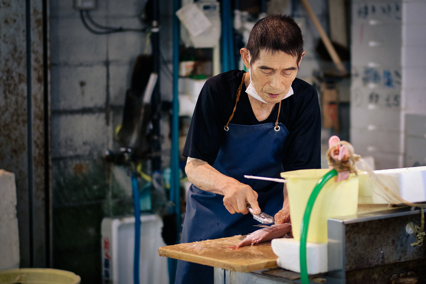
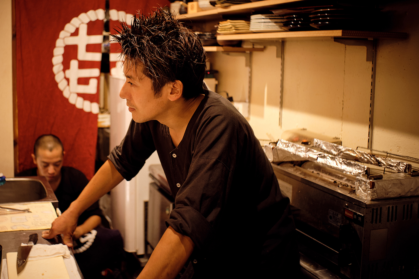
Whether in daily life, for my personal blog or for my photo shoots with the Seeds agency, my deep love for all things craft and pop culture has brought me into contact with many fascinating people and areas: the world of restaurants and sake, wholesale fishermen and fishmongers and a bonsai tree grower…
Meetings with Japanese craftspeople/artisans
You will find some of the pictures from these photo shoots on my Tumblr.
Read what my clients think of my work and look at my portfolio
The best way to find out more about how I work and my performance is to read the reviews left by my clients.
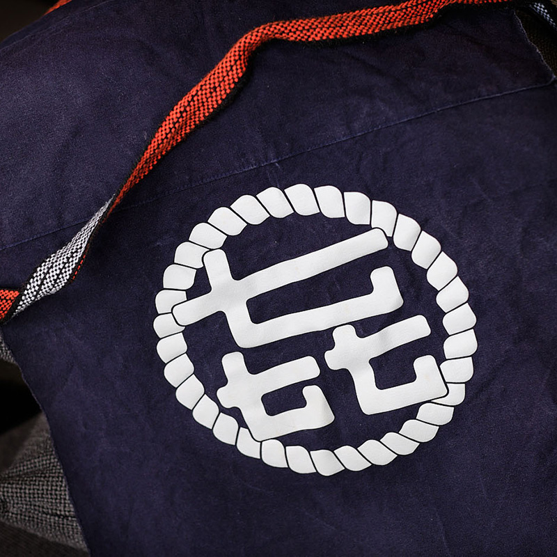
My portfolio will give you an idea of the sort of work I do. You’ll find my kamon logos and Japan-inspired logos here.
Want to work with me?
You’ve decided to go ahead?
Great! Tell me about your project using these forms. I’ll send you my proposal and, if you want to go ahead, we can block out some time in my schedule.
Not sure? Some FAQs…
Do I have to avoid using a red sun, cherry blossoms, red or black?
- Not necessarily. If it makes sense and we think about how to use it in a subtle and original way, why not?
What if I want something Manga- or Kawaii-style?
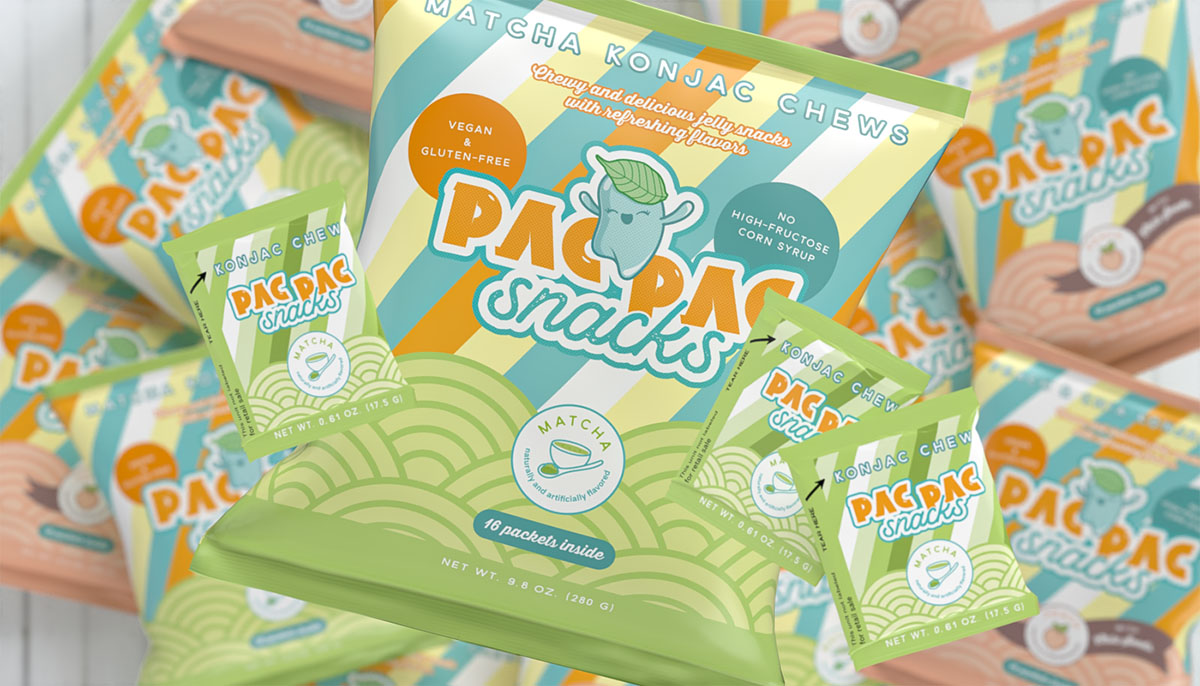
- This is not really my area of expertise but if your brand story resonates with me, and it doesn’t feel too “cliché”, I’m in! That was the case for PAC PAC Snacks and their logo, mascot and packaging.
How much will it cost?
- Once I know more about your project and your needs, I’ll send you a quote (free and without obligation).
How easy is it to work remotely? What are the fees?
- I have worked seamlessly with clients in Europe and the USA, using email and chat apps. Phone or video calls can also be used if necessary.
- You can pay online, using a bank card!
How does it work in practice?
- I describe my step-by-step design process here.
More questions?
- Ask me in the comments or send me a message on my contact page!


