Shu-Shu Aroma visual identity and packaging design
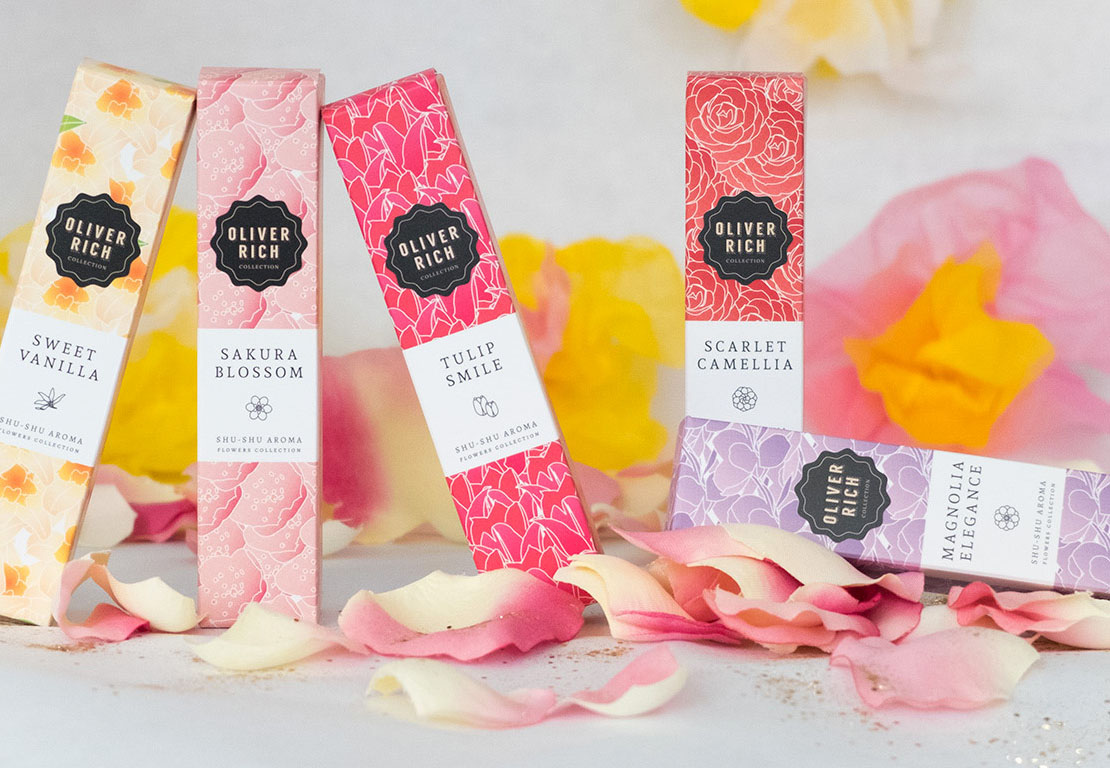
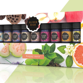
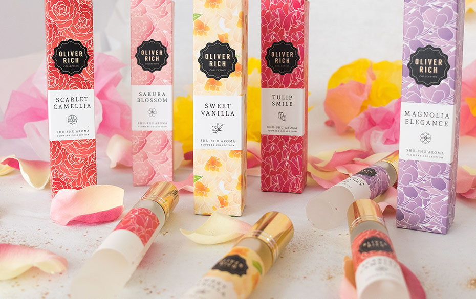
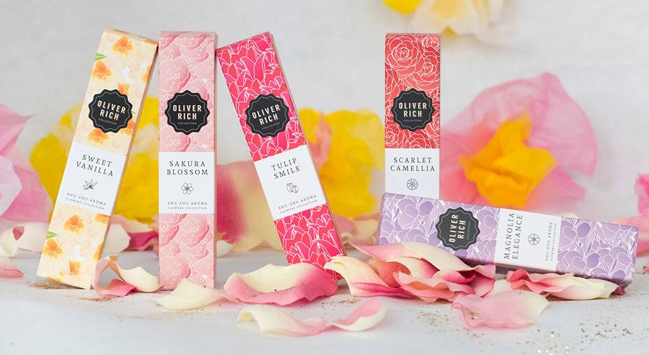
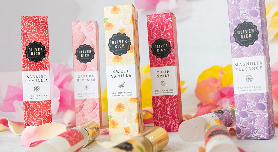
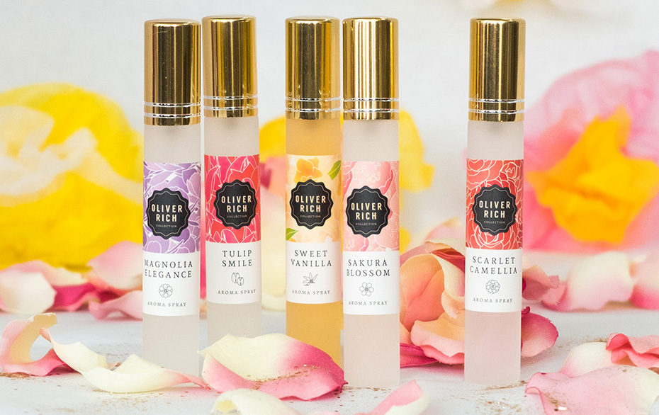
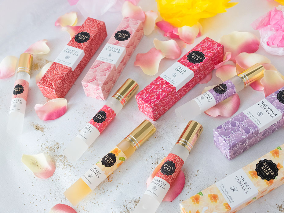
The Japanese cosmetic brand Oliver Rich launched Shu-Shu Aroma Flowers Collection in 2017. A collection of aromatic spray oils available in 5 fragrances: Camellia, Sakura, Vanilla, Tulip and Magnolia.
They entrusted me with the creation of the visual identity and packaging for the product line. For Shu-Shu, they wanted a soft, floral, innocent and elegant image.
Floral patterns and soft colours
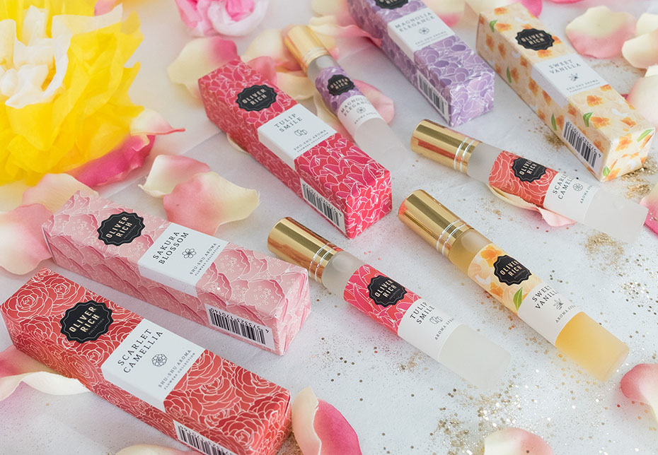
As with the Japan / London collection, and the Bouquet collection, I took up the idea of the pattern. So I made 5 floral patterns representing intertwined flowers for each fragrance. And used them as a background for the packaging (labels and boxes).
Each flower is represented in a simple way to give a feeling of innocence. The gradations from pastel colours to brighter colours recall the evanescence of the flowers’ scent. I chose white outlines to accentuate the freshness.
The elegance is brought by the white frames and the choice of a serif font used in capitals. I entrusted the creation of the small icons to my Thai intern, Jom Sakulpoonsook.
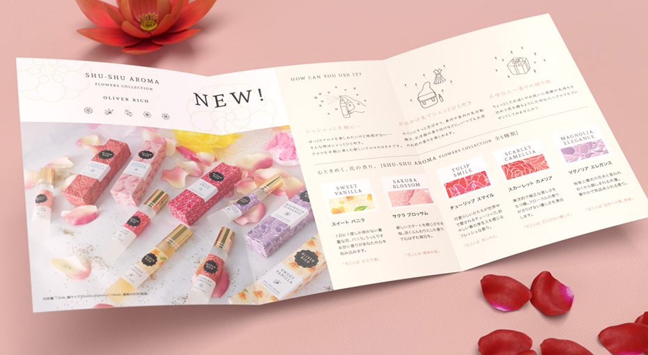
Counter displays and tri-fold brochure
For the counter displays and the leaflet, I left out the patterns which would have looked too heavy and cluttered. But in order to stay with a floral theme, I chose a gradient background from soft green to pink and low opacity flower pictures.
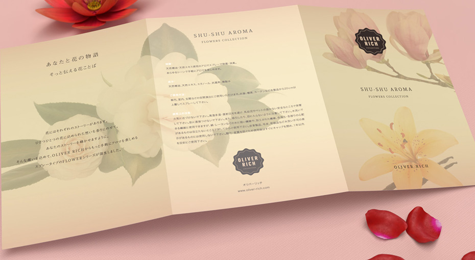
Ryota Kumagai did the illustrations for the leaflet in a cheerful and childlike style.
→ Learn more about visual identity or packaging design.
Project details
- Client:
- Categories:
- Skills:
- Share Project :


