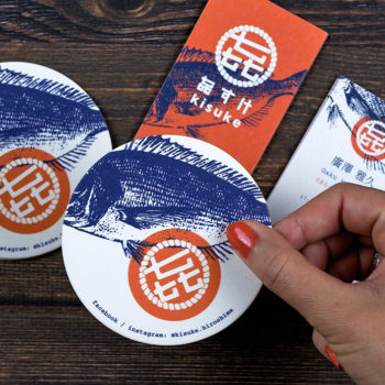

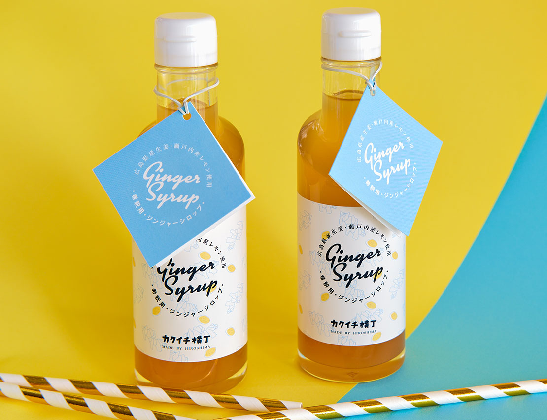
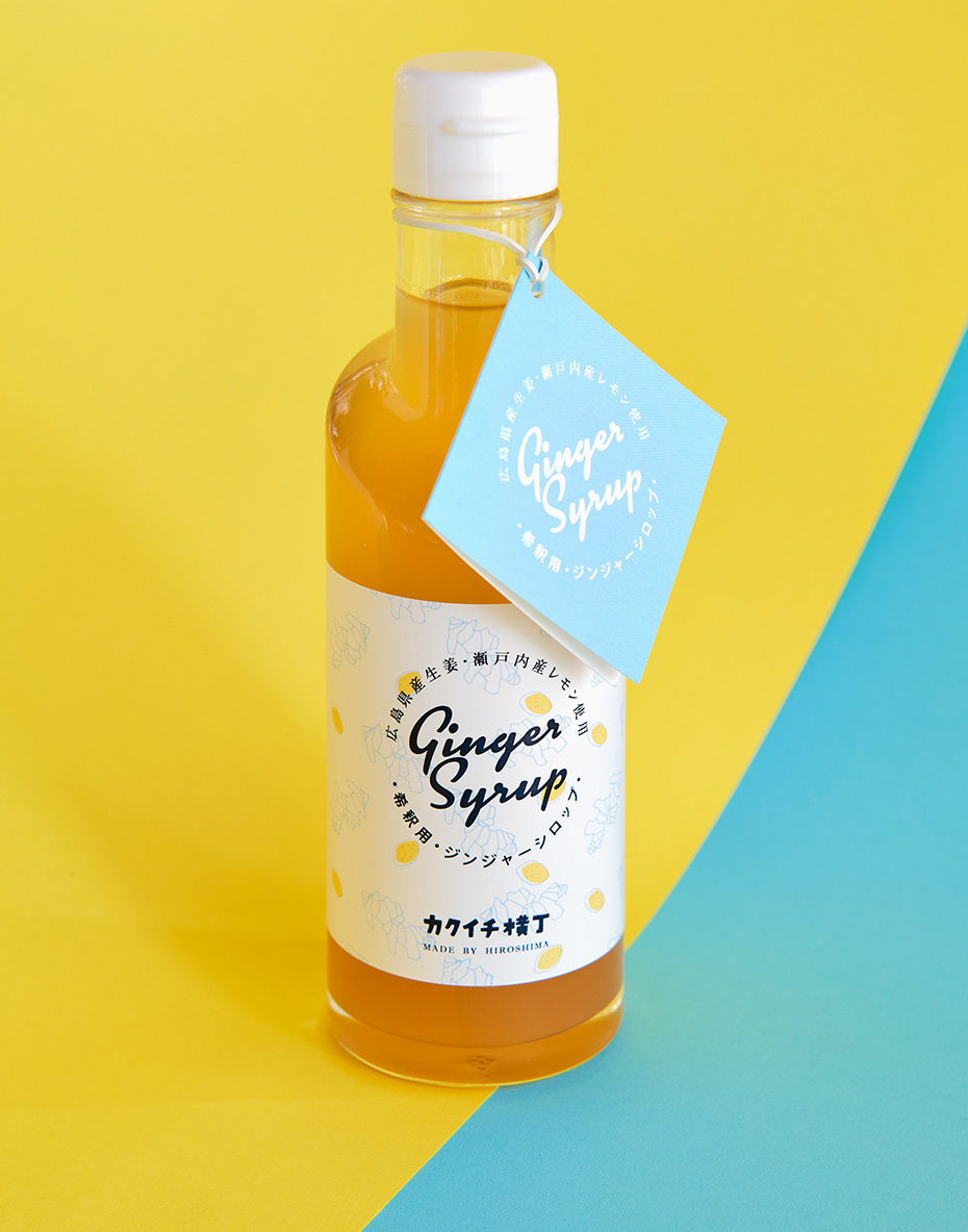
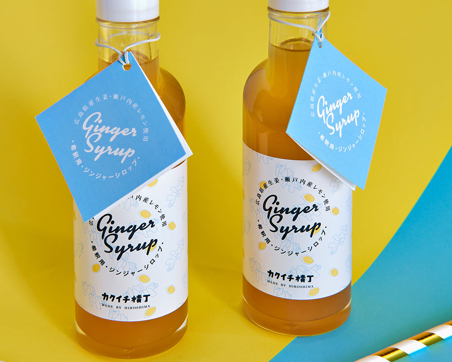
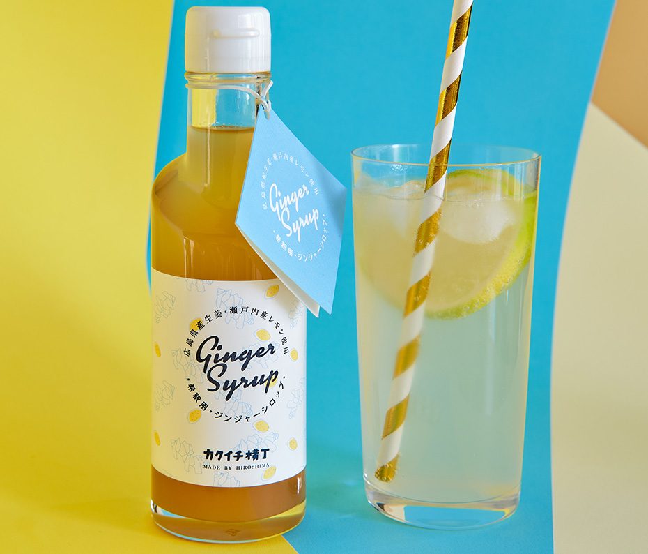
Visual identity and labels for Kakuichi Yokocho Ginger Syrup
“Kakuichi Yokocho Ginger Syrup is a ginger syrup made from locally sourced natural products. It is made from Hiroshima ginger, Setouchi lemon and beet sugar grown without pesticides.
The drink is sold throughout Japan, both online and in souvenir shops and high-end supermarkets.
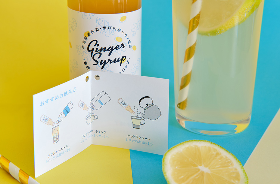
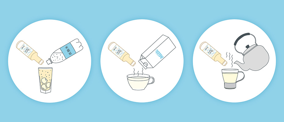
It can be consumed in different ways:
- Ginger Ale (with soda water)
- Hot Milk Ginger (with hot milk)
- Hot Ginger (with hot water)
The Client’s needs
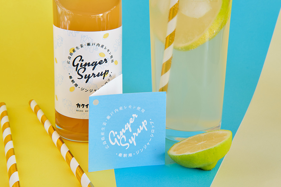
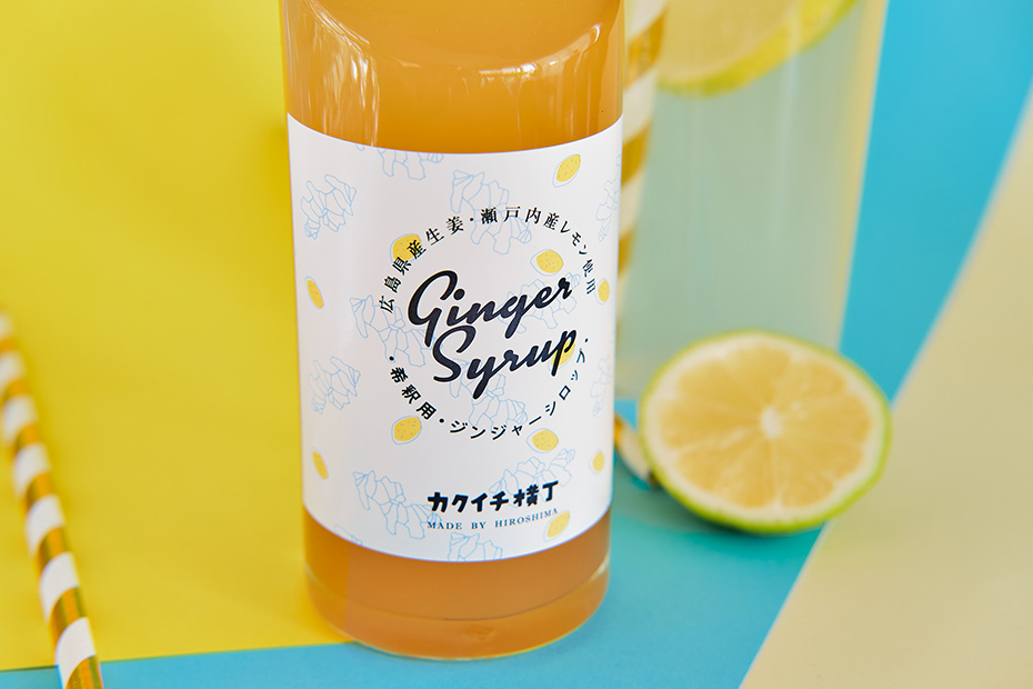
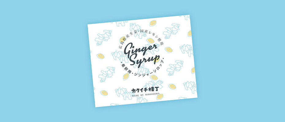
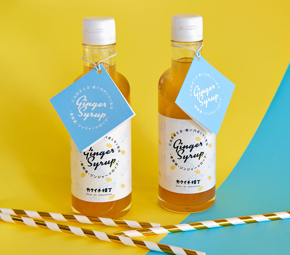
Logo, bottle label and neck label with illustrations explaining how to consume the syrup.
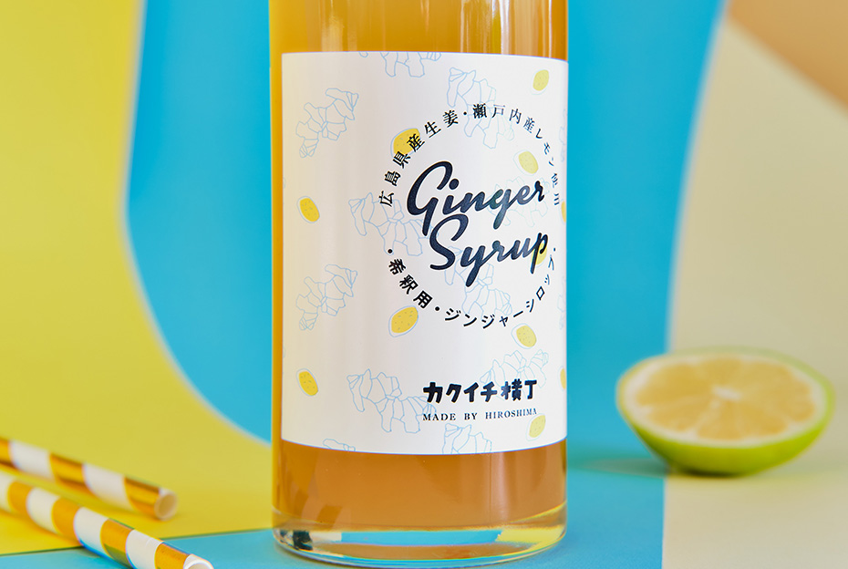
For its ginger syrup, the client, Kakuichi Yokocho, wanted a visual identity that conveyed the idea of a high-quality product. The packaging had to make people want to buy it for themselves as well as for gifts.
They also wanted to highlight the pleasant taste of their syrup. Because it differs from the ginger syrups presented in the “health and well-being” sections, which are often astringent.)
Finally, as the drink is made from natural products and has a pleasant taste, it is perfectly suited for children. This is why Kakuichi Yokocho also asked me to create a design that would appeal to children and make mothers want to buy it.
The creative solution
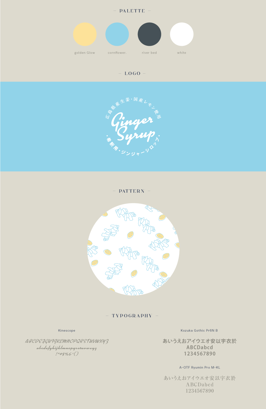
I went for a clean design with a limited colour palette. I also chose elegant fonts to give the drink a chic look.
To highlight the natural products in the syrup, I used a pattern made of lemon and ginger slices. They are drawn in a simple way, in a line drawing style on a white background.
I also chose soft and cheerful colours (golden glow yellow, cornflower and riverbed blue). This contrasts with the more pharmaceutical visuals of the ginger syrups found in the health section.
Finally, I added a nostalgic touch with the retro font and circular text used in the ‘Ginger Syrup’ logo. This is enhanced by the “screen print” style transparency effect of the design. This way, mums can take a moment to step back into their childhoods.
![]()
Project description
Logo Kakuichi Yokocho (カクイチ横丁): Hirofumi Kamigaki (IC4DESIGN)
Project details
- Client:
- Categories:
- Skills:
- Project Url:
- Share Project :