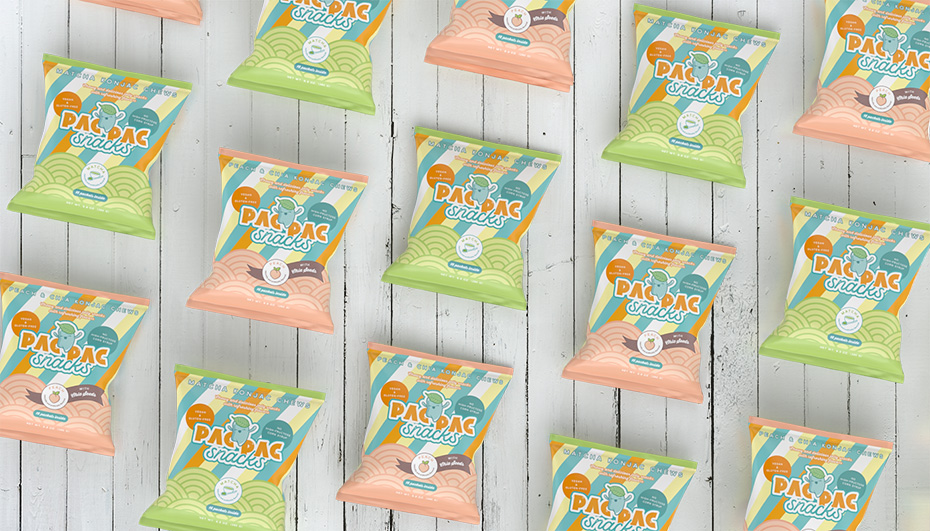
PAC PAC Snacks, the brand
Last year, the two founders of PAC PAC Snacks, a start-up in San Jose, California, contacted me.
They were looking for a graphic designer who could create the logo, mascot, visual identity and packaging for their new product.
And for that, they needed someone who could draw inspiration from the retro Japanese aesthetic of their childhood snacks.
A project made for me!
The concept
The product: healthy vegan snacks
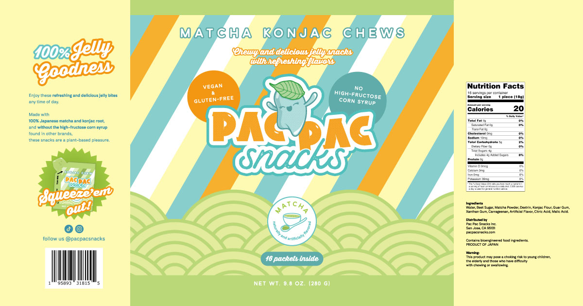
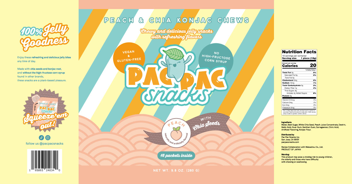
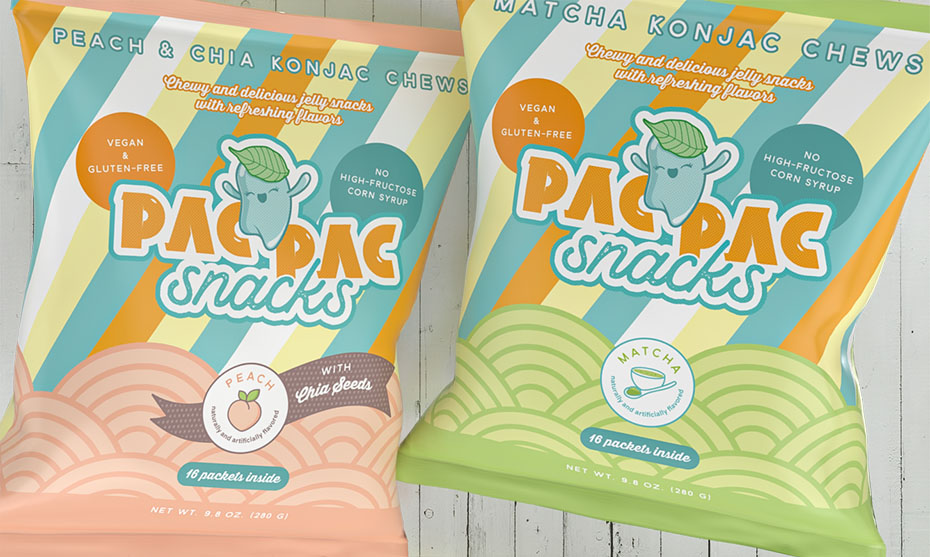
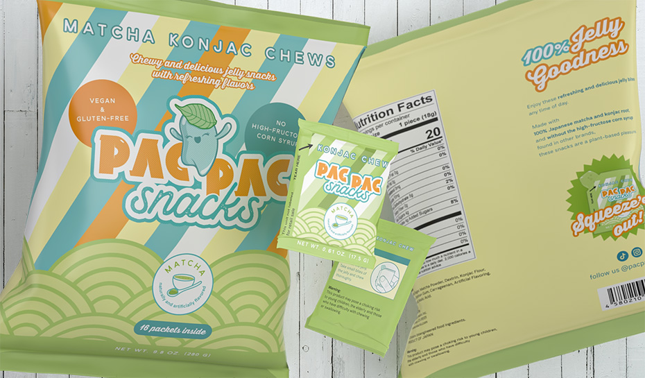
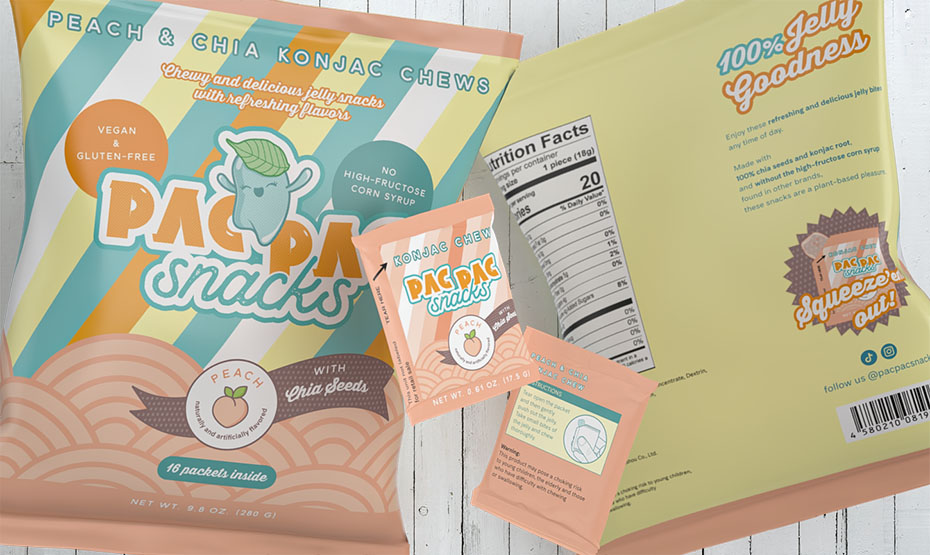
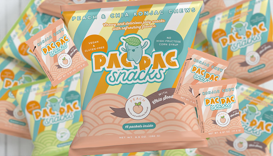
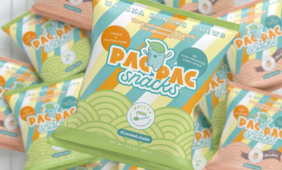
These snacks imported from Japan are konjac chews flavoured with matcha or peach and white chia seeds.
They’re low in calories, plant-based, full of prebiotic fibre and don’t contain fat or high glucose corn syrup.
The target audience
PAC PAC Snacks jellies are primarily aimed at 2 types of customers:
- Health-conscious Gen Z/millennials looking for a low-calorie snack but also wanting something that is enjoyable to eat with a nice packaging design.
- Americans who like anime, games and Japanese culture, so potentially nostalgic for Asian jelly snacks they had as a child, and who will enjoy PAC PAC snacks’ unique texture and flavour combos.
The brand and its name
PAC PAC comes from the Japanese word ぱくぱく(pakupaku) which means “heartily munching, gobbling”.
The brand bridges Japanese and US snack cultures and makes products that are craveable and wholesome.
Some of the keywords that define it:
- Futuristic, yet nostalgic
- new, yet familiar
- colourful, playful
- enjoyable, satisfying, delicious
- clean, healthy
- convenient
The work I’ve done for this project:
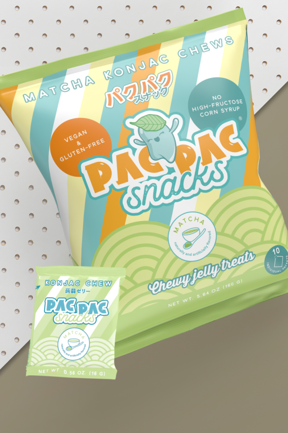
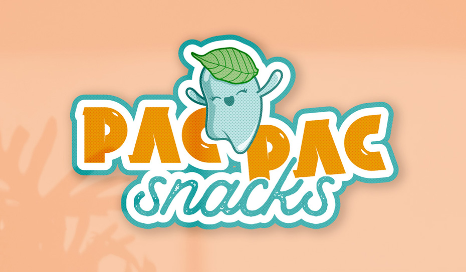
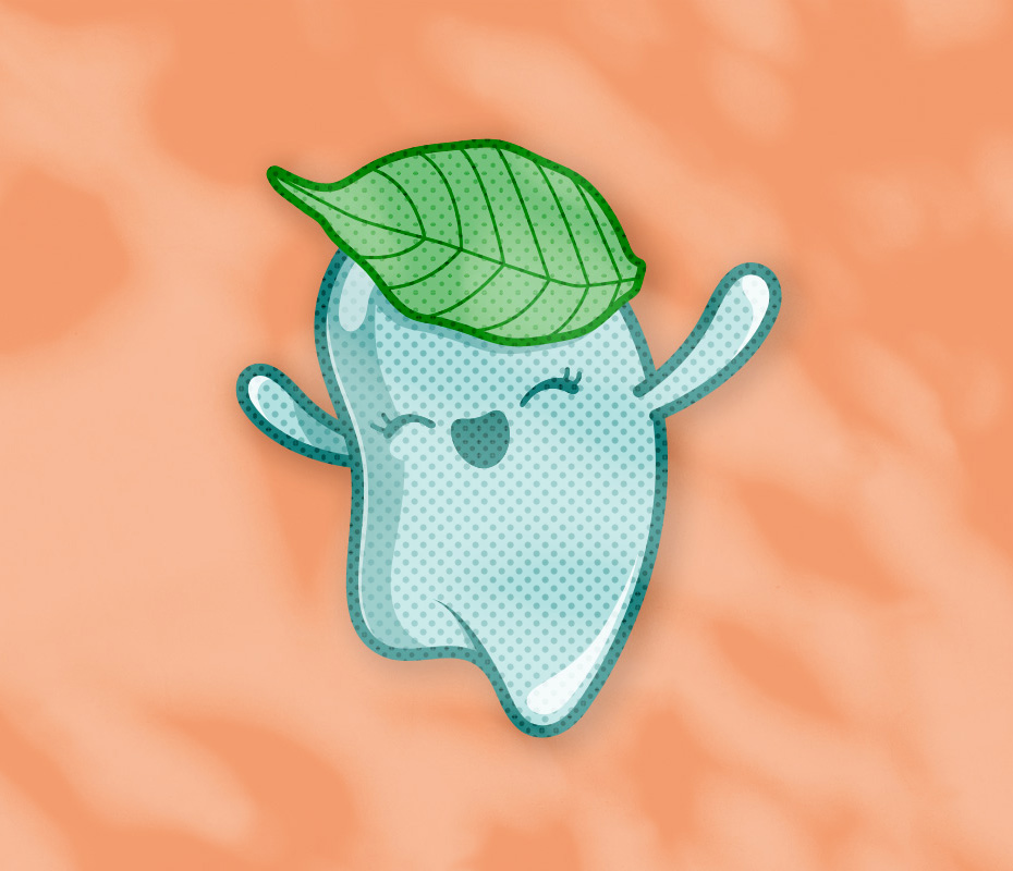
- Jella, the mascot (who represents a drop of konjac jelly with a leaf on her head)
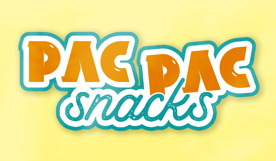
- A logo (with and without mascot) inspired by Japanese retro packaging and retro gaming
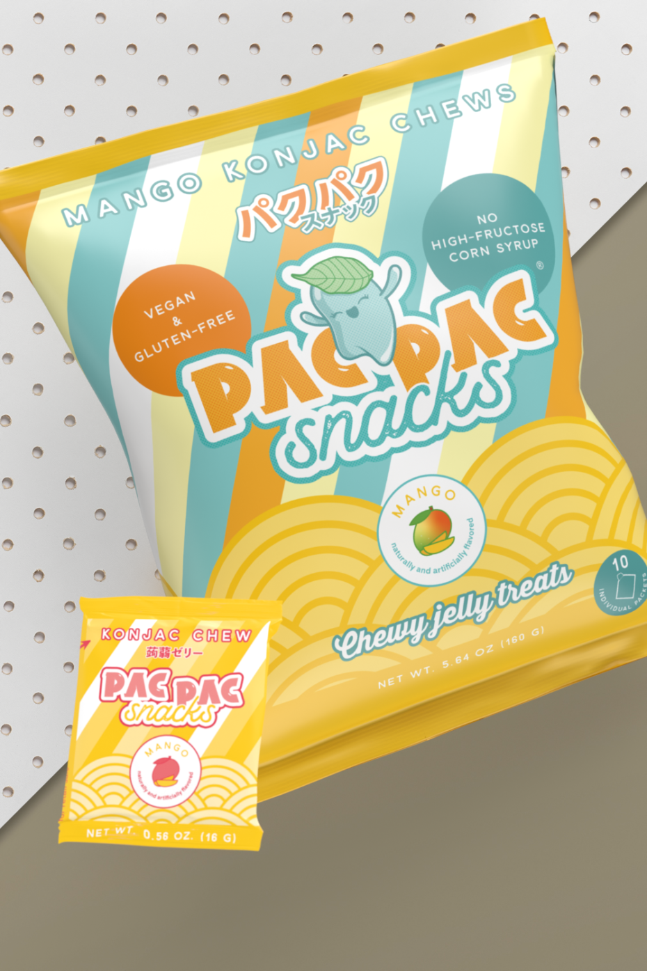
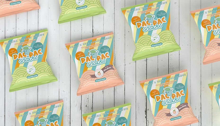
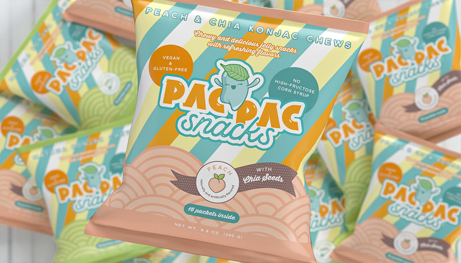
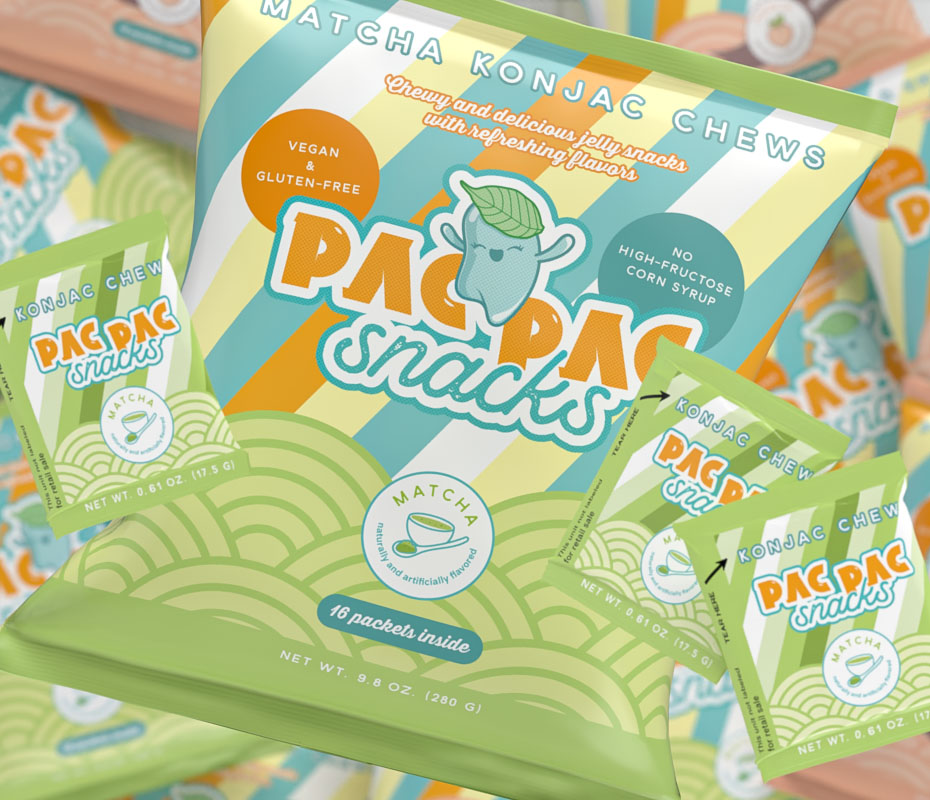
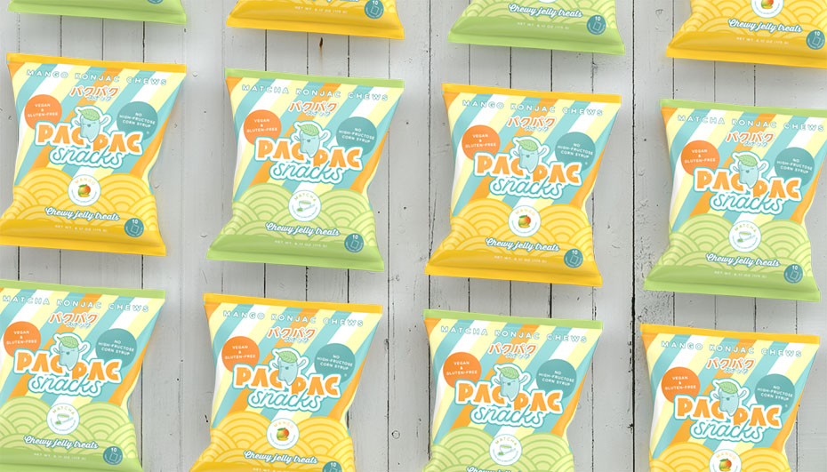
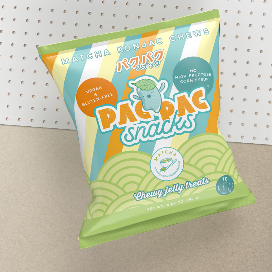
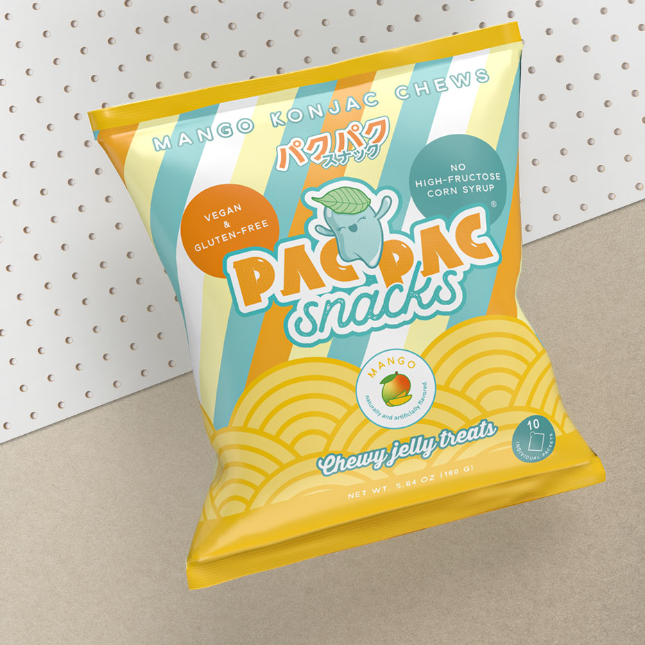
- The packaging: large bags and sachets for the 2 flavours: matcha & peach with chia seeds
- The brand guidelines
- Mockups made with Adobe Dimension for the Kickstarter campaign
- Instagram post templates for Canva
- Some illustrations
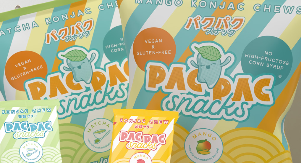
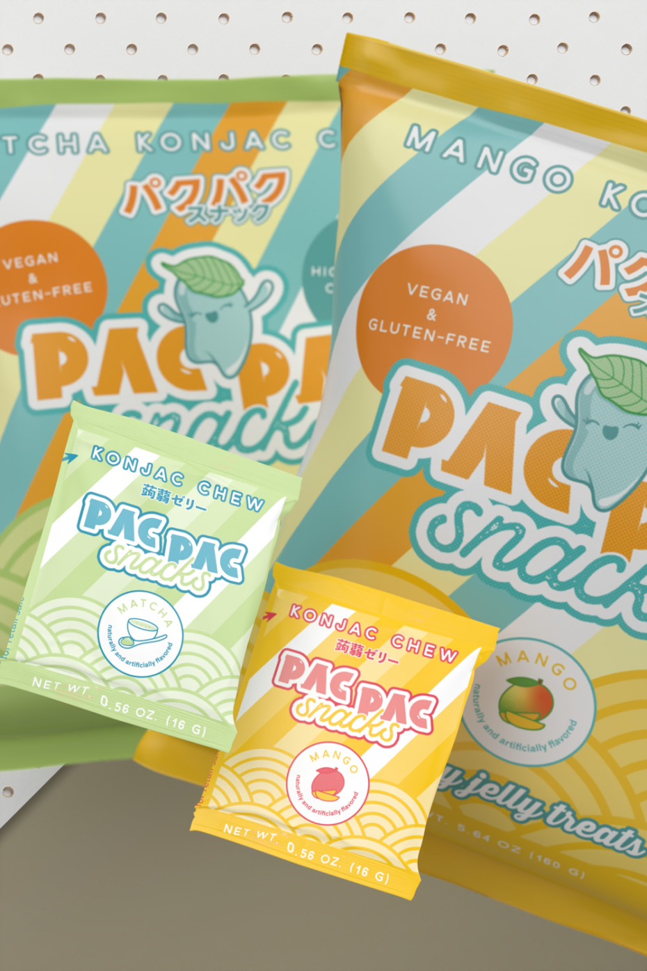
New flavour and new packaging design (2023)
New weight, new catchphrases, and addition of Japanese text. But also a layout readjusted according to consumers’ feedback.
We modified the design of the small sachets to be able to print them in 2 colors.
Do you feel like trying them?
Contact me for your food packaging, logo and visual identity projects on my contact page!
