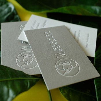
Oliver Rich rebranding
The brand and the product
Oliver Rich is a brand that started selling water-soluble aroma oils in Japan in 2008.
At that time, they mainly distributed their aroma oils in shopping centres such as Tokyu Hands or Loft.
The problem
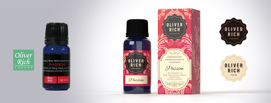
Although Oliver Rich aroma oils were very popular, sales began to fall between 2011 and 2012. New competitors appeared. And the somewhat amateur packaging was no longer enough to attract the attention of potential buyers.
A need for rebranding
In 2013, the Oliver Rich brand management asked me to work on a new brand identity and new packaging.
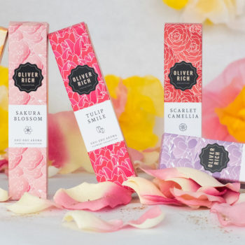
Above all, they wanted to develop a more elegant image.
The solution
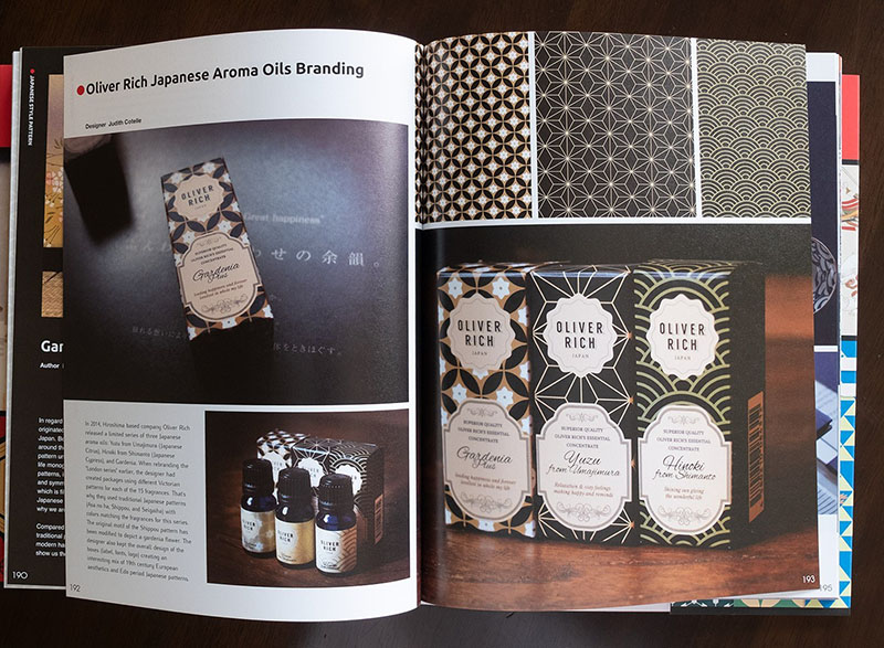
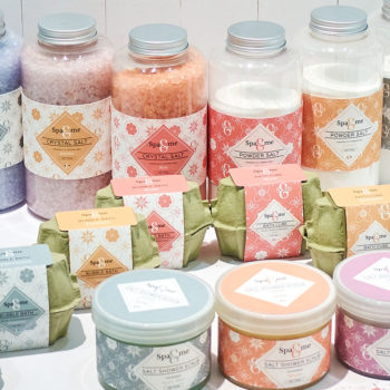
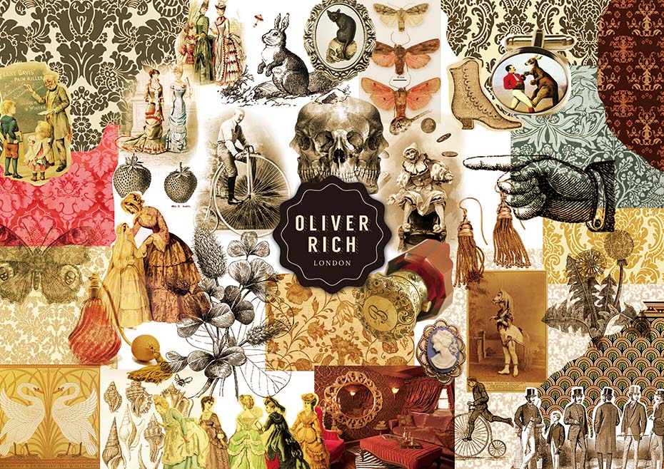
Inspired by the tagline of the logo: “London”, I articulated the visual concept around patterns reminiscent of the Victorian era and 19th-century cosmetics labels.
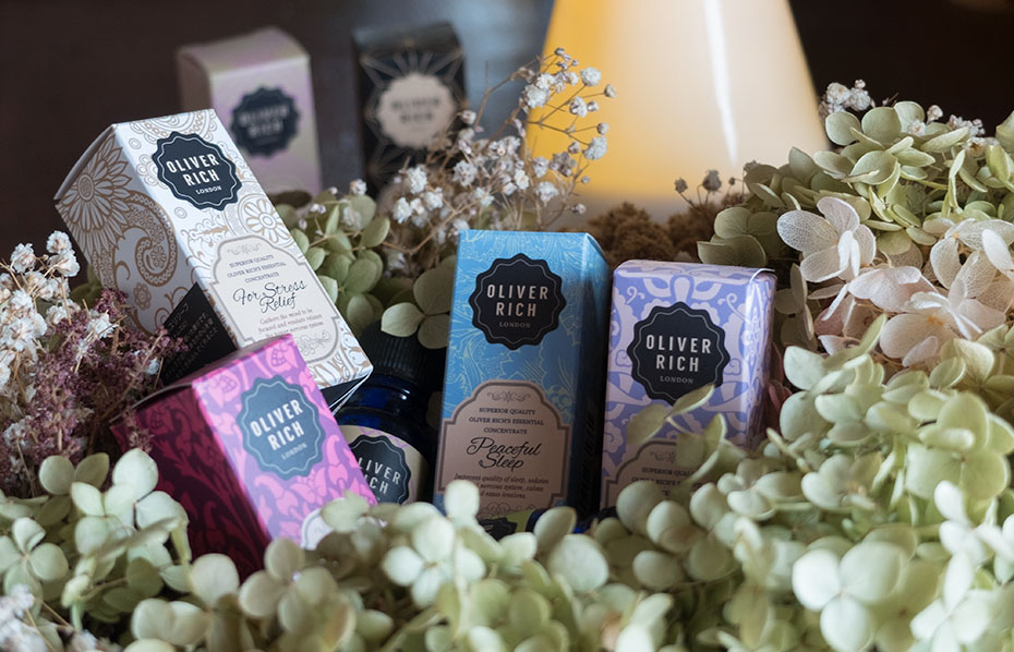

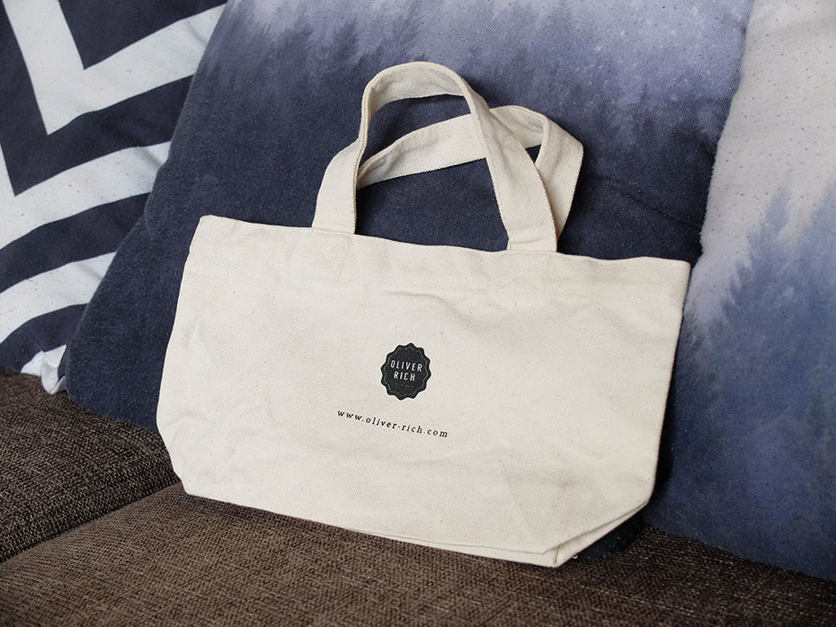
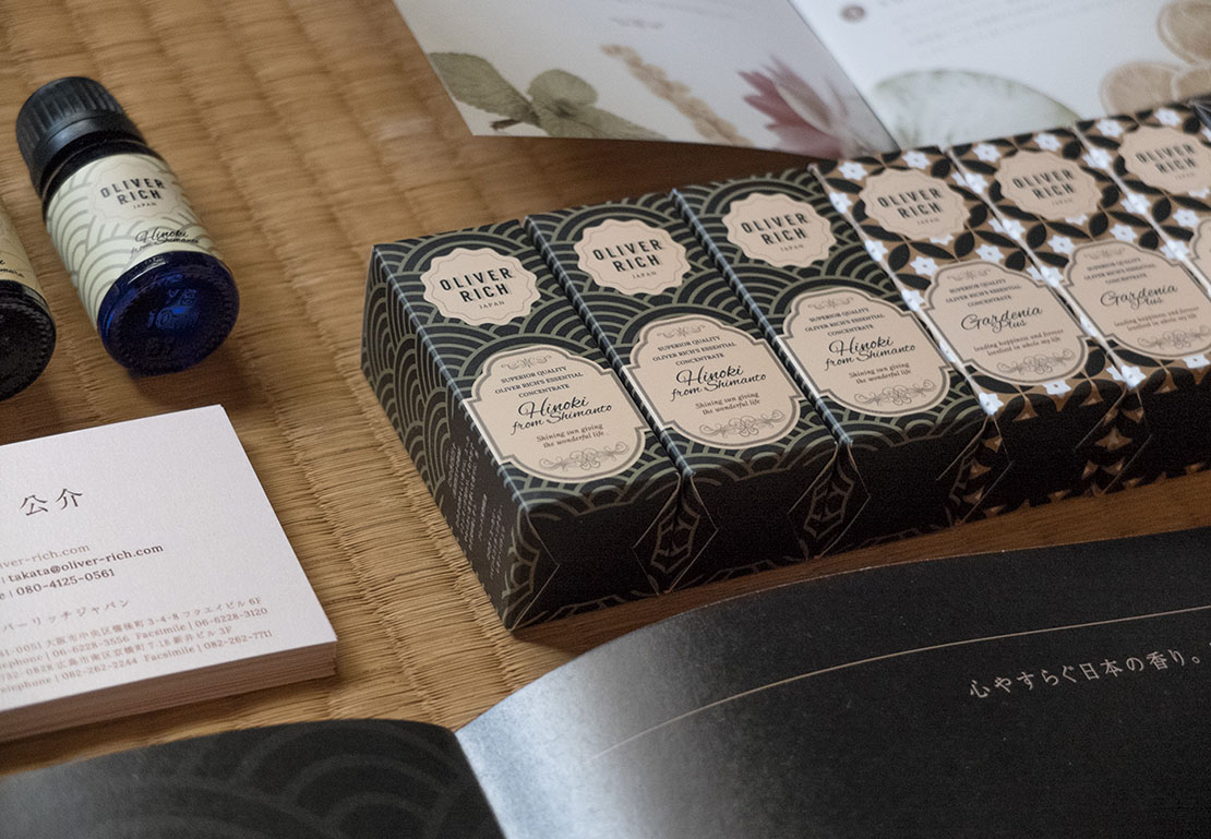
A new product line, the “Japan” series
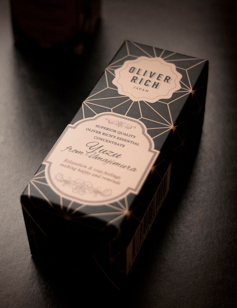
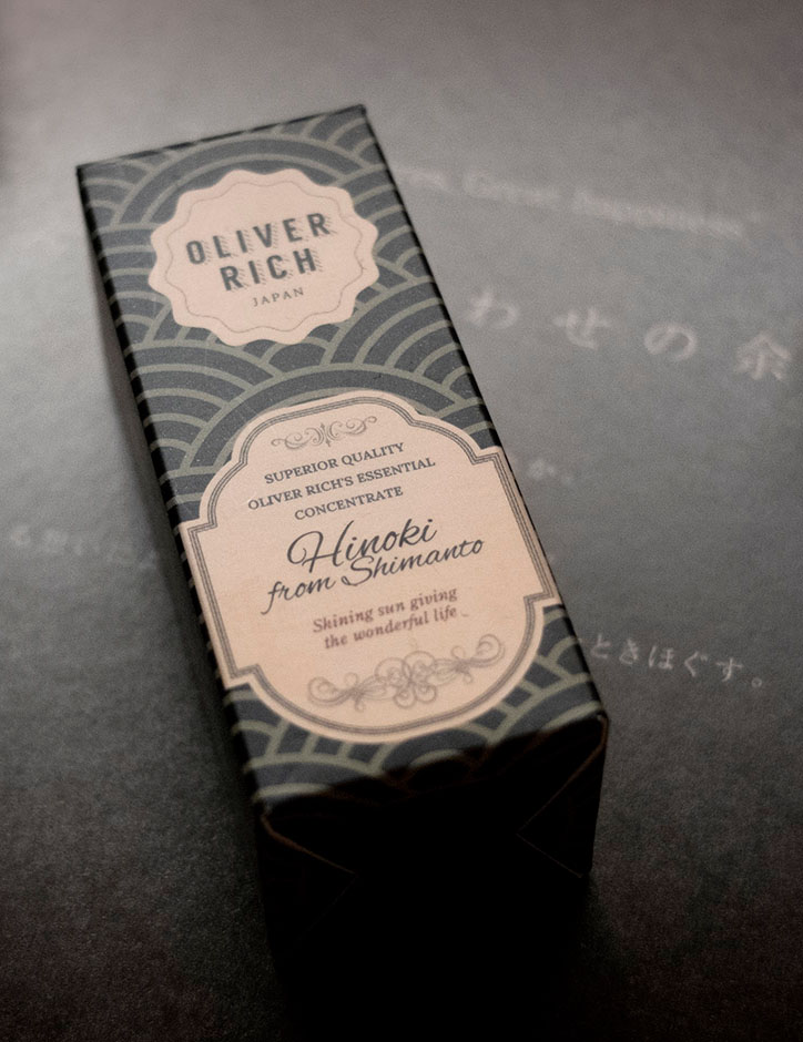
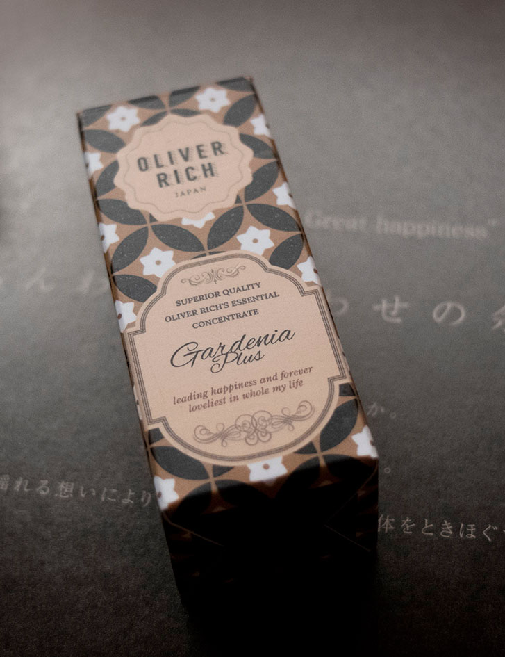
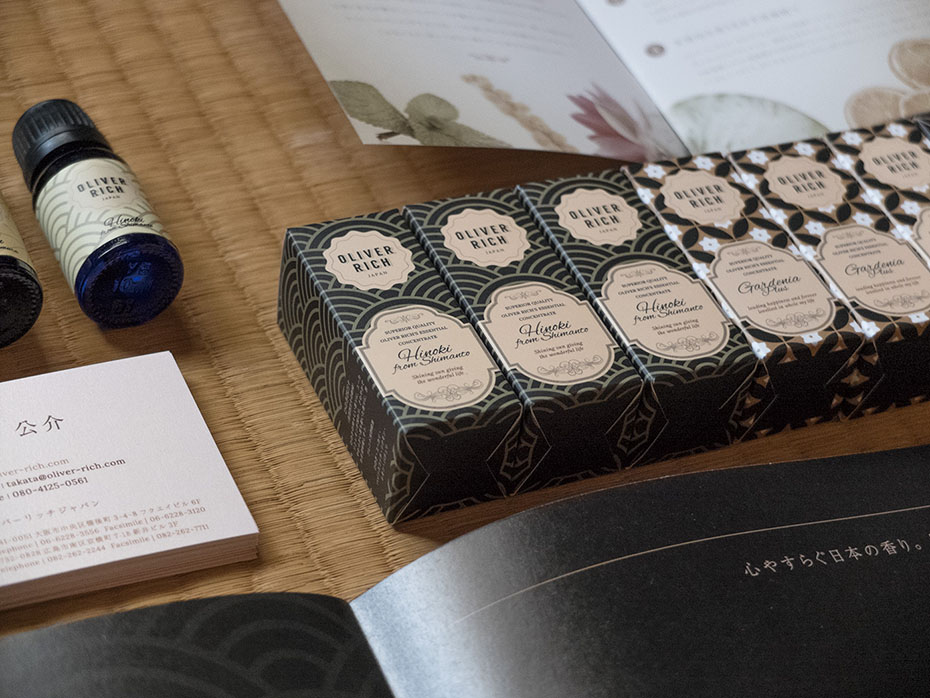
The brand took advantage of this image renewal to launch 3 new typically Japanese fragrances: Yuzu, Hinoki (cypress) and Gardenia.
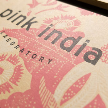
For this product line, I kept the same labels but used patterns and colours reminiscent of traditional Japan and the Edo era. A period that partly corresponds to the Victorian era.
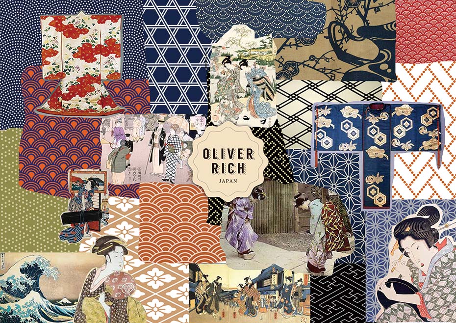
Three typical Japanese fragrances
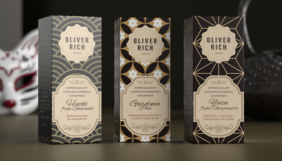
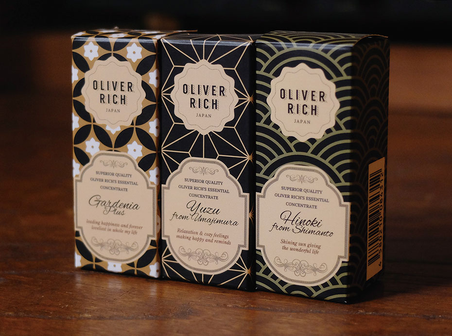
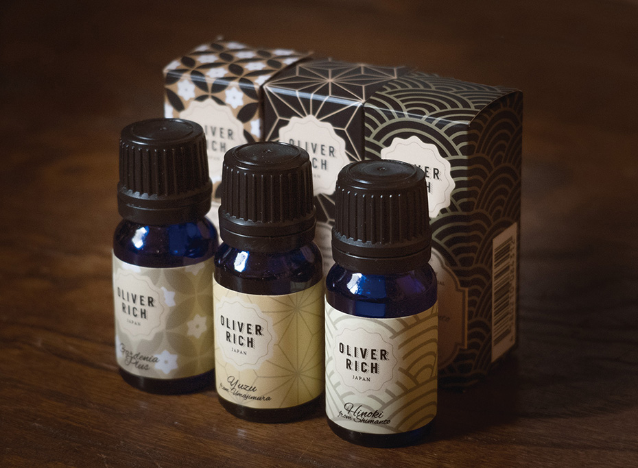
The results
After the rebranding, sales of Oliver Rich aroma oils increased significantly. Their contracts with Tokyu Hands and Loft were renewed. And new contracts were signed with shopping centres such as Don Quijote, Amazon Japan and many interior shops.

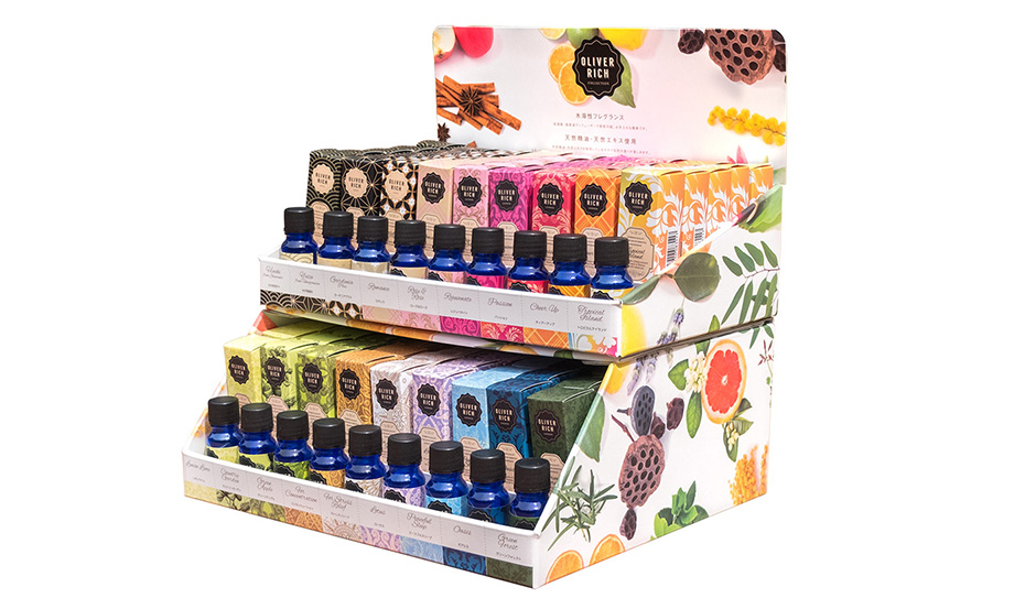
Project featured in The Dieline and in a graphic design book
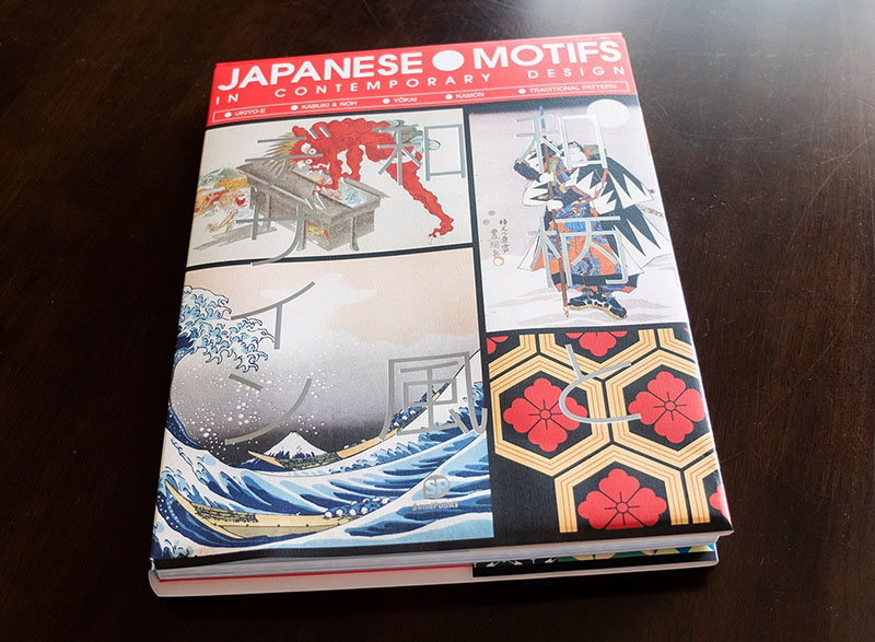
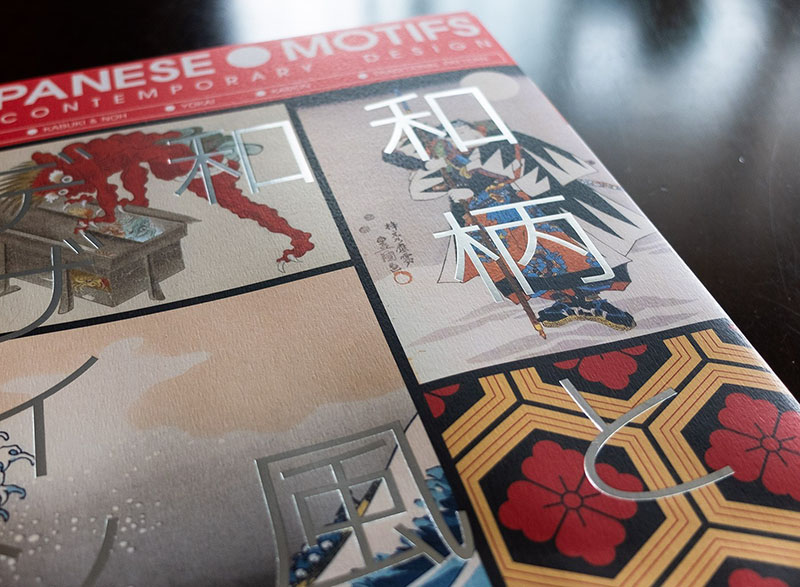
Project featured in JAPANESE MOTIFS IN CONTEMPORARY DESIGN by SendPoint
→ Contact me if you need to renew your brand identity or your packaging
Project description
Job made while working at Nininbaori | Hiroshima.
Project details
- Client:
- Categories:
- Skills:
- Share Project :


