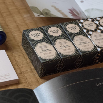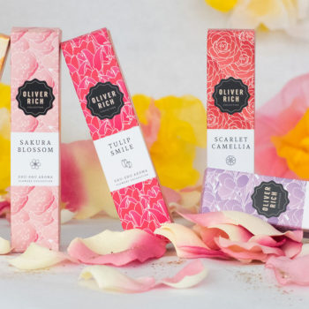
Oliver Rich hand cream packaging
Oliver Rich is a brand born in Hiroshima, which sells water-soluble aromatic oils. In 2013, they entrusted me with the design of a new visual identity for their brand: logo, packaging, stationery & POS (easel panels, counter displays).
To find out more about this rebranding work click here.
After designing new packaging for their flagship product, come the hand creams
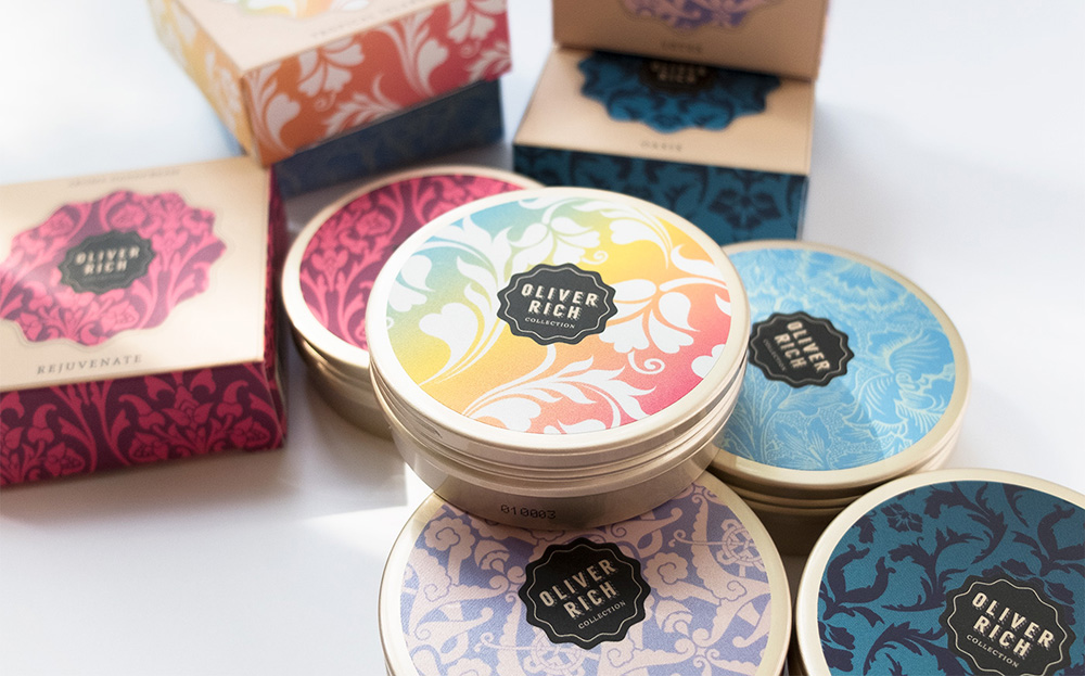
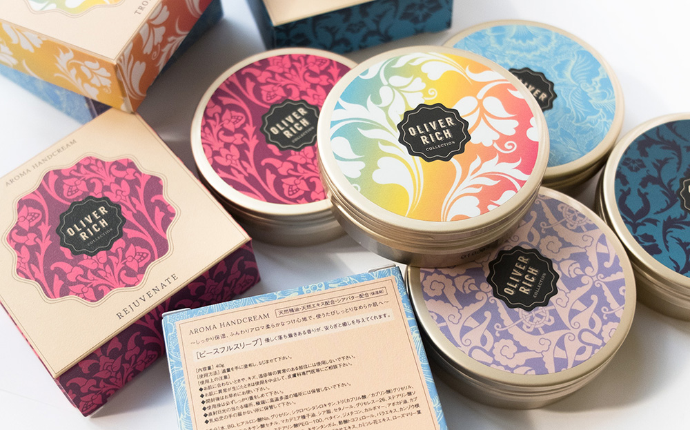
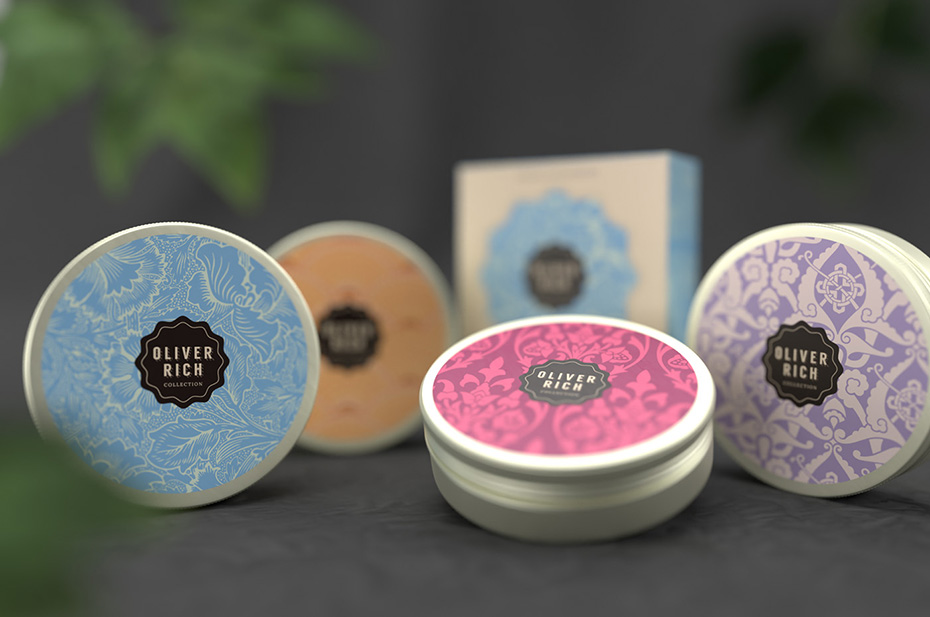
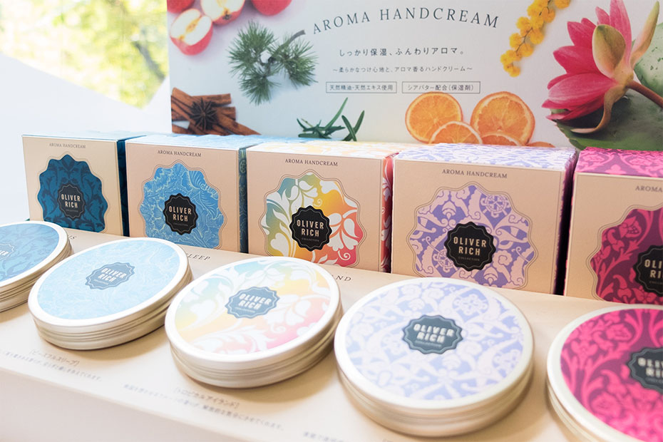
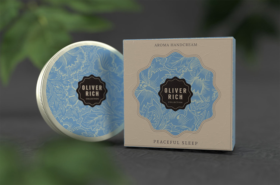
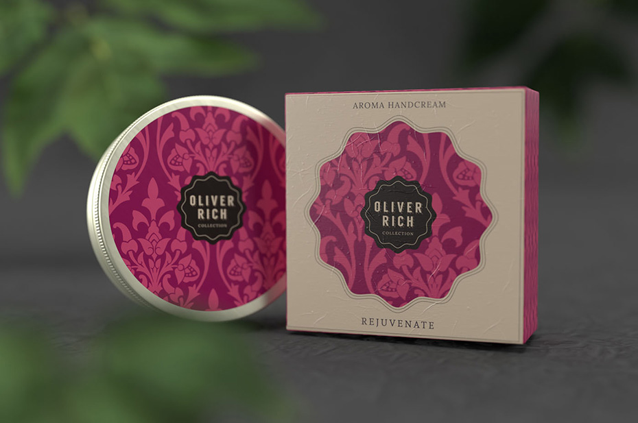
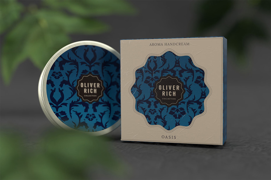
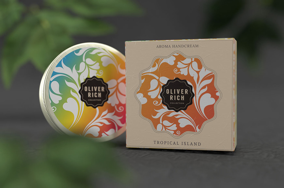
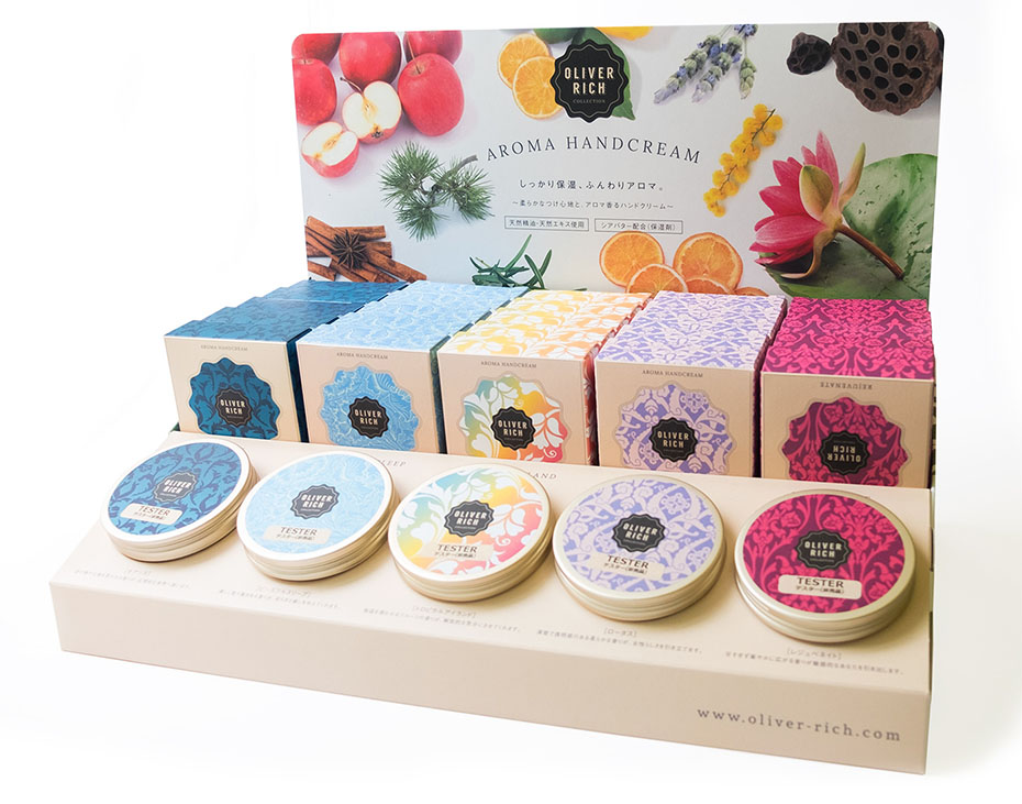
After the success of the aroma oils following the rebranding and the new look of the packaging, Oliver Rich decided to create a line of 5 hand creams.
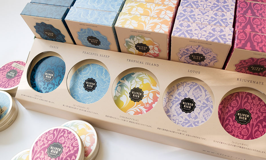
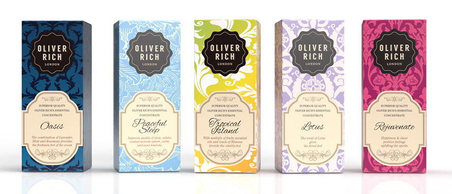
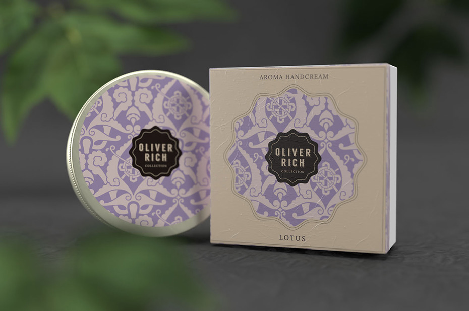
They chose the best selling fragrances: Oasis, Peaceful Sleep, Tropical Island, Lotus and Rejuvenate.
So I took the designs and patterns and adapted them to the boxes and labels of the aluminium jars, as well as the displays.
Oliver Rich hand creams
A new fragrance: Yuzu
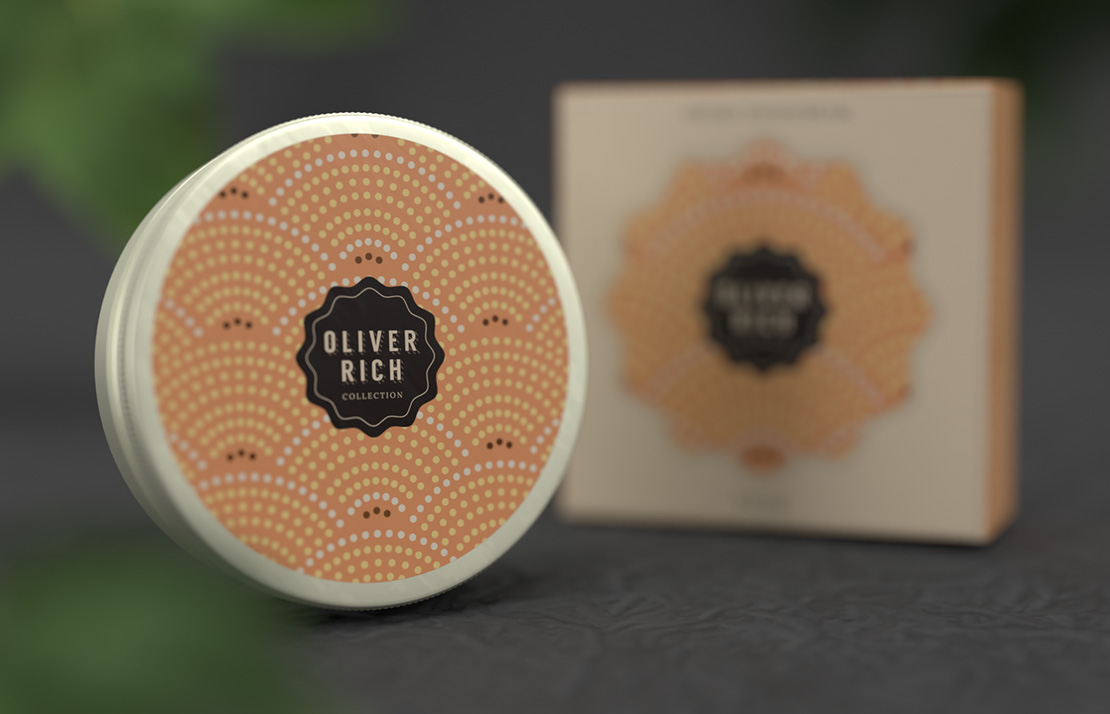
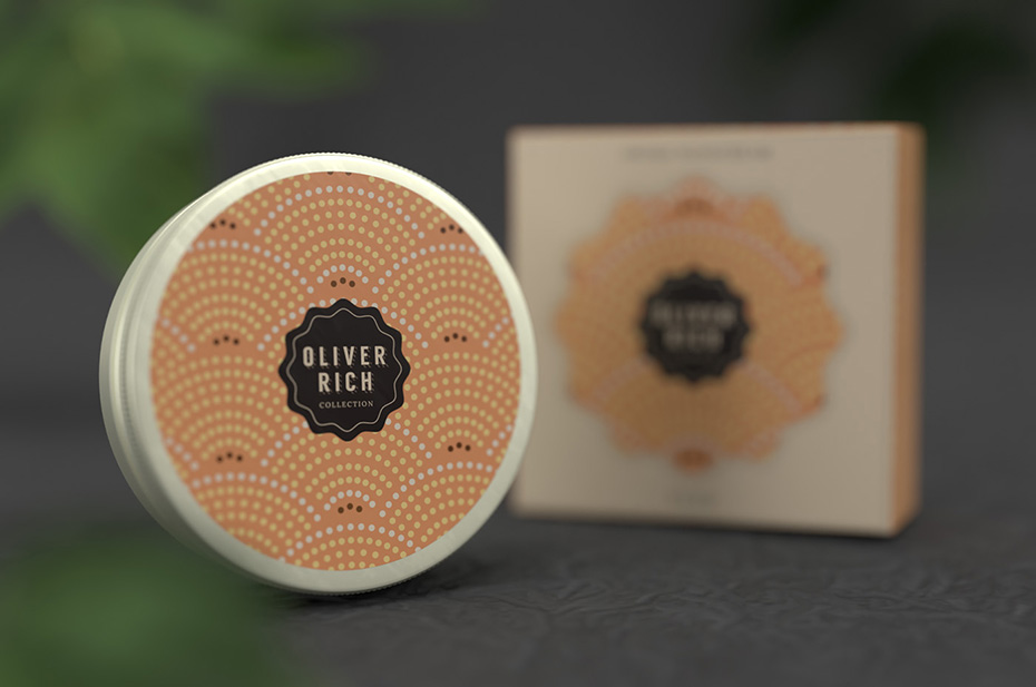
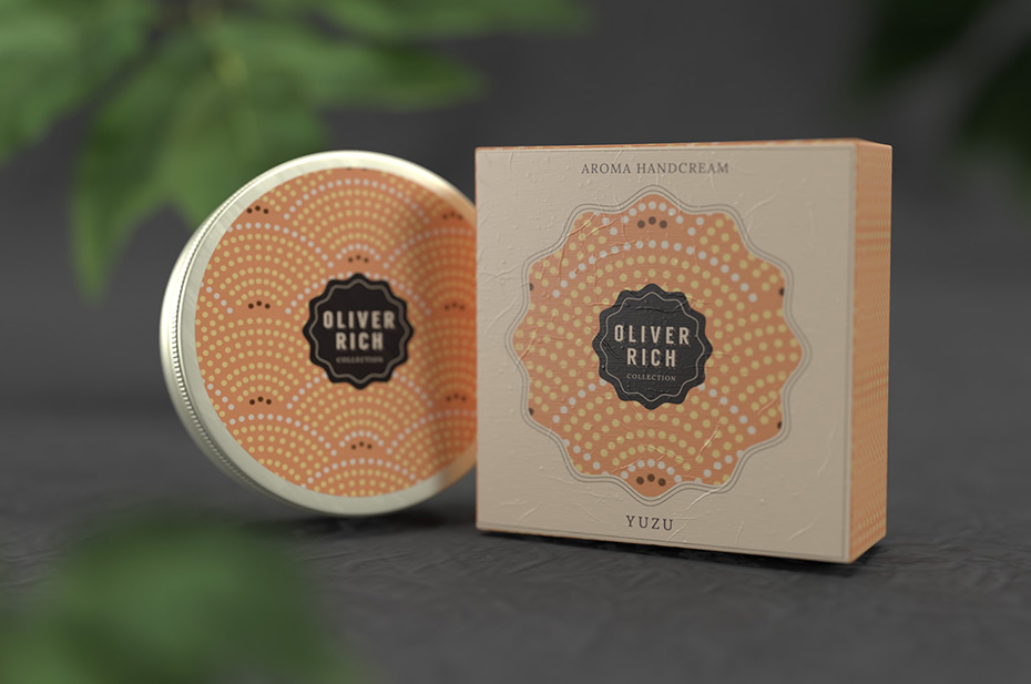
Later, and due to the success of the creams, the brand decided to add a new product: “Yuzu” (a Japanese citrus fruit).
For its packaging, I created a visual inspired by the traditional Japanese pattern called Seigaiha (青海波). I used colours and textures reminiscent of the fruit.
→ Need labels and packaging for your products? Click here to find out more.
Project description
Job made while working at Nininbaori | Hiroshima.
Project details
- Client:
- Categories:
- Skills:
- Share Project :


