Two collections
Packaging design for two lines of hand creams
QLEA Life Design is the client for whom I worked on the rebranding of the Oliver Rich brand. In 2017, they entrusted me with a project that was a little different from the ones we usually work on together.
Actually, it was a request from FrancFranc, a large Japanese chain of interior and decoration shops.
It consisted in proposing two collections of hand creams, each with 5 fragrances. One was to be packaged in tin jars and the other in plastic tubes.
The QLEA team designed the following two collections:
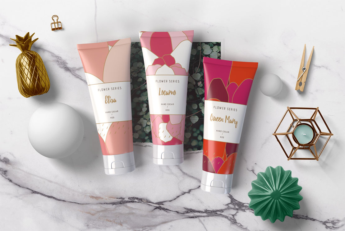
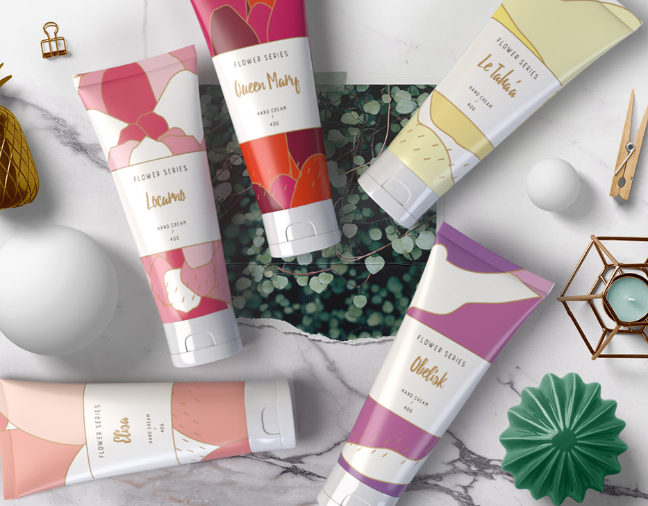
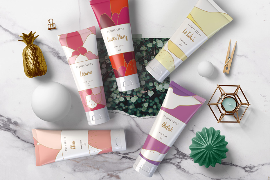
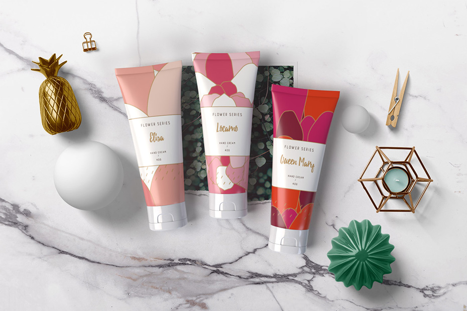
- “Flower Series (Queen Mary, Obelisk, Locarno, Le Taha’a, Elisa) themed on places famous for their flower production.
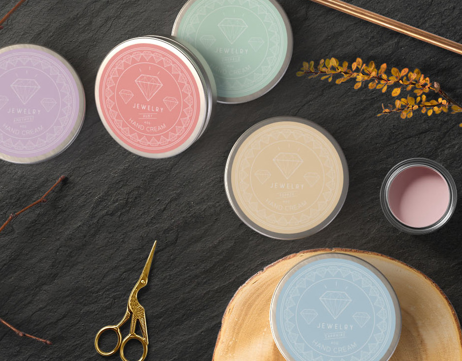
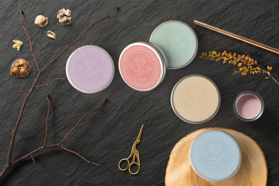
- “Jewelry” (Emerald, Sapphire, Topaz, Amethyst, Ruby) on the theme of precious stones.
They asked me to design the packaging of each collection.
Packaging design proposal for the “Flower Series” hand cream collection
For this collection, I proposed stylised and almost abstract flower petals.
Each tube uses a dominant colour representing the flower for which the place is famous. This colour is complemented by pastel tones.
The golden borders separating the petals are reminiscent of the silk painting technique to add a touch of elegance.

Packaging design proposal for the “Jewelry” collection
For the “Jewelry” collection I chose a simple elegance like the stones themselves. The colour of the gemstone and the white line patterns symbolising the cut stones.
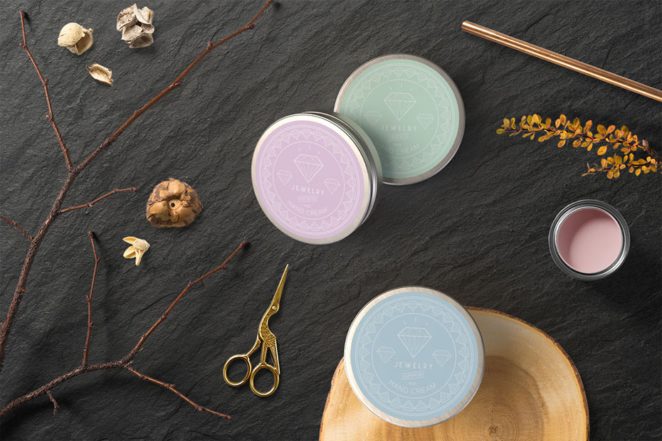
(These are the two proposals that QLEA Life Design selected. It received approval from the final client but the project wasn’t carried out)
→ More about packaging and label design
Project description
Job made while working at Nininbaori | Hiroshima.
Project details
- Client:
- Categories:
- Skills:
- Share Project :


