New collection of aroma oils by Oliver Rich
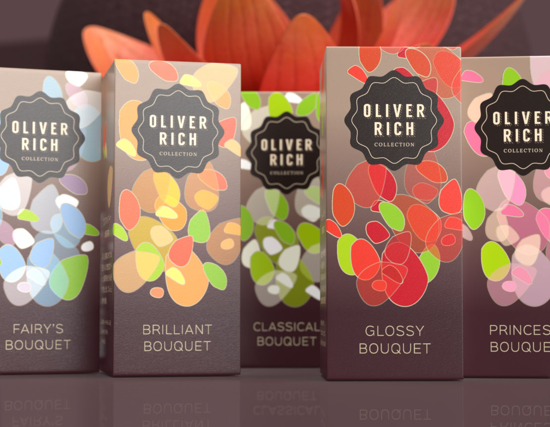
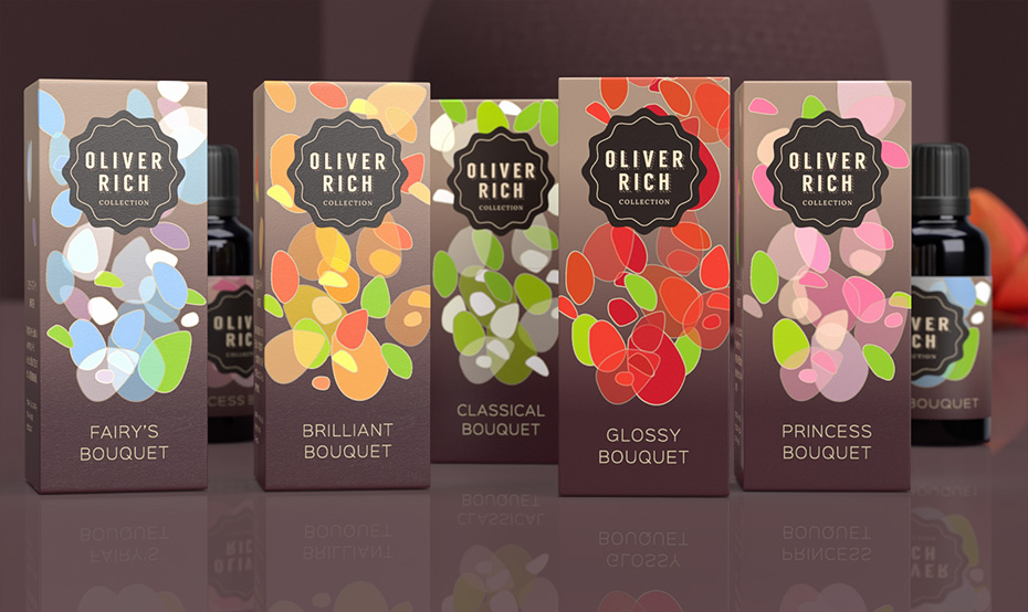
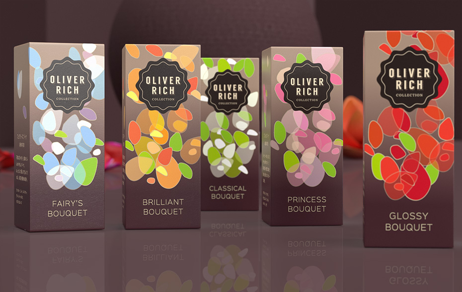
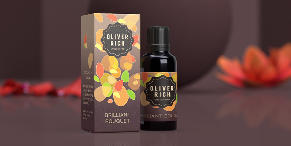
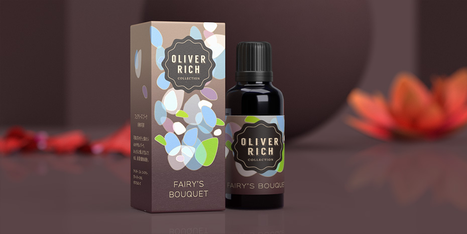
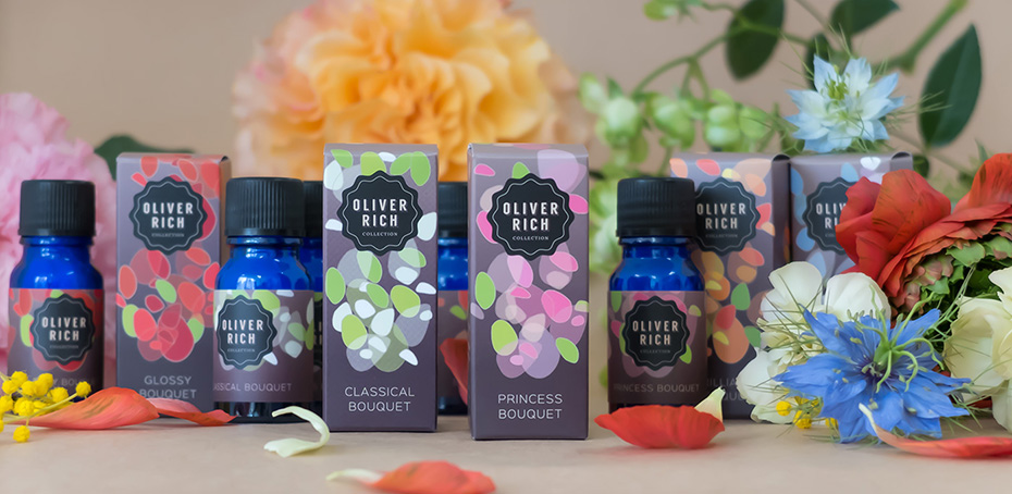
In 2017, the brand Oliver Rich launched a new collection of aroma oils. It consisted of five floral fragrances called “Bouquet Collection”.
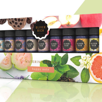
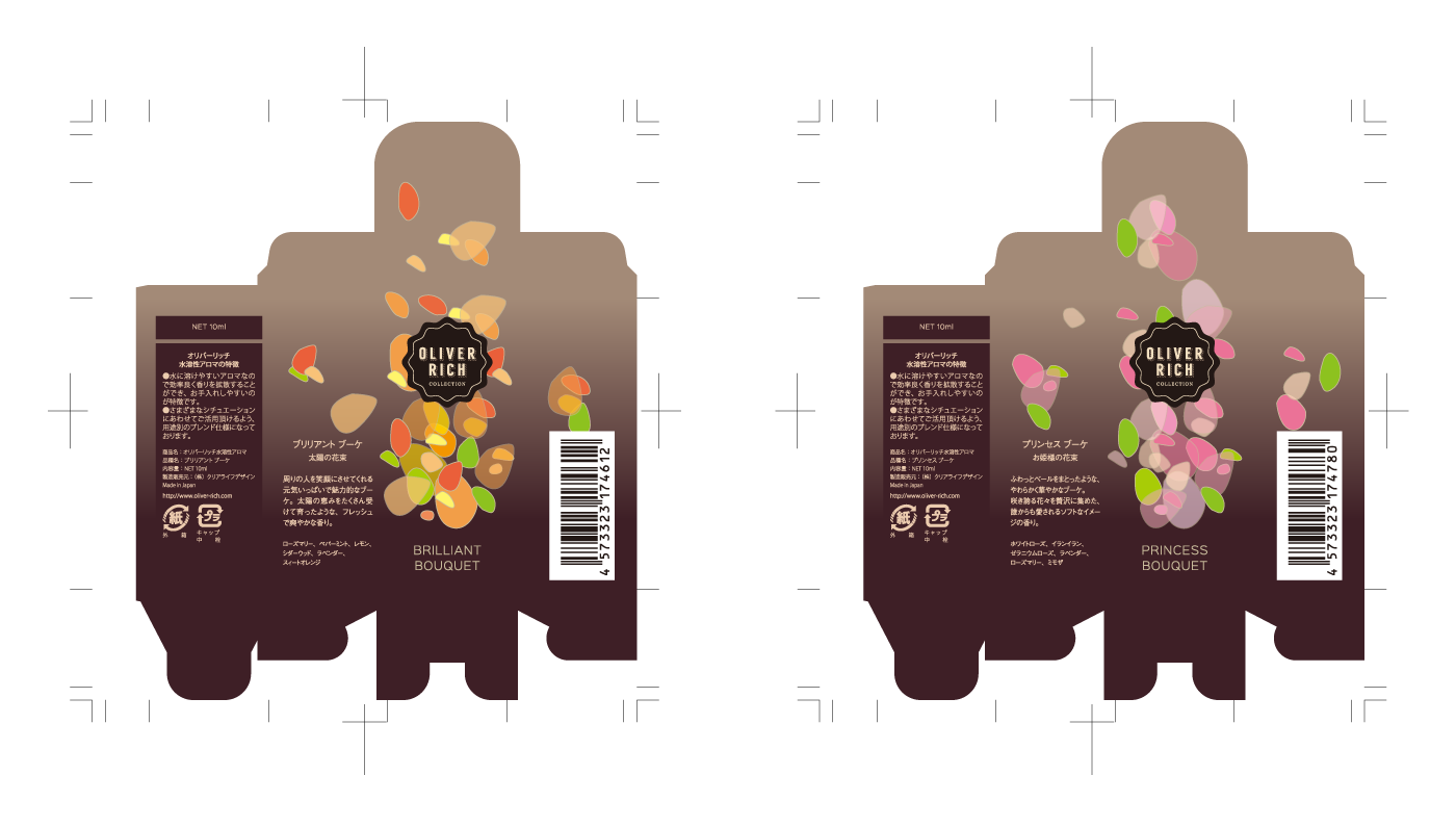
To differentiate each fragrance in the first two collections (London / Japan), I had designed a system of repeating patterns and colours unique to each product. And that’s how the public quickly identified and recognised the brand. For this new collection, as for Shu-Shu, it was therefore essential to keep this system.
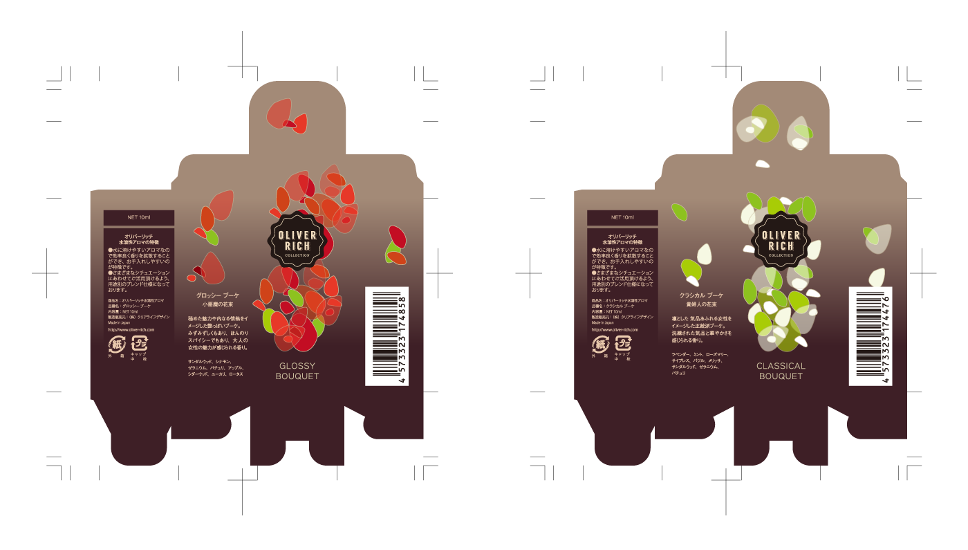
Packaging that evokes modernity, femininity, lightness and freshness
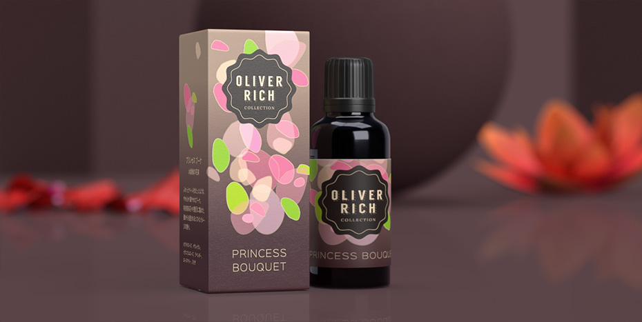
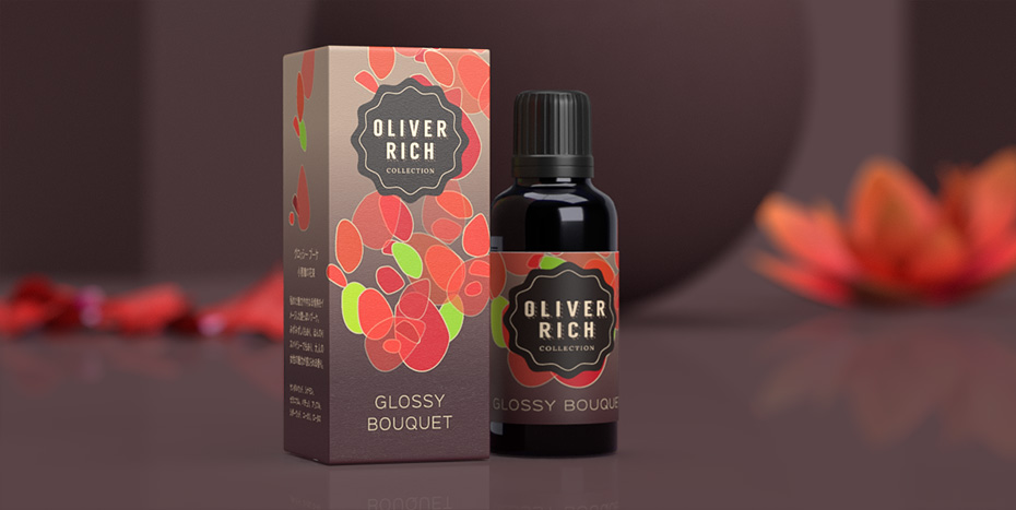
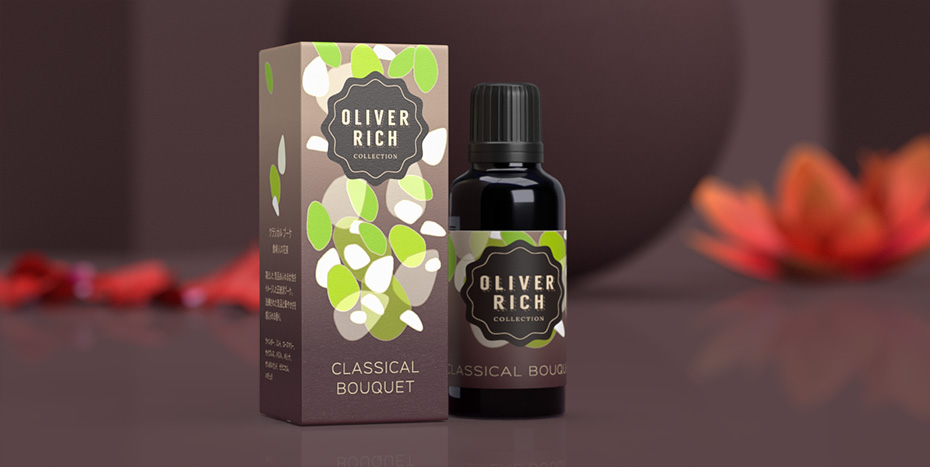
The packaging of the new aroma oils had to give an impression of modernity, femininity, lightness and freshness. The idea of a flower bouquet had to be present as well.
By representing flowers or a bouquet in a figurative way, the risk was creating an outdated result. It would also lack unity and lightness. So I chose to draw semi-transparent shapes reminiscent of petals and leaves. They seem to float in the air, like perfume.
In order to accentuate the idea of modernity, I opted for a sans-serif font with a light weight.
→ If you want me to design the packaging of your products, click here to find out more.
Project description
Job made while working at Nininbaori | Hiroshima.
Project details
- Client:
- Categories:
- Skills:
- Share Project :


